-1

I'd like the following result: enter image description here

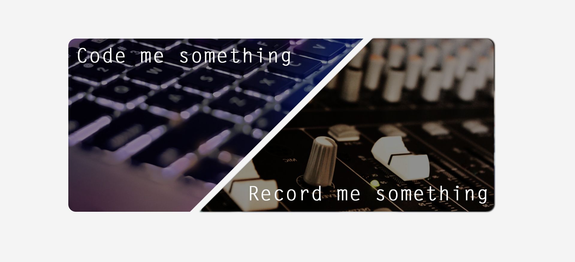
It is two images, that overlap.

I got quite close achieving this with a table and padding like so:

<div class="container">
  <table border="1">
    <tr> 
      <th width=500px>
        <div align="center">    
          <img
               src="./img/img_codemesomething.png"
               style="padding-left:100px"
               width=100% />    
        </div>
      </th> 
      <td width=500px>
        <div align="justify">       
          <img
               src="./img/img_recordmesomething.png"
               style="padding-right:100px"
               width=100% />    
        </div>
      </td>
    </tr>
  </table>
</div>

However, the result is that either both become very small. Or the left one starts to become bigger than the right one. I tried to use padding on both images then (left and right) but padding-right does nothing while padding-left pushes the images to the right which means it isnt centered anymore.

This is what this looks like:

enter image description here

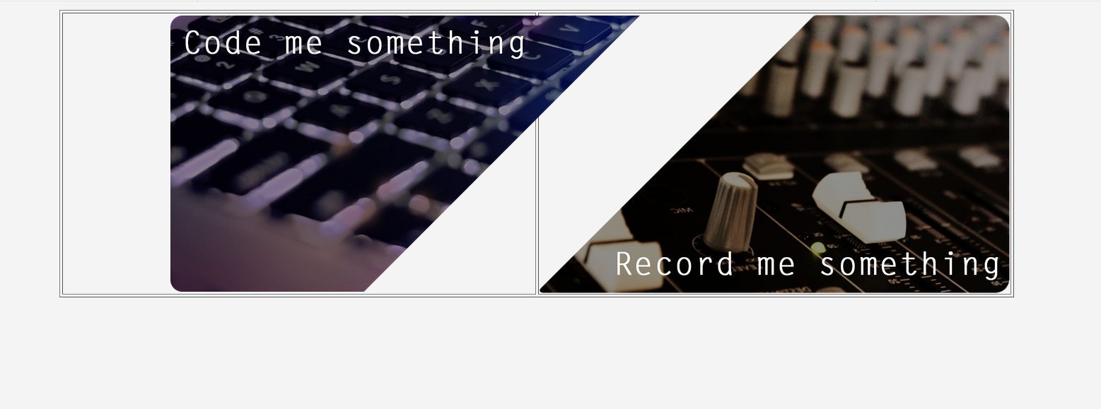
(ignore the borders).

If id like the result as shown in the first picture. and have this be exactly centered in width and height in the browser - how would I go on about this?

Thank you:)

*** EDIT:

The Css is nothing but:

.container{
    width:900px;
    margin:auto;
}

*** EDIT 2: Okay, so I got pretty close. Only problem now is that everything is sort of shifted to the right and not centered anymore but here is what I did:

<div class="container">
    <div class="centered">
                    <table border="0" width=1400px>
                    <tr> 
                        <td width=500px height=400px>
                            <div>   
                                <img
                                    src="./img/img_codemesomething.png"
                                    style="padding-left:40"
                                    width=210%
                                    height=210%
                                </img>  
                            </div>
                        </td>   
                        <td width=500px height=400px>
                            <div>       
                                <img
                                    src="./img/img_recordmesomething.png"
                                    width=210%
                                    height=210%
                                </img>  
                            </div>
                        </td>   

                </table>
    </div>          
</div>

CSS:

.centered {
  position: fixed;
  top: 50%;
  left: 50%;
  transform: translate(-50%, -50%);
}

.container{
    width:900px;
    margin:auto;
}

Result:

enter image description here

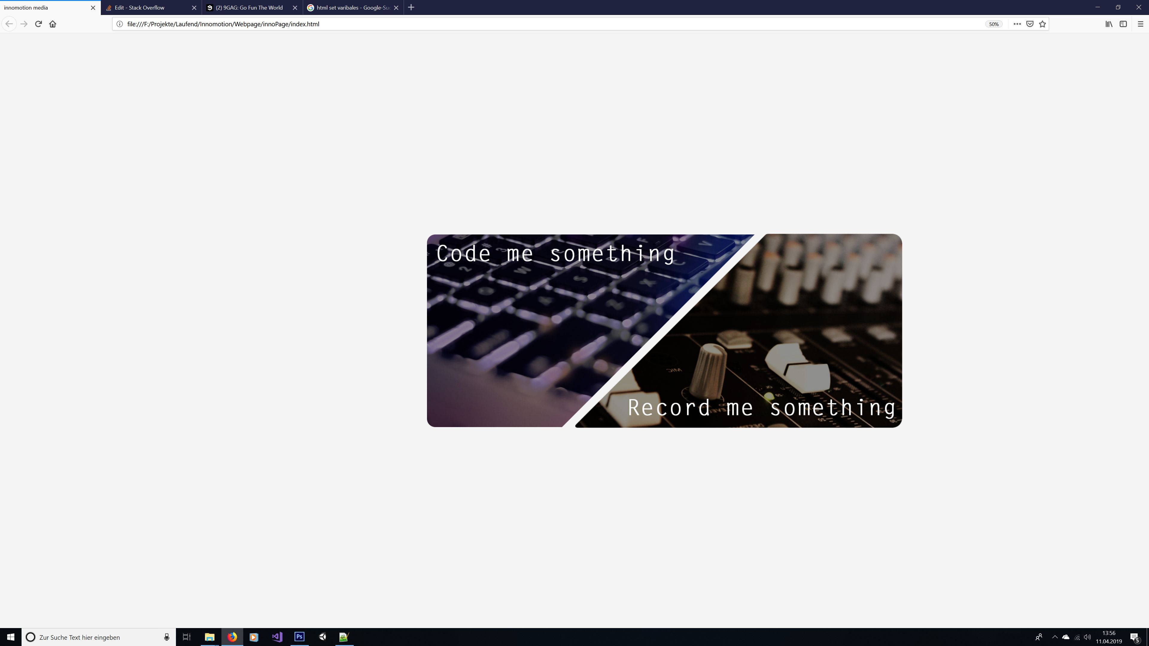
I try to get it to sit centered but I will check on other solution as well. So keep em coming :)

Rob
  • 14,746
  • 28
  • 47
  • 65
innomotion media
  • 862
  • 11
  • 30
  • Can you create a fiddle or share the code you have used to achieve what you got as if now so that we can check and help you as per your requirement? – AKNair Apr 11 '19 at 10:16
  • @AKNair maybe somethign is wrong here. the code is posted in the question? cant you see it? – innomotion media Apr 11 '19 at 10:17
  • What I meant is the CSS properties used for the layout using which you acheived this. Here is the fiddle I made with the code you posted. I am not getting the layout which you shared in question: http://jsfiddle.net/dsy5gn7q/1/ – AKNair Apr 11 '19 at 10:20
  • @AKNair see update. it is not really much in there tho... – innomotion media Apr 11 '19 at 10:22
  • @innomotionmedia can you post the links to original images, and also are you anyway restricted to use only tables? – AvcS Apr 11 '19 at 10:54
  • Best solution IMO would be to use a single image as the background and utilise the [map element](https://developer.mozilla.org/en-US/docs/Web/HTML/Element/map). – James Coyle Apr 11 '19 at 10:56
  • @JamesCoyle it is indeed an idea, however when I hover above one of the images, I want it to increase its size just a little bit more- so with mapping that wouldnt work... – innomotion media Apr 11 '19 at 11:02
  • You can check this link for a possible solution: https://stackoverflow.com/questions/49361690/two-images-background-inline-separate-by-diagonal-border – AKNair Apr 11 '19 at 11:22
  • These are the images: https://wetransfer.com/downloads/0cfd21ac0b9d1634923829bdbeeb76e020190411115902/bc3efc – innomotion media Apr 11 '19 at 12:03
  • Validate your HTML. You are using a number of obsolete attributes and, in fact, some of your HTML is thoroughly invalid by itself. Note: the `` tag does not need and does not use a closing slash and never has in HTML. – Rob Apr 11 '19 at 12:47

2 Answers2

2

Here is your solution as per your requirement, you can use image instead of color.

  <div class="container">
    <div class="traingle">
      <div class="triangle-left">
        <p>Code me something</p>
      </div>
      <div class="triangle-right">
        <p>Record me something</p>
      </div>
    </div>
  </div>

css goes here

.traingle{
    position: absolute;
    width: 620px;
    top: 50%;
    left:50%;
    transform: translate(-50%, -50%);
    display: flex;
    justify-content: space-between;
    align-items: center;
}
.triangle-left {
    width: 300px;
    border-top: solid 180px rgb(200,30,50);
    border-left: solid 0px transparent;
    border-right: solid 180px #00000000;
    margin-right: -156px;
  }
  .triangle-right {
    width: 300px;
    border-top: solid 0px rgb(200,30,50);
    border-left: solid 180px transparent;
    border-bottom: solid 180px rgb(200,30,50);
  }
   .traingle p{
    position: absolute;
    color: #fff;
    font-size: 20px;
    font-family: sans-serif;
   }

 .traingle .triangle-left p{
    top: 0px;
    left: 20px;
}
.traingle .triangle-right p{
    bottom: 0px;
    right: 20px;
}

Required Output

Refer Codepen Example

codeuix
  • 1,366
  • 1
  • 12
  • 18
  • hey. this does look really good. However, I wasnt able to implement a link (a) to both. I was able to implemend one to one triangle but not the other one. Would you mind showing this to me? Thank you! – innomotion media Apr 12 '19 at 10:26
1

You can implement this based on the dimensions of the actual images. The values 59% and 70% are calculated based on image dimensions.

<style>
    .container {
        position: relative;
        /**
         * As we are using absolutely positioned elements, parent element's height will not consider them
         * If you want to use this component inside normal flow of the document, that would mess things up.
         * So to make sure that component occupies the height of its children
         * Calculated as 70 * 59 / 100
         */
        padding-top: 41.3%;
    }
    .imageContainer {
        /**
         * Calculated as (W + W - S) / 2 - G
         * (200 - 100 * (slope.width / image.width)) / 2 - gap
         * Here slope.width / image.width = 0.58
         */
        width: 70%;
        position: absolute;
        top: 0;
    }
    .psuedoContainer {
        position: relative;
        /**
         * To make sure that image always follows the aspect ratio,
         * even if the container width changes.
         * Calculated as 100 * (image.height / image.width) 
         */
        padding-top: 59%;
    }
    .psuedoHolder {
        position: absolute;
        top: 0;
        left: 0;
        right: 0;
        bottom: 0;
    }
    img {
       height: 100%;
       width: auto; 
    }
</style>

<div class="component">
    <div class="container">
        <div class="imageContainer" style="left: 0;">
            <div class="psuedoContainer">
                <div class="psuedoHolder" style="text-align: left;">  
                    <img src="./img_codemesomething.png" />  
                </div>
            </div>
        </div>
        <div class="imageContainer" style="right: 0;">
            <div class="psuedoContainer">
                <div class="psuedoHolder" style="text-align: right;">
                    <img src="./img_recordmesomething.png" />
                </div>
            </div>
        </div>
    </div>
</div>

PS: You can change the width of the .component and everything else will follow the suite and you can position .component wherever you want

AvcS
  • 2,263
  • 11
  • 18
  • interesseting. however, the result is just two images not overlapping :( – innomotion media Apr 11 '19 at 11:45
  • can you explan what's happening or if you can give me the urls of the images you are using, I should be able to give you better solution – AvcS Apr 11 '19 at 11:57
  • it is just as if the images were to be sitting next to one another but are not overlapping. these are the images I am using. I am excited to see what you are coming up with :) https://wetransfer.com/downloads/0cfd21ac0b9d1634923829bdbeeb76e020190411115902/bc3efc – innomotion media Apr 11 '19 at 12:00
  • I am not able to achieve this using table, the percentage value on img are not following the container width because of table, i am gonna implement this using divs instead – AvcS Apr 11 '19 at 12:32
  • Very awesome new way of doing this. However one minor flaw: I am not able to implement a link to both images. Adding A HREF only works on the right triangle, not on the left one. Would you mind showing me how to add a link to both? Thank you so much! – innomotion media Apr 12 '19 at 10:30