0

I have a df called "bound" with values (how many animals I found) for different time intervals (9_10,10_11,11_12 =column names). The last two rows are a mean and sd of the air temperature during the interval, derived from another df.

9_10   10_11   11_12
2.1     5.1      NA
4.23    2.1      9.2
NA      3.2      5.6
18.56   20.45    23.56
5.67    5.12     5.78

My df is a lot longer though..

Now, I want to make a boxplot, where the column names define the x-axis and the boxes are made from the values for animals found. The mean should be printed as a line (maybe with a second y-axis) with the sd as error bars. Somehow like this, though the lines would lie outside the boxplots, because they so not derive from the same data:

https://peltiertech.com/images/2011-06/BoxPlotH5a.png (I'm sorry, I'm somehow not allowed to post pictures here)

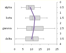
Alpha, beta etc. would be 9_10, 10_11 etc.

I have tried already this already (amongst others):

t <- ggplot(stack(bound[1:3,]), aes(x=ind, y=values))
t <- t + geom_boxplot(outlier.shape=NA,fill="grey", color="black")
t <- t + coord_cartesian(ylim = c(0, 20))
t <- t + scale_x_discrete(name = NULL, labels=c("09:00 - 09:59","10:00 - 10:59","11:00 - 11:59"))
t <- t + scale_y_continuous(name = "animals found per hour")
t <- t + geom_line(stack(bound[4,]),aes(x=ind, y=values)) 
t <- t + scale_y_continuous(sec.axis = sec_axis(~.), name = "mean air temperature")

This code gives me a fine boxplot just like I want it for the rows with the number of animals found. But the line for the air temperature does not appear and I don't know if ggplot is able to do it. It seems to me like it plots a line somewhere vertically within the boxplots, but not horizontally between the boxplots.

Can anyone help me?

Julia.Ed
  • 1
  • 2

1 Answers1

0

There were two issues:

  1. you were trying to make a geom_line with a non-numeric x value
  2. you need to specify data= when you make new ggplot additions, and the data set isn't the same as the one in the original ggplot

Hope this helps

edit: in future, try the function dput(bound) to capture your data set in to code, for posting to SO :)

# data
library(ggplot2)
input <- c(2.1,     5.1  ,    NA,
           4.23,    2.1   ,   9.2,
           NA  ,    3.2   ,   5.6,
           18.56,   20.45 ,   23.56,
           5.67 ,   5.12  ,   5.78)
bound <- data.frame(matrix(input, ncol=3, byrow = TRUE))
names(bound) <- c("9_10", "10_11", "11_12")

t <- ggplot(stack(bound[1:3,]), aes(x=ind, y=values))
t <- t + geom_boxplot(outlier.shape=NA,fill="grey", color="black")
t <- t + coord_cartesian(ylim = c(0, 20))
t <- t + scale_x_discrete(name = NULL, labels=c("09:00 - 09:59","10:00 - 10:59","11:00 - 11:59"))
t <- t + scale_y_continuous(name = "animals found per hour")

# extract the bound[4,]
error_bars <- stack(bound[4,])
# replace with your formulation e.g. looks like negative binomial maybe?
error_bars$low <- error_bars$values-1.96*unlist(bound[5,])
error_bars$upp <- error_bars$values+1.96*unlist(bound[5,])

# two issues
# 1. the column ind will have values "9_10" which aren't numeric scale
#    boxplots have factor levels on x axis. The levels by default will be numeric
#    vector starting at 1,2,3 etc.
#    Try replacing ind with these factor levels
error_bars$ind <- 1:3


# 2. best practice to add data=line_df, as without it, ggplot throws a tantrum
# if you've specified a different data set in the original ggplot
t <- t + geom_line(data=error_bars, aes(x=ind, y=values)) +
  geom_errorbar(data=error_bars, aes(ymin=low, ymax=upp), colour="indianred2")
t <- t + scale_y_continuous(sec.axis = sec_axis(~), name = "mean air temperature")
t <- t + theme_minimal()
# can now see the line
t
Jonny Phelps
  • 2,687
  • 1
  • 11
  • 20
  • Oh wow, that works pretty well!! Thanks a lot! Also for the dput advise.. The only thing bothering me now, is that the line floats way above the boxplots. If I use `line_df <- stack(bound[68,]/2)` and then `t <- t + scale_y_continuous(sec.axis = sec_axis(~./2), name = "mean air temperature")` the line appears at an y axis value of 5, which is not correct.. Do you know how to fix that? Also I'd like to add errorbars to the line, which come from line `bound[5,]`. Sorry, I forgot to ask that in the original question... – Julia.Ed Apr 19 '19 at 09:08
  • I've edited to show how you can include error bars. Doing two axes plots in ggplot is not straightforward by the looks of it: https://stackoverflow.com/questions/3099219/plot-with-2-y-axes-one-y-axis-on-the-left-and-another-y-axis-on-the-right – Jonny Phelps Apr 21 '19 at 08:45
  • You could either try plotting them on separate windows e.g. https://cran.r-project.org/web/packages/cowplot/vignettes/plot_grid.html. It's difficult if your scales are out, but you could see if a transformation on the data could align the scales e.g. http://www.dataminingblog.com/standardization-vs-normalization/ – Jonny Phelps Apr 21 '19 at 08:48