2

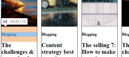
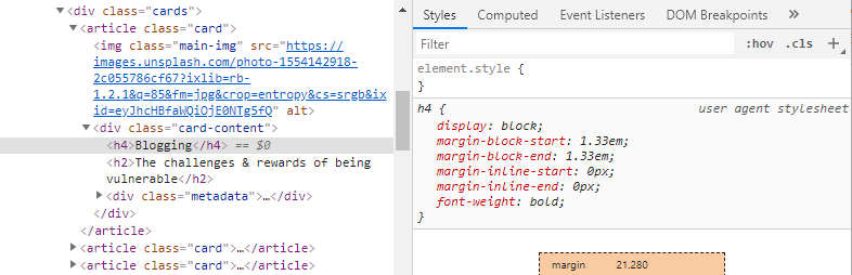
I have a lot of white space at the bottom of my CSS Grid items and I want to figure out why. I set an image to take 40% height of the container, whose height is set to 100% height. I had understood that by default a grid item's height (in a row) is that of its content. All items in an implicit row should have the same height if they only span one row, which is the case for me.

How do I get the portion under the image to take up only the space needed for the next and any padding, and no more?

.cards {
  display: grid;
  grid-template-columns: repeat(6, 1fr);
  grid-template-rows: min-content;
  grid-gap: 1rem;

}

.card {
  height: 100%;
  border: 1px solid black;
}

.main-img {
  display: block;
  object-fit: cover;
  height: 40%;
  width: 100%;
}

.author-img {
  display: none;
}
<body>
    <div class="cards">
        <article class="card">
          <img class="main-img" src="https://images.unsplash.com/photo-1554142918-2c055786cf67?ixlib=rb-1.2.1&q=85&fm=jpg&crop=entropy&cs=srgb&ixid=eyJhcHBfaWQiOjE0NTg5fQ" alt="">
          <div class="card-content">
            <h4>Blogging</h4>
            <h2>The challenges & rewards of being vulnerable</h2>
            <div class="metadata">
              <img class="author-img" src="https://via.placeholder.com/1000x800/fb0" alt="">
              <div>
                <p class="author-name">By Alex</p>
                <p class="article-date">on April 16th, 2019</p>
              </div>
            </div>
          </div>
        </article>
        <article class="card">
          <img class="main-img" src="https://images.unsplash.com/photo-1553994535-aa6c2ee8cfc1?ixlib=rb-1.2.1&q=85&fm=jpg&crop=entropy&cs=srgb&ixid=eyJhcHBfaWQiOjE0NTg5fQ" alt="">
          <div class="card-content">
            <h4>Blogging</h4>
            <h2>Content strategy best practices vs reality with Alex of Scripted</h2>
            <div class="metadata">
              <img class="author-img" src="https://via.placeholder.com/1000x800/cf0" alt="">
              <div>
                <p class="author-name">By Alex</p>
                <p class="article-date">on April 16th, 2019</p>
              </div>
            </div>
          </div>
        </article>
        <article class="card">
          <img class="main-img" src="https://images.unsplash.com/photo-1554283048-23c1133c646e?ixlib=rb-1.2.1&q=85&fm=jpg&crop=entropy&cs=srgb&ixid=eyJhcHBfaWQiOjE0NTg5fQ" alt="">
          <div class="card-content"><h4>Blogging</h4>
          <h2>The selling 7: How to make amazing employee bio videos (+Examples)</h2>
          <div class="metadata">
            <img class="author-img" src="https://via.placeholder.com/1000x800/cf0" alt="">
            <div>
              <p class="author-name">By Alex</p>
              <p class="article-date">on April 16th, 2019</p>
            </div>
          </div></div>
        </article>
        <article class="card">
          <img class="main-img" src="https://images.unsplash.com/photo-1554302006-5c11782b1f69?ixlib=rb-1.2.1&q=85&fm=jpg&crop=entropy&cs=srgb&ixid=eyJhcHBfaWQiOjE0NTg5fQ" alt=""> 
          <div class="card-content">
            <h4>Blogging</h4>
            <h2>The challenges & rewards of being vulnerable</h2>
            <div class="metadata">
              <img class="author-img" src="https://via.placeholder.com/1000x800/fb0" alt="">
              <div>
                <p class="author-name">By Alex</p>
                <p class="article-date">on April 16th, 2019</p>
              </div>
            </div>
          </div>
        </article>
        <article class="card">
          <img class="main-img" src="https://images.unsplash.com/photo-1553586633-929ec02f4fb4?ixlib=rb-1.2.1&q=85&fm=jpg&crop=entropy&cs=srgb&ixid=eyJhcHBfaWQiOjE0NTg5fQ" alt="">
          <div class="card-content">
            <h4>Blogging</h4>
            <h2>Content strategy best practices vs reality with Alex Barron of Scripted</h2>
            <div class="metadata">
              <img class="author-img" src="https://via.placeholder.com/1000x800/cf0" alt="">
              <div>
                <p class="author-name">By Alex</p>
                <p class="article-date">on April 16th, 2019</p>
              </div>
            </div>
          </div>
        </article>
        <article class="card">
          <img class="main-img" src="https://images.unsplash.com/photo-1548247416-ec66f4900b2e?ixlib=rb-1.2.1&q=85&fm=jpg&crop=entropy&cs=srgb&ixid=eyJhcHBfaWQiOjE0NTg5fQ" alt="">
          <div class="card-content">
            <h4>Blogging</h4>
            <h2>The selling 7: How to make amazing employee bio videos (+Examples)</h2>
            <div class="metadata">
              <img class="author-img" src="https://via.placeholder.com/1000x800/cf0" alt="">
              <div>
                <p class="author-name">By Alex</p>
                <p class="article-date">on April 16th, 2019</p>
              </div>
            </div>
          </div>
        </article>
    </div>
</body>

CodePen

TylerH
  • 20,799
  • 66
  • 75
  • 101
Alex B
  • 1,009
  • 3
  • 18
  • 26

2 Answers2

1

You need to set your height of 40% in px or rem or em because 40% is calculating differently, for responsive you can use % or vh but height set in px or rem or em is more suitable in this case.

.cards {
  display: grid;
  grid-template-columns: repeat(6, 1fr);
  grid-template-rows: min-content;
  grid-gap: 1rem;
}

.card {
  border: 1px solid black;
}

.main-img {
  display: block;
  object-fit: cover;
  height: 15rem;
  width: 100%;
}

.author-img {
  display: none;
}
<body>
    <div class="cards">
        <article class="card">
          <img class="main-img" src="https://images.unsplash.com/photo-1554142918-2c055786cf67?ixlib=rb-1.2.1&q=85&fm=jpg&crop=entropy&cs=srgb&ixid=eyJhcHBfaWQiOjE0NTg5fQ" alt="">
          <div class="card-content">
            <h4>Blogging</h4>
            <h2>The challenges & rewards of being vulnerable</h2>
            <div class="metadata">
              <img class="author-img" src="https://via.placeholder.com/1000x800/fb0" alt="">
              <div>
                <p class="author-name">By Alex</p>
                <p class="article-date">on April 16th, 2019</p>
              </div>
            </div>
          </div>
        </article>
        <article class="card">
          <img class="main-img" src="https://images.unsplash.com/photo-1553994535-aa6c2ee8cfc1?ixlib=rb-1.2.1&q=85&fm=jpg&crop=entropy&cs=srgb&ixid=eyJhcHBfaWQiOjE0NTg5fQ" alt="">
          <div class="card-content">
            <h4>Blogging</h4>
            <h2>Content strategy best practices vs reality with Alex of Scripted</h2>
            <div class="metadata">
              <img class="author-img" src="https://via.placeholder.com/1000x800/cf0" alt="">
              <div>
                <p class="author-name">By Alex</p>
                <p class="article-date">on April 16th, 2019</p>
              </div>
            </div>
          </div>
        </article>
        <article class="card">
          <img class="main-img" src="https://images.unsplash.com/photo-1554283048-23c1133c646e?ixlib=rb-1.2.1&q=85&fm=jpg&crop=entropy&cs=srgb&ixid=eyJhcHBfaWQiOjE0NTg5fQ" alt="">
          <div class="card-content"><h4>Blogging</h4>
          <h2>The selling 7: How to make amazing employee bio videos (+Examples)</h2>
          <div class="metadata">
            <img class="author-img" src="https://via.placeholder.com/1000x800/cf0" alt="">
            <div>
              <p class="author-name">By Alex</p>
              <p class="article-date">on April 16th, 2019</p>
            </div>
          </div></div>
        </article>
        <article class="card">
          <img class="main-img" src="https://images.unsplash.com/photo-1554302006-5c11782b1f69?ixlib=rb-1.2.1&q=85&fm=jpg&crop=entropy&cs=srgb&ixid=eyJhcHBfaWQiOjE0NTg5fQ" alt=""> 
          <div class="card-content">
            <h4>Blogging</h4>
            <h2>The challenges & rewards of being vulnerable</h2>
            <div class="metadata">
              <img class="author-img" src="https://via.placeholder.com/1000x800/fb0" alt="">
              <div>
                <p class="author-name">By Alex</p>
                <p class="article-date">on April 16th, 2019</p>
              </div>
            </div>
          </div>
        </article>
        <article class="card">
          <img class="main-img" src="https://images.unsplash.com/photo-1553586633-929ec02f4fb4?ixlib=rb-1.2.1&q=85&fm=jpg&crop=entropy&cs=srgb&ixid=eyJhcHBfaWQiOjE0NTg5fQ" alt="">
          <div class="card-content">
            <h4>Blogging</h4>
            <h2>Content strategy best practices vs reality with Alex Barron of Scripted</h2>
            <div class="metadata">
              <img class="author-img" src="https://via.placeholder.com/1000x800/cf0" alt="">
              <div>
                <p class="author-name">By Alex</p>
                <p class="article-date">on April 16th, 2019</p>
              </div>
            </div>
          </div>
        </article>
        <article class="card">
          <img class="main-img" src="https://images.unsplash.com/photo-1548247416-ec66f4900b2e?ixlib=rb-1.2.1&q=85&fm=jpg&crop=entropy&cs=srgb&ixid=eyJhcHBfaWQiOjE0NTg5fQ" alt="">
          <div class="card-content">
            <h4>Blogging</h4>
            <h2>The selling 7: How to make amazing employee bio videos (+Examples)</h2>
            <div class="metadata">
              <img class="author-img" src="https://via.placeholder.com/1000x800/cf0" alt="">
              <div>
                <p class="author-name">By Alex</p>
                <p class="article-date">on April 16th, 2019</p>
              </div>
            </div>
          </div>
        </article>
    </div>
</body>
Nisharg Shah
  • 16,638
  • 10
  • 62
  • 73
  • Thank you. This solved the issue. But I want to know more about the "40% is calculating differently" so I can understand it? Are you or anyone else able to explain this to me? – Alex B Apr 21 '19 at 08:24
  • 40% is calculated from your viewport and when you resize it your height is increasing and decreasing but most of all time height is not measured in %, for that you need to use viewport `vh vw` – Nisharg Shah Apr 21 '19 at 09:58
1

How do I get the portion under the image to take up only the space needed for the next and any padding, and no more?

The grid item following the image is a div with a heading (h4) inside. This heading has default top and bottom margins set by the browser.

enter image description here

enter image description here

Override this default with h4 { margin-top: 0 }

.cards {
  display: grid;
  grid-template-columns: repeat(6, 1fr);
  grid-template-rows: min-content;
  grid-gap: 1rem;
}

.card {
  height: 100%;
  border: 1px solid black;
}

.main-img {
  display: block;
  object-fit: cover;
  height: 40%;
  width: 100%;
}

.author-img {
  display: none;
}

h4 {
  margin-top: 0;
}
<div class="cards">
  <article class="card">
    <img class="main-img" src="https://images.unsplash.com/photo-1554142918-2c055786cf67?ixlib=rb-1.2.1&q=85&fm=jpg&crop=entropy&cs=srgb&ixid=eyJhcHBfaWQiOjE0NTg5fQ" alt="">
    <!--           <h1>Alex</h1> -->
    <div class="card-content">
      <h4>Blogging</h4>
      <h2>The challenges & rewards of being vulnerable</h2>
      <div class="metadata">
        <img class="author-img" src="https://via.placeholder.com/1000x800/fb0" alt="">
        <div>
          <p class="author-name">By Alex</p>
          <p class="article-date">on April 16th, 2019</p>
        </div>
      </div>
    </div>
  </article>
  <article class="card">
    <img class="main-img" src="https://images.unsplash.com/photo-1553994535-aa6c2ee8cfc1?ixlib=rb-1.2.1&q=85&fm=jpg&crop=entropy&cs=srgb&ixid=eyJhcHBfaWQiOjE0NTg5fQ" alt="">
    <div class="card-content">
      <h4>Blogging</h4>
      <h2>Content strategy best practices vs reality with Alex of Scripted</h2>
      <div class="metadata">
        <img class="author-img" src="https://via.placeholder.com/1000x800/cf0" alt="">
        <div>
          <p class="author-name">By Alex</p>
          <p class="article-date">on April 16th, 2019</p>
        </div>
      </div>
    </div>
  </article>
  <article class="card">
    <img class="main-img" src="https://images.unsplash.com/photo-1554283048-23c1133c646e?ixlib=rb-1.2.1&q=85&fm=jpg&crop=entropy&cs=srgb&ixid=eyJhcHBfaWQiOjE0NTg5fQ" alt="">
    <div class="card-content">
      <h4>Blogging</h4>
      <h2>The selling 7: How to make amazing employee bio videos (+Examples)</h2>
      <div class="metadata">
        <img class="author-img" src="https://via.placeholder.com/1000x800/cf0" alt="">
        <div>
          <p class="author-name">By Alex</p>
          <p class="article-date">on April 16th, 2019</p>
        </div>
      </div>
    </div>
  </article>
  <article class="card">
    <img class="main-img" src="https://images.unsplash.com/photo-1554302006-5c11782b1f69?ixlib=rb-1.2.1&q=85&fm=jpg&crop=entropy&cs=srgb&ixid=eyJhcHBfaWQiOjE0NTg5fQ" alt="">
    <div class="card-content">
      <h4>Blogging</h4>
      <h2>The challenges & rewards of being vulnerable</h2>
      <div class="metadata">
        <img class="author-img" src="https://via.placeholder.com/1000x800/fb0" alt="">
        <div>
          <p class="author-name">By Alex</p>
          <p class="article-date">on April 16th, 2019</p>
        </div>
      </div>
    </div>
  </article>
  <article class="card">
    <img class="main-img" src="https://images.unsplash.com/photo-1553586633-929ec02f4fb4?ixlib=rb-1.2.1&q=85&fm=jpg&crop=entropy&cs=srgb&ixid=eyJhcHBfaWQiOjE0NTg5fQ" alt="">
    <div class="card-content">
      <h4>Blogging</h4>
      <h2>Content strategy best practices vs reality with Alex Barron of Scripted</h2>
      <div class="metadata">
        <img class="author-img" src="https://via.placeholder.com/1000x800/cf0" alt="">
        <div>
          <p class="author-name">By Alex</p>
          <p class="article-date">on April 16th, 2019</p>
        </div>
      </div>
    </div>
  </article>
  <article class="card">
    <img class="main-img" src="https://images.unsplash.com/photo-1548247416-ec66f4900b2e?ixlib=rb-1.2.1&q=85&fm=jpg&crop=entropy&cs=srgb&ixid=eyJhcHBfaWQiOjE0NTg5fQ" alt="">
    <div class="card-content">
      <h4>Blogging</h4>
      <h2>The selling 7: How to make amazing employee bio videos (+Examples)</h2>
      <div class="metadata">
        <img class="author-img" src="https://via.placeholder.com/1000x800/cf0" alt="">
        <div>
          <p class="author-name">By Alex</p>
          <p class="article-date">on April 16th, 2019</p>
        </div>
      </div>
    </div>
  </article>
</div>
Michael Benjamin
  • 346,931
  • 104
  • 581
  • 701