I'm learning about Flexbox. Currently, I have a layout that shifts to flex-direction: column in mobile. Mobile is all good.
However on the desktop view, since I need my layout to have different columns with different heights, there are gaps of white space that I'm not able to fix and find a solution for.
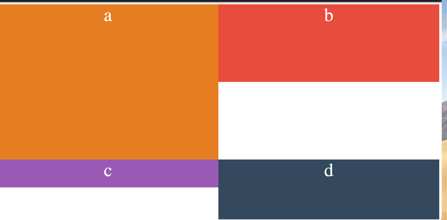
I'd like div d to be stacked right below b. not having that white space created due to a height.
This is how I currently have my code structured.
 <div class="parent">
  <div class="col a">a</div>
  <div class="col b">b</div>
  <div class="col c">c</div>
  <div class="col d">d</div>
</div>
/* Some default styles to make each box visible */
.a {
  background: #e67e22;
  heigth: 300px;
}
.b {
  background: #e74c3c;
}
.c {
  background: #9b59b6;
}
.d {
  background: #34495e;
}

.parent {
  display: flex;
  height: 100%;
  flex-wrap: wrap;
  width: 100%;
}

.col {
  width: 50%;
}

.col.a {
  height: 500px
}

.col.b {
  height: 250px
}

.col.c {
  height: 90px
}

.col.d {
  height: 200px
}

.col.b {
  align-self: baseline;
}

@media all and (max-width: 500px) {
  .container {
    height: auto;
  }
  .a, .b, .c, .d { width: 100%; }
  .b {
    order: 3;
  }
}
Any insights would be greatly appreciated. Also here's a code pen