1

enter image description here https://codepen.io/tobq/pen/BEVedj

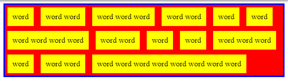
I have these variable-width, overflowing, children in a container.

How could I get the inner spacing without the outer spacing between the children and container?

Using grid-gap results in this behaviour:

enter image description here 
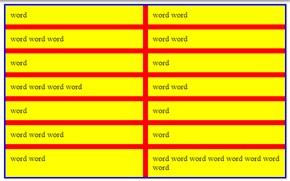
https://codepen.io/tobq/pen/xezNKY

A proper gap, but now fixed width, aligned, cells - which isn't what I want.

What I've thought about doing is using a negative margin to mask this spacing, but this seems hacky

enter image description here https://codepen.io/tobq/pen/EJRzQp

and has a load of side-effects, for example the blue border around the body no longer being visible. It's also still rendering all of the extra space, it would just need to be clipped off by another container with overflow: hidden, https://codepen.io/tobq/pen/jRKoKw.

Using first/last-child selectors to remove padding won't work, as there are multiple elements per line. So, for example, removing the final elements margin-bottom won't remove the bottom border, because there are still other elements on the line with a margin-bottom. There's no way - that I know of - to select all elements on the last line.

Tobiq
  • 2,489
  • 19
  • 38

3 Answers3

0

I'm not sure what you are trying to accomplish here, but you can try to set margin: 0 in > div, and setting padding: 0 in section

If you still want 'inner' padding, you can set margin-bottom: 5px in > div, and the selecting > div:last-child { margin-bottom: 0 } too.

karlPet
  • 44
  • 4
  • Then, there's no spacing between elements, just inner padding. – Tobiq Apr 21 '19 at 22:58
  • Also, your edit wont work, as there's more than one element on the final line, so removing the last elements padding wont remove the bottom spacing – Tobiq Apr 21 '19 at 22:59
  • Hm, what exactly are you trying to do with the css? – karlPet Apr 21 '19 at 23:01
  • I don't understand your question? I want spacing between each element, with no spacing around the outside container – Tobiq Apr 21 '19 at 23:01
0

Here is an idea where you can consider negative margin on the elements. The trick is to apply a top margin equal to -X and a bottom one equal to 2*X to have at the end X between the elemens and no space on the top (same logic for left and right). Then you add padding on the main container to rectify the negative margin for the first elements.

There will be a small issue for the last row as you will have 2*X margin. To fix it you can decrease the background size by 2*X and add a negative margin bottom also eqaul to 2*X (same logic on the right side.

body {
  border: 3px solid blue;
  overflow-x:hidden; /*to avoid overflow due to negative margin-right*/
}

section {
  background: 
    linear-gradient(red,red) top left/calc(100% - 10px) calc(100% - 10px) no-repeat;
  font-size:0;
  padding-left:5px;
  padding-top:5px;
  margin-bottom: -10px;
  margin-right: -10px;
}

section>div {
  display: inline-block;
  font-size:initial;
  background: yellow;
  padding: 10px;
  margin: -5px 10px 10px -5px;
}
<section>
  <div>word</div>
  <div>word word</div>
  <div>word word word</div>
  <div>word word</div>
  <div>word</div>
  <div>word</div>
  <div>word word word word</div>
  <div>word word</div>
  <div>word</div>
  <div>word</div>
  <div>word word word</div>
  <div>word</div>
  <div>word word</div>
  <div>word word word word word word word word</div>
</section>

Another idea is to simuate the space using outline and pseudo elements:

body {
  border: 3px solid blue;
}

section {
  background:red;
  font-size:0;
  overflow:hidden;
}

section>div {
  display: inline-block;
  font-size:initial;
  background: yellow;
  padding: 10px 15px 15px 10px;
  outline:5px solid red;
  position:relative;
}
section>div:after {
  content:"";
  position:absolute;
  top:-5px;
  bottom:0;
  left:100%;
  width:100vw;
  background:red;
}
<section>
  <div>word</div>
  <div>word word</div>
  <div>word word word</div>
  <div>word word</div>
  <div>word</div>
  <div>word</div>
  <div>word word word word</div>
  <div>word word</div>
  <div>word</div>
  <div>word</div>
  <div>word word word</div>
  <div>word</div>
  <div>word word</div>
  <div>word word word word word word word word</div>
</section>
Temani Afif
  • 245,468
  • 26
  • 309
  • 415
0
.container {
  margin: -10px;
}
.child {
  margin: 10px;
}

Would ensure that all children that will be up against the container, but 20px from each other.

Karl Stefan
  • 150
  • 2
  • 8
  • 1
    This is what I spoke about, but there are issues with this, that I spoke about and fixed. – Tobiq Apr 21 '19 at 23:16
  • I think the only way around this is to use an extra container cutting off the overflow—as you said yourself. – Karl Stefan Apr 21 '19 at 23:20