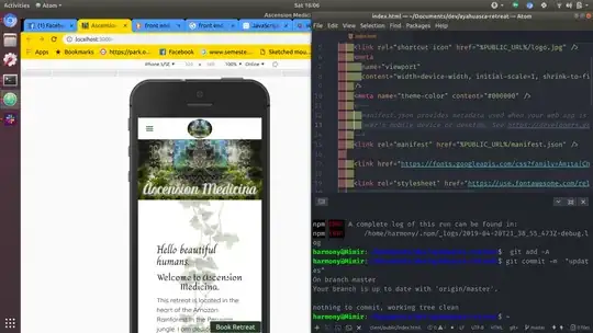
I recently deployed a website after testing for responsiveness in chrome developer tools that displays correctly in chrome developer tools and on mobile in Firefox but not chrome.
Here's what it looks like in the developer tools.

Here's what it looks like on chrome on a mobile device.
 You can see that the background image is gone and the header image is off to the left.
I thought it might be because of an older version of chrome so I managed to get a look at it on a newer version of chrome.
 So on this newer one the picture is no longer to the left but the background is still missing.
So it works when I'm viewing the website on a desktop and reduce the size to mobile and on Firefox but breaks in chrome on mobile.
I've tried different versions of chrome, uninstalling and reinstalling chrome, using both the chrome and firefox developer tools and I've also tried finding similar questions already answered on Stack Overflow and the most similar says to make sure to have
<meta name="viewport" content="width=device-width, initial-scale=1"/>
which I have and I even saw a post saying to add maximum-scale=1 which I tried.
Since it works fine in the developer tools I've been flying blind trying things and redeploying.