36

I'm using webpack, react-datepicker and have managed to import its css with the provided css module.

import 'react-datepicker/dist/react-datepicker-cssmodules.css

The component looks fine and dandy, but now I want to make it full width like the time element above it.

enter image description here

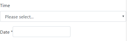
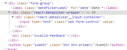
Looking at the CSS, what it needs is for the react-datepicker-wrapper element that gets dynamically added by the library to have display: block. Any modifications I make to react-datepicker-wrapper in my own css does nothing.

What should I do?

enter image description here

date-picker.component.jsx

import React from 'react';
import DatePicker from 'react-datepicker';
import 'react-datepicker/dist/react-datepicker-cssmodules.css';
import './date-picker.component.bootstrap.css';

// eslint-disable-next-line no-confusing-arrow
const buildClassNames = (touched, isInvalid) =>
touched && isInvalid ? 'form-control is-invalid' : 'form-control';

export const DatePickerBootstrap = (props) => {
  const { setFieldValue, setFieldTouched, errors, touched } = props;
  const { name, value, label, ...rest } = props;

  return (
<div className="form-group">
    <label className='datePickerLabel' htmlFor={name}>{label}</label>
    <DatePicker
    selected={value}
    onChange={(e) => {
      setFieldValue(name, e);
      setFieldTouched(name);
    }}
    className={buildClassNames(touched, !!errors)}
    customInput={
        <input
        type="text"
        id={name}
        placeholder={label} />
    }
    {...rest}
    />

    <div className="invalid-feedback">
        {errors}
    </div>
</div>
  );
};

export default DatePickerBootstrap;
Sebastian Patten
  • 7,157
  • 4
  • 45
  • 51
  • 1
    This isn't really a React or date-picker question. It's simply about CSS specificity. What rule are you trying to override? – isherwood Apr 22 '19 at 13:29
  • I think as its using CSS Modules, it just ignores any CSS I give to it. Thats really the issue. I'm not sure how you override 3rd party CSS module styling – Sebastian Patten Apr 22 '19 at 19:35
  • I asked what the rule is. That would clear some things up. Show the actual CSS that's being applied to the element, please. – isherwood Apr 22 '19 at 20:01
  • @SebastianPatten did you get the `invalid-feedback` div to work? I'm doing something similar and the className adjustment to the inner form-control input does not override the `display: none` style like it does in standard bootstrap examples where the two elements are peers. – Rake36 Sep 30 '19 at 00:39

10 Answers10

21

From https://github.com/Hacker0x01/react-datepicker/issues/2099#issuecomment-704194903

Try with wrapperClassName property:

<DatePicker wrapperClassName="datePicker" dateFormat="dd/MM/yyyy" />

CSS:

.datePicker {
  width: 100%;
}

This way you won't modify the styles for the whole app

styled-components bonus:

import React from 'react';
import styled, { css, createGlobalStyle } from 'styled-components';
import DatePicker from 'react-datepicker';

const DatePickerWrapperStyles = createGlobalStyle`
    .date_picker.full-width {
        width: 100%;
    }
`;

<>
  <DatePicker wrapperClassName='date_picker full-width' />
  <DatePickerWrapperStyles />
</>


Daniel Pérez
  • 1,873
  • 1
  • 17
  • 25
20

I think you're just missing some CSS. Try this in your custom stylesheet (anywhere after the datepicker's stylesheet):

.react-datepicker-wrapper,
.react-datepicker__input-container,
.react-datepicker__input-container input {
    display: block;
    width: 100%;
}

Demo

isherwood
  • 58,414
  • 16
  • 114
  • 157
6

styled-components

<>
  <DatePickerWrapper  
    popperContainer={Popper}
    calendarContainer={Calendar} 
  />
</>

const DatePickerWrapper = styled(({ className, ...props }) => (
  <DatePicker {...props} wrapperClassName={className} />
))`
  width: 100%;
`;

const Calendar = styled.div`
  border-radius: 10px;
  box-shadow: 0 6px 12px rgba(27, 37, 86, 0.16);
  overflow: hidden;
`;

const Popper = styled.div`
  position: absolute;
  top: 0;
  left: 0;
  z-index: 2;
`;
VladGalko
  • 61
  • 1
  • 4
2

You can get your css work by putting !important at the end of the lines:

display: block !important;

And, you should import your css file at the end:

import 'library0.css';
import 'library1.css';
import 'library2.css';
import 'yourCss.css'; // Your css
Burak Gavas
  • 1,304
  • 1
  • 9
  • 11
  • 2
    That doesn't seem to have an effect on the input's size, and `!important` should always be a last resort. – isherwood Apr 22 '19 at 13:36
  • 1
    order of importing the css files matters a lot. placing the custom css at the end overrides the css defined in the library files - this works for me. using '!important' should never be the approach to adopt. – Rohit Mitta Mar 13 '20 at 11:03
2

overwrite the default css like

.react-datepicker__input-container input {
   width: 100%;
}

working example

Junius L
  • 15,881
  • 6
  • 52
  • 96
1

You can use the class of each element of the picker to override its default style, using the inspect tool you can identify each element's class, if your new style won't be applied you can use the !important property to override the default style

enter image description here

The following code is applied to most of the pickers elements

.react-datepicker__triangle {
  display: none;
}

.react-datepicker__day.react-datepicker__day--keyboard-selected {
  border: none;
  border-radius: 7px;
  background-color: var(--dark);
  color: var(--white);
}

.react-datepicker__day.react-datepicker__day--keyboard-selected:hover {
  border: none;
  border-radius: 7px;
  background-color: var(--dark);
  color: var(--white);
}

.react-datepicker-popper .react-datepicker__navigation {
  padding-top: 12px;
  color: #000;
}

.react-datepicker {
  box-shadow: 0 0 20px 0 rgba(0, 0, 0, 0.189);
  border: none !important;
  font-family: "Inter" !important;
}

.react-datepicker__header {
  border-bottom: solid 5px var(--light) !important;
  background: white !important;
}

.react-datepicker__current-month {
  color: var(--dark) !important;
}

.react-datepicker__day.react-datepicker__day--today {
  border-radius: 7px;
  border: solid 2px var(--brand) !important;
  background-color: white !important;
  color: var(--dark) !important;
  width: 30px;
  height: 30px;
}

.react-datepicker__day.react-datepicker__day--selected {
  border: none;
  border-radius: 7px;
  background-color: black;
  color: white;
}

.react-datepicker__day--selected:hover,
.react-datepicker__day--in-selecting-range:hover,
.react-datepicker__day--in-range:hover,
.react-datepicker__month-text--selected:hover,
.react-datepicker__month-text--in-selecting-range:hover,
.react-datepicker__month-text--in-range:hover,
.react-datepicker__quarter-text--selected:hover,
.react-datepicker__quarter-text--in-selecting-range:hover,
.react-datepicker__quarter-text--in-range:hover,
.react-datepicker__year-text--selected:hover,
.react-datepicker__year-text--in-selecting-range:hover,
.react-datepicker__year-text--in-range:hover {
  border: none;
  border-radius: 7px !important;
  background-color: var(--brand) !important;
  color: var(--dark) !important;
}
Alohe
  • 301
  • 2
  • 11
1
          <DatePicker
            className='form-control form-control-solid w-250px '
            selected={startDate}
            onChange={onChange}
            selectsRange
            startDate={startDate}
            endDate={endDate}
            isClearable={true}
          />
0

You can put it inside a flexbox.

If you are using bootstrap, you can use the d-flex and flex-column classes on the wrapper element.

<div className="d-flex flex-column">
    <DatePickerField name="date" label="Date" />
</div>

If not, you can style the wrapper using CSS properties.

<div className="date-picker-wrapper">
    <DatePickerField name="date" label="Date" />
</div>

CSS:

.date-picker-wrapper {
    display: flex !important;
    flex-direction: column !important;
}
Eyoab
  • 725
  • 9
  • 10
0

You can add to the style sheet:

.react-datepicker__input-container{
  input{
    width: 100%;
    padding: 0.375rem 2.25rem 0.375rem 0.75rem;
    -moz-padding-start: calc(0.75rem - 3px);
    font-size: 1rem;
    font-weight: 400;
    line-height: 1.5;
    color: #212529;
    background-color: #fff;
    border: 1px solid #ced4da;
    border-radius: 0.25rem;
    transition: border-color 0.15s ease-in-out, box-shadow 0.15s ease-in-out;
    appearance: none;
}

}

Output

0

From https://github.com/Hacker0x01/react-datepicker/issues/2099#issuecomment-704194903

Try

<DatePicker calendarClassName={/* styles */}></DatePicker>
Fred
  • 182
  • 1
  • 22