4

I have made a select control using the documentation as an example. However, the button changes its width depending on the width of the text for the selected item. This makes the control jump around and is not a good UI design.

first

second

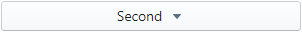
Is there a way to specify using fill or to have the button be a fixed width? While I was partly successful in setting a fixed width, the rendered control was ugly, with both the text and arrow being centered, as shown here:

fixed width, but centered content

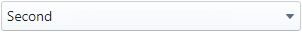
Instead, what I want is this:

fixed width, properly aligned content

How can this be created with blueprintjs?

Because someone will ask for an SSCCE, here is exactly what I used: https://blueprintjs.com/docs/#select/select-component

Edit:

I have been able to get the result I want, but it does seem like the library itself should handle this instead of resorting to a series of CSS hacks. The following CSS changes produce the desired output, but I am still hoping for a better answer.

.selectButton,
.selectButton > span,
.selectButton > span > div,
.selectButton > span > div > button {
    width: 100%;
}

.selectButton > span > div > button {
    display: inline;
}

.selectButton span.bp3-icon-caret-down {
    float: right;
}
Mike Viens
  • 2,467
  • 3
  • 19
  • 23

2 Answers2

1

There is a github issue about this.

Full Width

You should use the alignText property to align the text and the icon. Ex :

 <Select className="fullwidth" items={['toto', 'tata']} filterable={false} itemRenderer={renderSelectItem} onItemSelect={this.onCategoryChange.bind(this)} >
    <Button text={this.state.category} alignText="left" fill="{true}" rightIcon="caret-down" />
 </Select>

You must add a custom CSS rule to make the select full width :

.bp3-popover-wrapper.fullwidth, .bp3-popover-wrapper.fullwidth > .bp3-popover-target {
   display:block;
}

However, if you click on the select, the list will not display with full width. If you have a basic use case, you may want to use HTMLSelect instead of Select, it has the desired default behaviour when "fill" is true.

Fixed width

If you want to make the select and the list fixed width you have 2 solutions :

<Select className="fullwidth" popoverProps={{ portalClassName:"fullwidth" }} items={['toto', 'tata']} filterable={false} itemRenderer={renderSelectItem} onItemSelect={this.onCategoryChange.bind(this)} >
    <Button text={this.state.category} alignText="left" fill="{true}" rightIcon="caret-down" />
</Select>

<Select className="fullwidth" popoverProps={{ usePortal: false }} items={['toto', 'tata']} filterable={false} itemRenderer={renderSelectItem} onItemSelect={this.onCategoryChange.bind(this)} >
    <Button text={this.state.category} alignText="left" fill="{true}" rightIcon="caret-down" />
</Select>

.bp3-popover-wrapper.fullwidth, .bp3-popover-wrapper.fullwidth > .bp3-popover-target {
   display:block;
   max-width: 500px;
}

/* with portal */
.bp3-overlay.fullwidth .bp3-select-popover {
   width: 500px;
}

/* without portal */
.bp3-popover-wrapper.fullwidth .bp3-select-popover {
   width: 500px;
}
Kiruahxh
  • 1,276
  • 13
  • 30
-1

This should work if the container of the button is 100%. Just put some additional selectors so that it doesn't affect your application globally.

.bp3-button {
  width: 100%;
}

.bp3-button-text {
  flex-grow: 1;
}
Kevin Raoofi
  • 1,023
  • 11
  • 16