-1

I'm developing something similar to a Kanban board where I lay out cards (represented by divs) in columns (also represented by divs). Image 1 illustrates the current state of my app:

layout now

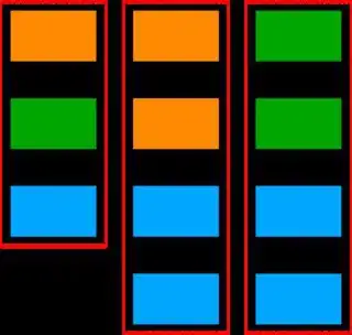
Each card is a div. The cards are grouped in columns (red dotted lines) which are divs laid out in flexbox layout. Coloring illustrates which release a card is mapped to.

Some code: index.html:

<!doctype html>
<html>
<head>
    <title>Some code to copy & paste into your project</title>
    <link rel="stylesheet" type="text/css" href="styles.css">
</head>
<body>
    <div class="map">
        <div class="column">
            <div class="card release-1"></div>
            <div class="card release-2"></div>
            <div class="card release-3"></div>
        </div>
        <div class="column">
            <div class="card release-1"></div>
            <div class="card release-1"></div>
            <div class="card release-3"></div>
            <div class="card release-3"></div>
        </div>
        <div class="column">
            <div class="card release-2"></div>
            <div class="card release-2"></div>
            <div class="card release-3"></div>
            <div class="card release-3"></div>
        </div>
    </div>
</body>
</html>

styles.css:

.map {
    display: flex;
    flex-direction: row;
}

.column {
    display: flex;
    flex-direction: column;

}

.card {
    width: 100px;
    height: 80px;
    border: 1px solid black;
    margin: 10px;
}

.release-1 {
    background-color: #f90;
}

.release-2 {
    background-color: #0a0;
}

.release-3 {
    background-color: #0af;
}

Now I'd like to add swimlanes for the releases. The result should look like this:

layout with swimlanes I'm aiming for

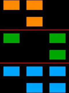
I didn't find any way to put something like "breakpoints" into the flex columns to move the cards to the next swimlane.

Grid would work but I need to know how many columns and swimlanes I will have beforehand. As the map is rendered dynamically, I would need to render the css dynamically as well. Doesn't look like the best approach to me :-P

Quite obvious this could be done with html tables, but there's two reasons that keep me from using them:

  1. Back in the days when floating layouts based on divs and css replaced table layouts, I learned that tables should only be used for data, not for layouts
  2. My whole layout is already based on divs. Switching to tables would require major efforts which I'd like to avoid

What speaks in favor of tables is the fact, that it would be really easy to achieve this layout with tables. I also don't expect any negative side effects as this layout isn't meant to float or break anyways. It's just two fixed dimensions and everything outside the viewport will be scrolled.

Anyways: before I re-write everything, I would like to know if this might as well be achieved with flex/flexbox layout or any other way I haven't heard of yet.

Right now I'm using no fronted framework, just plain html & css. I'd like to keep it that way if possible.

Do you have any suggestions?

Thanks in advance! Fred

Fred
  • 1,103
  • 2
  • 14
  • 35
  • 1
    https://css-tricks.com/snippets/css/complete-guide-grid/ – Quentin Apr 30 '19 at 11:09
  • FWIW - CSS-Grid would be the way to go. – Paulie_D Apr 30 '19 at 11:13
  • Your Github mock doesn't help in any way to understand – yunzen Apr 30 '19 at 11:23
  • @yuzen: That's why I didn't post it in the first place. I just added it as it appears that I'm required by stackoverflow law to post a bad approach before I get suggestions for a good one. – Fred Apr 30 '19 at 11:45
  • So I added some code you can c&p to your own project. I guess you already had the same code in your mind as all of you seem to be real pros. I also explained why grid isn't my favorite solution here. – Fred Apr 30 '19 at 12:13
  • If you took a a [tour](https://stackoverflow.com/tour) of the [help centre](http://stackoverflow.com/help), you would know [how to ask a good question](http://stackoverflow.com/help/how-to-ask), rather than waiting for people to tell you and downvote and close your initial question – Pete Apr 30 '19 at 12:23
  • After studying all of your links, it appears to me, that the only thing I still doing wrong is to ask for suggestions? Well then I'll go back into my cage and try all the bazillions of possible solutions for my problem (including those I don't know yet) and then come back to ask for a very specific detail; Why is it forbidden to ask for general ideas before wasting time on one approach; I don't want you to code my solution! I just asking for an answer to the question: Which approach would you recommend me to dig deeper into? – Fred Apr 30 '19 at 12:38
  • @Fred That's not the way it normally works. One would not like to poke you in a direction that is not constructive. On the other had: would it be helpful, if I had said: grid? – yunzen Apr 30 '19 at 12:48
  • I don't like to waste time on approaches that turn out to be bad after putting a lot of time and effort into it. That's why I ask people who know better to give me a direction. If you would have told me why you think grid is your way to go, this would have been helpful. If some more people would have posted their suggestion with some reasoning why they consider this as the best approach, it would have helped even more, because I would have been able to choose one based on reasoning. I would have learned much more from this than from the one very specific answer you gave me below. – Fred Apr 30 '19 at 14:27
  • Although your answer below is a nice one, it's very specific. If I flag it as "accepted", I will never find out if there are better approaches based on different concepts. I really don't understand why discussing about concepts without digging into code is so much hated here on SO. – Fred Apr 30 '19 at 14:29

2 Answers2

1

Something in this direction?

document.querySelector('.toggle-lanes')
  .addEventListener('click', toggleLanes)

function toggleLanes(e) {
document.querySelector('.toggle-lanes-target').classList.toggle('lanes')
  
}
:root {
  --column: 1;
  --release: 1;
}

.cards {
  display: grid;
  grid-auto-columns: 1fr;
  grid-auto-rows: auto;
  grid-auto-flow: row dense;
}
.cards .card {
  padding: 20px;
  box-sizing: border-box;
  border-radius: 20px;
  border: 3px solid silver;
  border: 1px solid silver;
  background-color: gold;
  grid-column-start: var(--column);
}
.cards .card.release-1 {
  background-color: orange;
}
.cards .card.release-2 {
  background-color: green;
}
.cards .card.release-3 {
  background-color: blue;
}

.cards.lanes {
  grid-auto-flow: column dense;
}
.cards.lanes .card {
  grid-row-start: calc(var(--release) * 1000 + var(--num));
}

.card[style*="--release:1"],
.card[style*="--release: 1"] {
  background-color: orange;
}

.card[style*="--release:2"],
.card[style*="--release: 2"] {
  background-color: green;
}

.card[style*="--release:3"],
.card[style*="--release: 3"] {
  background-color: blue;
}
<button class="toggle-lanes">Click to toggle swimming lanes</button>

<div class="cards toggle-lanes-target">
  <div class="card" style="--column: 1; --release: 1; --num: 1">C1 R1 A</div>
  <div class="card" style="--column: 2; --release: 1; --num: 1">C2 R1 B</div>
  <div class="card" style="--column: 2; --release: 1; --num: 2">C2 R1 C</div>
  <div class="card" style="--column: 1; --release: 2; --num: 1">C1 R2 D</div>
  <div class="card" style="--column: 3; --release: 2; --num: 1">C3 R2 E</div>
  <div class="card" style="--column: 3; --release: 2; --num: 2">C3 R2 F</div>
  <div class="card" style="--column: 1; --release: 3; --num: 1">C1 R3 G</div>
  <div class="card" style="--column: 2; --release: 3; --num: 1">C2 R3 H</div>
  <div class="card" style="--column: 2; --release: 3; --num: 2">C2 R3 I</div>
  <div class="card" style="--column: 3; --release: 3; --num: 1">C3 R3 J</div>
  <div class="card" style="--column: 3; --release: 3; --num: 2">C3 R3 J</div>
</div>

The use of CSS custom properties helps with the infinite columns/rows problem

The only small difficulty lies in the calculation of the --num property's value. It's basically the counting of cards that have same --column and --release values.

Dynamic Stylesheets would only be necessary if you'd use indefinately many releases.

yunzen
  • 32,854
  • 11
  • 73
  • 106
  • This is a really cool approach! Thank's a lot! Unfortunately I can't upvote it as I don't have enough reputation :-P Might be counted someday in the future... – Fred Apr 30 '19 at 12:47
  • @Fred You can accept the answer: Click the gray chech mark under the votes and it will turn green. I will get 15 points and you will get 2 points. – yunzen Apr 30 '19 at 12:50
  • @Fred BTW you cannot use `grid-gap` with any other value than `0` in my example. – yunzen Apr 30 '19 at 12:54
0

Thanks to the help of @yunzen I came up with a solution. Basically it all boiled down to placing the releases in a grid. The cards will find their position within the release container.

The downside of this approach is, that parts of the CSS need to be dynamically generated according to the number of columns and releases in the grid. But it makes an easier to understand code compared to @yunzen's answer.

Minimal solution

HTML:

<!doctype html>
<html>
<head>
    <title>Grid</title>
    <link rel="stylesheet" type="text/css" href="styles.css">
</head>
<body>
    <div class="map">

        <div class="release column-1 release-1">
            <div class="card"></div>
        </div>
        <div class="release column-1 release-2">
            <div class="card"></div>
        </div>
        <div class="release column-1 release-3">
            <div class="card"></div>
        </div>

        <div class="release column-2 release-1">
            <div class="card"></div>
            <div class="card"></div>
        </div>
        <div class="release column-2 release-3">
            <div class="card"></div>
            <div class="card"></div>
        </div>

        <div class="release column-3 release-2">
            <div class="card"></div>
            <div class="card"></div>
        </div>
        <div class="release column-3 release-3">
            <div class="card"></div>
            <div class="card"></div>
        </div>

    </div>
</body>
</html>

CSS:

/* STATIC */

.map {
    display: grid;
    grid-auto-columns: min-content;
    grid-auto-rows: min-content;
}

.card {
    width: 100px;
    height: 80px;
    border: 1px solid black;
    margin: 10px;
}

/* DYNAMIC */

.column-1 {
    grid-column-start: 1;
    grid-column-end: 2;
}

.column-2 {
    grid-column-start: 2;
    grid-column-end: 3;
}

.column-3 {
    grid-column-start: 3;
    grid-column-end: 4;
}

.release-1 {
    grid-row-start: 1;
    grid-row-end: 2;
}

.release-2 {
    grid-row-start: 2;
    grid-row-end: 3;
}

.release-3 {
    grid-row-start: 3;
    grid-row-end: 4;
}

/* DEBUG */

.release-1 .card {
    background-color: #f90;
}

.release-2 .card {
    background-color: #0a0;
}

.release-3 .card {
    background-color: #0af;
}

With column containers

As I would like to keep my column containers, I extended the above code like this:

HTML:

<!doctype html>
<html>
<head>
    <title>Grid with Columns</title>
    <link rel="stylesheet" type="text/css" href="styles.css">
</head>
<body>
    <div class="map">

        <div class="column column-1">
            <div class="release release-1">
                <div class="card"></div>
            </div>
            <div class="release release-2">
                <div class="card"></div>
            </div>
            <div class="release release-3">
                <div class="card"></div>
            </div>
        </div>

        <div class="column column-2">
            <div class="release release-1">
                <div class="card"></div>
                <div class="card"></div>
            </div>
            <div class="release release-3">
                <div class="card"></div>
                <div class="card"></div>
            </div>
        </div>

        <div class="column column-3">
            <div class="release release-2">
                <div class="card"></div>
                <div class="card"></div>
            </div>
            <div class="release release-3">
                <div class="card"></div>
                <div class="card"></div>
            </div>
        </div>

    </div>
</body>
</html>

CSS:

/* STATIC */

.map {
    display: grid;
    grid-auto-columns: min-content;
    grid-auto-rows: min-content;
}

.column {
    display: contents;
}

.card {
    width: 100px;
    height: 80px;
    border: 1px solid black;
    margin: 10px;
}

/* DYNAMIC */

.column-1 .release {
    grid-column-start: 1;
    grid-column-end: 2;
}

.column-2 .release {
    grid-column-start: 2;
    grid-column-end: 3;
}

.column-3 .release {
    grid-column-start: 3;
    grid-column-end: 4;
}

.release-1 {
    grid-row-start: 1;
    grid-row-end: 2;
}

.release-2 {
    grid-row-start: 2;
    grid-row-end: 3;
}

.release-3 {
    grid-row-start: 3;
    grid-row-end: 4;
}

/* DEBUG */

.release-1 .card {
    background-color: #f90;
}

.release-2 .card {
    background-color: #0a0;
}

.release-3 .card {
    background-color: #0af;
}

The most interesting part of this is "display: contents;" for the columns containers. Browser support is still bad for this feature, so I might need to fall back to the first example. If you want to read more about it, look here.

Fred
  • 1,103
  • 2
  • 14
  • 35