0

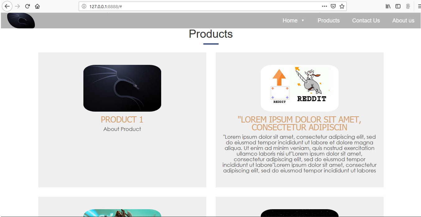
I am displaying the products on my HTML page. Some products have large details and some have minor details. When I show those products the div of products with large details have greater height than the products with minor details. To fix this issue I assigned height to the div but it didn't work because when I open my page in mobile view the details of the product overflow from its div. Then I tried to change the class of a div using media query: if width is < 991px change col-md-6 to col-md-12. I made this change using jquery but it only affect the first div. What is the Standard solution of this problem?. full screen Mobile view the div have fix length here``

$(window).resize(function() {
  if ($(window).width() < 991) {
    alert("window");
    $( "product612" ).removeClass( "col-md-6" ).addClass( "col-md-12" );
    $("product612").toggleClass('col-md-6 col-md-12');
  }
});
.product{
  background-color: rgba(92, 90, 90, 0.096);
  word-wrap:break-word;
  position: relative;
  text-align: center;
  padding: 40px 20px;
  margin: 15px 0px;
  height: 433.4px !important; 
}


.product:after {
  content: "";
  background-color: rgba(2, 2, 2, 0.781);
  position: absolute;
  left: 0;
  top: 0;
  bottom: 0;
  width: 0%;
  z-index: -1;
  -webkit-transition: 0.2s width;
  transition: 0.2s width;
  
}

.product:hover p{
  color: white !important;
}

.product:hover:after 
{
  width: 100%;
  height: auto;
}

.product p{
  color: rgb(80, 80, 80) !important;
  font-size: 17px;
  line-height: 18px;
  font-weight: 500;
  font-family: Avant Garde, Avantgarde, Century Gothic, CenturyGothic, AppleGothic, sans-serif;
}
 
.product>img {
  height: 150px;
  width: 250px;
  margin: 0px auto 12px auto;
  margin-left: auto;
  border-radius: 15%;
}
<div class="container" >
    <div class="row">

      <div class="section-header text-center" >
          <h1 class="glow title">Products</h1>
      </div>

      {% for product in products %}
      
        <div id="product612" class="col-md-6 col-sm-12 col-xs-12">
            <div class="product">
            <img src="{{product.image.url}}" class="img-responsive " alt="product picture">
            <h4>{{product.name}}</h4>
            <p>{{product.detail}}</p><br>
            </div>
        </div>
      {% endfor %}
    </div>
  </div>
M_FarhanZia
  • 63
  • 1
  • 1
  • 13
  • use `vw` instead of px – xmaster May 07 '19 at 11:03
  • 3
    as you're using `bootstrap`, you should not build your page in a way you have to change `col-` because bootstrap is already build for that with `col-md` `col-sm` etc... you should just allow height to change on mobile – robinvrd May 07 '19 at 11:04
  • You should certainly not do this with JavaScript. – Daniel Roseman May 07 '19 at 11:04
  • @DanielRoseman how should I do this? – M_FarhanZia May 07 '19 at 11:05
  • https://getbootstrap.com/docs/4.0/layout/grid/ Please read the documentation - it fully explains how to do different column sizes for different screen widths – Pete May 07 '19 at 11:06
  • With media queries, as you state at first. And as others have said, Bootstrap should already take care of this for you. – Daniel Roseman May 07 '19 at 11:07
  • @DanielRoseman i'm printing the div using for loop in django template i used jquery to select the div then tried to change the col-md-6 to col-md-12 but it only worked on the first div. Why? – M_FarhanZia May 07 '19 at 11:07
  • because you use the same id - if you do that then jquery will only select the first item with that id as ids must be unique – Pete May 07 '19 at 11:09
  • @Pete then whats the solution? – M_FarhanZia May 07 '19 at 11:11
  • Use a class instead - or use boostrap column classes properly - therre should be no need for jquery to change the width of the column - if the media query falls outside the defined widths, then create a new media query, don't use jquery for what css can do – Pete May 07 '19 at 11:12
  • @Pete i am using the column classes but the problem is with the height of the div which have more detail becomes greater in height than the other which have less text in it which causes uneven height of divs – M_FarhanZia May 07 '19 at 11:16
  • Are you using boostrap4 - all columns in the same row will be equal height. I also don't see how toggling the col classes will sort out the height – Pete May 07 '19 at 11:22
  • @Pete they are not of same height when i show two divs in one ROW like col-md-6 the div with greater text have greater height then the div with less text – M_FarhanZia May 07 '19 at 11:48
  • They should be: https://www.bootply.com/qu6W2yXHBp see the right column is the same height as the left column even though it has no content so either you have overridden something or you are not using bootstrap4 – Pete May 07 '19 at 11:52
  • @Pete im using this – M_FarhanZia May 07 '19 at 12:01

1 Answers1

1

Two things before answering the question you actually asked:

  1. Bootstrap's grid system is supposed to make it possible to avoid doing things like this, so you might want to post a new question with a MCVE of what you're doing and ask how to avoid having to change the col-md-x class.
  2. ids must be unique in the document, so that's the first thing you need to fix.

Answering the question you asked, though:

You've said:

i made this change using jquery but it only affect the first div.

but the code you've shown uses

$( "product612" ).removeClass( "col-md-6" ).addClass( "col-md-12" );
$("product612").toggleClass('col-md-6 col-md-12');

which won't do anything, because $("product612") won't match anything (you meant $("#product612"), and I guess you must have used that at one point if you saw one change).

Use a class instead of the id, and then in your resize function:

$(window).resize(function() {
  var isNarrow = $(window).width() < 991;
  $(".the-class")
      .toggleClass("col-md-6", !isNarrow)
      .toggleClass("col-md-12", isNarrow);
});

You might use matchMedia instead of resize for this so you only run your callback when the size change actually matters rather than on every tiny resize change, e.g.:

(function() {
    function widthUpdate(mqle) {
          $(".the-class")
              .toggleClass("col-md-6", !mqle.matches)
              .toggleClass("col-md-12", mqle.matches);
    }
    var mql = window.matchMedia('(max-width: 990px)');
    mql.addListener(widthUpdate);
    widthUpdate(mql);
})();

It doesn't fire the listener when you first hook it up, so you have to do that manually.


(Given the duplicate identified by Pete and the Bootstrap stuff, I deleted this at first. But then decided maybe it will be useful to someone later. Don't want to get any rep from it, though, so I marked it a Community Wiki.)

T.J. Crowder
  • 1,031,962
  • 187
  • 1,923
  • 1,875
  • needing to change bootstrap's classes is a good alert that the semantic of the page is not properly built. – robinvrd May 07 '19 at 11:07
  • @robinvrd - Yeah, I was just adding a note to that effect. :-) – T.J. Crowder May 07 '19 at 11:10
  • @T.J.Crowder the jquery code u provided worked whats the difference between the two codes that u provided?. I used the first one. – M_FarhanZia May 07 '19 at 11:23
  • @T.J.Crowder what is the ideal solution of this uneven div height problem? – M_FarhanZia May 07 '19 at 11:24
  • @M_FarhanZia - It's worth reading the documentation I linked to. `matchMedia` only calls the callback when the match *changes*. `resize` calls the callback any time the size of the window changes. That's what I meant by *"...so you only run your callback when the size change actually matters rather than on every tiny resize change..."* – T.J. Crowder May 07 '19 at 11:25
  • @M_FarhanZia - That's an entirely different question. As I suggested above, I recommend creating an [MCVE](/help/mcve) and posting a new question. – T.J. Crowder May 07 '19 at 11:25
  • it means that matchmedia only run the func when the width is less that 991 whereas the resize func check every time? – M_FarhanZia May 07 '19 at 11:26
  • @M_FarhanZia - Yes. – T.J. Crowder May 07 '19 at 11:29
  • @T.J.Crowder sir the function only run when I resize the window it is not working when I open this page in window whose width is less the 990px it run when I resize it. I want it to run when the size of the screen is less than 990px – M_FarhanZia May 07 '19 at 11:38
  • @M_FarhanZia - I forgot about that gotcha, updated now. – T.J. Crowder May 07 '19 at 11:42
  • @T.J.Crowder "It doesn't fire the listener when you first hook it up, so you have to do that manually." WHAT do u mean by this? im new to jquery dont mind about my questions if u found them silly. – M_FarhanZia May 07 '19 at 11:53
  • @M_FarhanZia - I mean that `addListener` doesn't call the function you provide right away, only when the media query match *changes*. So to get the function called on page load, we have to call it ourselves. (That part isn't jQuery, just built-in browser stuff.) – T.J. Crowder May 07 '19 at 12:03
  • @T.J.Crowder so how you called this function on page load? – M_FarhanZia May 07 '19 at 12:07
  • @M_FarhanZia - `widthUpdate(mql);`. I'm sorry, I need to step away from this now. – T.J. Crowder May 07 '19 at 12:14
  • @T.J.Crowder thanks for your time and sorry for taking it too much – M_FarhanZia May 07 '19 at 12:21