0

In ggplot2, how can I add ticks on the top x-axis when I have levels in variables?

For example, take a look at this graphic:

library(ggplot2)

ToothGrowth$dose <- factor(ToothGrowth$dose, levels=unique(ToothGrowth$dose))

p <- ggplot(data=ToothGrowth, aes(x=supp, y=len, fill=dose)) +
geom_boxplot() +
theme_bw(base_size=20) +
scale_y_continuous(sec.axis=dup_axis(labels=NULL,name=NULL))
p

The above plot also has ticks in the right axis, which is half of what I need.

But when I try adding ticks to the top axis:

p + 
scale_x_continuous(labels = levels(ToothGrowth$supp),
                   breaks = seq_along(levels(ToothGrowth$supp)),
                   sec.axis=dup_axis(labels=NULL,name=NULL))

I get the message:

Error: Discrete value supplied to continuous scale

which I think happens because I have levels in the dose variable.

I tried to use scale_x_discrete. However, it doesn't accept the argument sec.axis.

Is there any way make it work?
thiagoveloso
  • 2,537
  • 3
  • 28
  • 57
  • This seems to be a duplicate of [Duplicating discrete x-axis for ggplot](https://stackoverflow.com/questions/48964760/duplicating-discrete-x-axis-for-ggplot) and [Duplicating (and modifying) discrete axis in ggplot2](https://stackoverflow.com/questions/45361904/duplicating-and-modifying-discrete-axis-in-ggplot2) – Maurits Evers May 09 '19 at 23:16
  • I don't think it's a duplicate because I also have levels in my dataset. Please see the updated post. – thiagoveloso May 10 '19 at 16:53
  • It's very much a duplicate; the general concepts of the solutions presented in the linked posts apply here as well (please do take a look!); use `scale_x_continuous` and manually make the x axis scale `numeric`. PS. It's generally poor form to *significantly* change your post and/or add additional & substantially different questions *after* you've received answers. – Maurits Evers May 10 '19 at 23:37

1 Answers1

2

You can convert the x variable to numeric and then group by and copy the labels from the original variable.

ToothGrowth %>%
  mutate(supp2 = as.numeric(supp)) %>%
  ggplot(aes(x=supp2, y=len, group = supp)) +
  geom_boxplot() +
  theme_bw(base_size=20) +
  scale_y_continuous(sec.axis=dup_axis(labels=NULL,name=NULL)) +
  scale_x_continuous(labels = levels(ToothGrowth$supp), breaks = seq_along(levels(ToothGrowth$supp)), sec.axis=dup_axis(labels=NULL,name=NULL)) 

Edit in response to OP updating post:

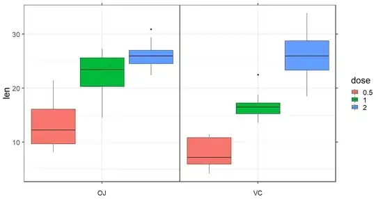
That does complicate things a little. This will get you close but it's not perfect. Maybe someone else will chime in with a better approach or a means to remove the inside border.

ToothGrowth %>%
  mutate(dose = factor(dose),
         cons = 1) %>%
  ggplot(aes(x = cons, y = len)) +
  geom_boxplot(aes(fill = dose)) +
  facet_wrap(~supp, strip.position = "bottom") +
  theme_bw(base_size = 20) +
  scale_y_continuous(sec.axis = dup_axis(labels = NULL,name = NULL)) +
  scale_x_continuous(labels = NULL, breaks = 1, sec.axis = dup_axis(labels = NULL,name = NULL)) +
  theme(strip.placement = "outside",
        strip.background = element_rect(color = "white", fill = "white"),
        panel.spacing.x = unit(0, "mm"),
        axis.title.x = element_blank())

Which gives:

enter image description here

Ritchie Sacramento
  • 29,890
  • 4
  • 48
  • 56
  • Thanks for your reply, it works. However, after posting I realized that I have another variable to add to the plot, and I think that variable is the source of my problem. I wonder if you can take a look at the edit I've done to the original post? – thiagoveloso May 10 '19 at 16:52
  • 1
    @thiagoveloso - see updated post. – Ritchie Sacramento May 10 '19 at 23:20