2

I have grid like this; enter image description here

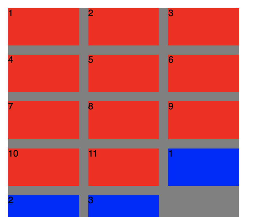
I want to order numbers from top to bottom, not left to right. (I want blues at last column)

.grid {
  display: grid;
  grid-gap: 1em;
  grid-template-columns: repeat(3, calc((100% / 3) - calc(2em / 3)));
  grid-auto-flow: row;
}

Here is playground; https://codesandbox.io/s/tender-framework-r30gy?fontsize=14

How can I accomplish this?

Paulie_D
  • 107,962
  • 13
  • 142
  • 161
Mohamed
  • 1,251
  • 3
  • 15
  • 36

2 Answers2

0

If i got question right you need every 12th item and further on new line. i would try, give all items same class and use nth-child(12n) with grid-column-start: 1;.

.grid-item-device-type-1:nth-child(12n) {
  /* height: 180px; */
  /* min-width: 320px; */
  grid-column-start: 1;

}

hope it helps :)

Maielo
  • 692
  • 1
  • 6
  • 20
-1

Something like this would do the trick.

Keep in mind that using CSS to reorder elements like this isn't optimal for supporting screen readers.

.item1 { grid-area: 1 / 1; }
.item2 { grid-area: 2 / 1; }
.item3 { grid-area: 3 / 1; }
.item4 { grid-area: 4 / 1; }
.item5 { grid-area: 5 / 1; }
.item6 { grid-area: 1 / 2; }
.item7 { grid-area: 2 / 2; }
.item8 { grid-area: 3 / 2; }
.item9 { grid-area: 4 / 2; }
.item10 { grid-area: 5 / 2; }
.item11 { grid-area: 1 / 3; }
.item1b { grid-area: 2 / 3; }
.item2b { grid-area: 3 / 3; }
.item3b { grid-area: 4 / 3; }