5

Expected behavior:

After selecting an item, Menu list will be close immediately and Select component loses its focus state with borderBottom become 1px solid and backgroundColor become white.

Current behavior:

Select behavior after selecting an item

As shown in the image above, the borderBottom is 2px solid and the backgroundColor isn't white which are indicating the Select component is in a focus state.

What should I do to achive the expected behavior?

Additional Explanation:

Actually what annoys me is the focus appearance of the Select component, not the focus itself, What I want is the behavior like in fonts.google.com. After selecting a style (e.g. Bold 700), yeah the Select component still in focus state but it doesn't show any sign of focus and that is what I actually want.

Bens
  • 831
  • 4
  • 12
  • 28
  • Why are you expecting focus to leave the Select? Where are you wanting focus to go? – Ryan Cogswell May 21 '19 at 16:49
  • 1
    Actually what annoys me is the focus appearance of the Select component, not the focus itself, What I want is the behavior like in https://fonts.google.com. After selecting a style (e.g. Bold 700), and yeah the Select component still in focus state but it doesn't show any sign of focus and that's what I actually want. – Bens May 21 '19 at 17:25

3 Answers3

2

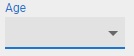
Below is an example showing how to customize the focus appearance of Select.

You can find some explanation about the underline customization in my answer here: How do I custom style the underline of Material-UI without using theme?

import React from "react";
import PropTypes from "prop-types";
import { withStyles } from "@material-ui/core/styles";
import Input from "@material-ui/core/Input";
import InputLabel from "@material-ui/core/InputLabel";
import MenuItem from "@material-ui/core/MenuItem";
import FormControl from "@material-ui/core/FormControl";
import Select from "@material-ui/core/Select";

const styles = theme => ({
  formControl: {
    margin: theme.spacing.unit,
    minWidth: 120
  },
  select: {
    "&:focus": {
      backgroundColor: "white"
    }
  },
  selectInput: {
    "&:hover:not($disabled):not($focused):not($error):before": {
      borderBottomWidth: 1
    },
    "&:after": {
      borderBottomWidth: 1
    }
  },
  disabled: {},
  focused: {},
  error: {}
});

class SimpleSelect extends React.Component {
  state = {
    age: ""
  };

  handleChange = event => {
    this.setState({ [event.target.name]: event.target.value });
  };

  render() {
    const { classes } = this.props;
    const selectInputClasses = {
      root: classes.selectInput,
      disabled: classes.disabled,
      focused: classes.focused,
      error: classes.error
    };

    return (
      <FormControl className={classes.formControl}>
        <InputLabel htmlFor="age-simple">Age</InputLabel>
        <Select
          value={this.state.age}
          onChange={this.handleChange}
          input={<Input classes={selectInputClasses} />}
          inputProps={{
            name: "age",
            id: "age-simple",
            classes: { select: classes.select }
          }}
        >
          <MenuItem value="">
            <em>None</em>
          </MenuItem>
          <MenuItem value={10}>Ten</MenuItem>
          <MenuItem value={20}>Twenty</MenuItem>
          <MenuItem value={30}>Thirty</MenuItem>
        </Select>
      </FormControl>
    );
  }
}

SimpleSelect.propTypes = {
  classes: PropTypes.object.isRequired
};

export default withStyles(styles)(SimpleSelect);

Edit Select with focus styling changes

Ryan Cogswell
  • 75,046
  • 9
  • 218
  • 198
  • Please @Ryan can you see the question in here https://stackoverflow.com/questions/66978284/material-ui-select-how-to-focus-the-select-when-the-input-is-clicked?noredirect=1#comment118404403_66978284 I want to keep the focus on parent container but I can't – July Apr 07 '21 at 14:58
1

You can use this trick to force Select to lose its focus:

<>
        <InputLabel
            id="CUSTOM_TITLE"
            shrink
        >
            {ANY_TITLE}
        </InputLabel>
        <Select
            ref={YOUR_SELECT_REF}
            input={<OutlinedInput notched label="ANY_TITLE" />}
            labelId="CUSTOM_TITLE"
            onClose={() => {
                ref.current.classList.remove('Mui-focused');
                ref.current.previousSibling?.classList.remove('Mui-focused');
            }}
            onOpen={() => {
                ref.current.classList?.add('Mui-focused');
                ref.current.previousSibling?.classList.add('Mui-focused');
            }}
        >
            {props.children}
        </Select>
</>
0

I don't know if I've understood the question correctly, but I think you can solve this using refs, as the React docs state:

[...] Managing focus, text selection, or media playback.

class MyComponent extends React.Component {
    constructor(props) {
        super(props);
        this.selector= React.createRef();
    }
    render() {
        return <Selector ref={this.selector}>[...]</Selector>;
    }
}

Then you can access the element itself by doing this.selector.current, and you can set (or unset) it's focus by doing this.selector.current.focus() or this.selector.current.blur() on Selector's element click. If what you want to do is to focus another element on click, you should get the ref for the element you want to focus and do it the same way.

I hope this is what you needed!

esandez
  • 21
  • 4