0

Now I'm working with this database:

structure(list(year = c(1990, 1991, 1992, 1993, 1994, 1995, 1996, 
1997, 1998, 1999, 2000, 2001, 2002, 2003, 2004, 2005, 2006, 2007, 
2008, 2009, 2010, 2011, 2012, 2013, 2014, 2015, 2016, 2017, 2018
), saldo = c(8275867, 3702514, -2636805, -3665755, -5751042, 
841426, 48908, -4019329, -4943662, -2199522, 1060542, 6223146, 
16661053, 16087980, 12130455, 11699873, 12392519, 11272844, 12556386, 
16885829, 11381863, 9020415, 12008167, 1521176, 2668277.78157, 
-3419083.03045001, 2057032, -8308931, -3881619)), row.names = c(NA, 
-29L), class = c("tbl_df", "tbl", "data.frame"))

So this is my code to plot the trade balance time series of Argentina:

install.packages("ggplot2")
library(ggplot2)    

    rx <- do.call("rbind",
              sapply(1:(nrow(TB_since_1990)-1), function(i){
                f <- lm(year~saldo, TB_since_1990[i:(i+1),])
                if (f$qr$rank < 2) return(NULL)
                r <- predict(f, newdata=data.frame(saldo=0))
                if(TB_since_1990[i,]$year < r & r < TB_since_1990[i+1,]$year)
                  return(data.frame(year=r,saldo=0))
                else return(NULL)
              }))
newdata.df <- rbind(TB_since_1990, rx)
newdata.df <- newdata.df[order(newdata.df$saldo),]


color.plot <- "darkorchid4"
size.line <- 1.5

ggplot(newdata.df, aes(x=year, y=saldo, fill = "Trade balance")) + 
  geom_area(alpha = 0.6) + 
  geom_line(color= color.plot, size = size.line) +
  geom_hline(aes(yintercept = 0)) +
  labs(fill= "", title="Argentina Trade Balance",x="",y="Saldo") +
  scale_y_continuous(breaks = seq(from = -10e6, to = 20e6, by = 2.5e6), 
                     limits = c(-10e6, 20e6)) +
  scale_x_continuous(breaks = seq(from = 1990, to = 2018, by = 1), 
                     limits = c(1990, 2018)) +
  scale_fill_manual(values = c("Trade balance" = color.plot)) +
  theme_minimal() +
  theme(text = element_text(size=10), 
        axis.text.x = element_text(angle=90, hjust=1),
        plot.title = element_text(hjust = 0.5),
        legend.position = "bottom")

This is my current plot:

enter image description here

I want this graph:

I want this graph

I don't know how to point out the negative values ​​of the y-axis in the plot. Also, I want to add more space between each value of the y-axis.

Alfonso
  • 644
  • 7
  • 17
Jose Montoya
  • 147
  • 1
  • 10
  • Why are you setting the axis breaks as the exact values in your data, instead of evenly spaced sequences? – camille May 25 '19 at 20:52
  • @camille My mistake, What should I do so that it is distributed in evenly spaced sequences? – Jose Montoya May 26 '19 at 21:09
  • I edited my answer with a "final" version of the plot. Please let me know if this works for you and up-vote and/or accept the answer if it solved your question – Alfonso Jun 01 '19 at 09:26

2 Answers2

3

I agree with @yarnabrina that geom_area is the option you need. However, ggplot needs some help to make exactly what you ask for, see below.

data.df <- structure(list(year = c(1990, 1991, 1992, 1993, 1994, 1995, 1996, 
                               1997, 1998, 1999, 2000, 2001, 2002, 2003, 2004, 2005, 2006, 2007, 
                               2008, 2009, 2010, 2011, 2012, 2013, 2014, 2015, 2016, 2017, 2018
), saldo = c(8275867, 3702514, -2636805, -3665755, -5751042, 
             841426, 48908, -4019329, -4943662, -2199522, 1060542, 6223146, 
             16661053, 16087980, 12130455, 11699873, 12392519, 11272844, 12556386, 
             16885829, 11381863, 9020415, 12008167, 1521176, 2668277.78157, 
             -3419083.03045001, 2057032, -8308931, -3881619)), row.names = c(NA, 
                                                                             -29L), class = c("tbl_df", "tbl", "data.frame"))

The graph using just geom_area

ggplot(data.df, aes(x=year, y=saldo)) + 
       geom_area() + 
       geom_line(color= "red") + 
       geom_point(color= "red")

enter image description here

I added a line and points to show your data. Now it is clear that geom_area does not work as you want when crossing the x-axis.

To fix this we need to add the y-axis crossing points to the data set. This can be done with a combination of lm and predict functions of R base.

See below the code to calculate the new points (from this post)

rx <- do.call("rbind",
              sapply(1:(nrow(data.df)-1), function(i){
                f <- lm(year~saldo, data.df[i:(i+1),])
                if (f$qr$rank < 2) return(NULL)
                r <- predict(f, newdata=data.frame(saldo=0))
                if(data.df[i,]$year < r & r < data.df[i+1,]$year)
                  return(data.frame(year=r,saldo=0))
                else return(NULL)
              }))
newdata.df <- rbind(data.df, rx)
newdata.df <- newdata.df[order(newdata.df$saldo),]

and to plot the graph.

ggplot(newdata.df, aes(x=year, y=saldo)) + 
       geom_area() + 
       geom_line(color= "red") + 
       geom_point(color= "red")
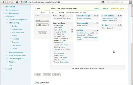
enter image description here

Now it looks more like what you were looking for. The last thing would be to modify the code to make it nicer.

Final plot

Set some values for easy configuration (you can find more color options here or using google ^_^)

color.plot <- "darkorchid4"
size.line <- 1.5

option 1

ggplot(newdata.df, aes(x=year, y=saldo, color = "Trade balance")) + 
  geom_area(fill = color.plot, alpha = 0.6, size = size.line) + 
  # geom_line(color= color.plot, size = size.line) +
  geom_hline(aes(yintercept = 0), size = size.line) +
  labs(color= "", title="Argentina Trade Balance",x="",y="Saldo") +
  scale_y_continuous(breaks = seq(from = -10e6, to = 20e6, by = 2.5e6), 
                     limits = c(-10e6, 20e6)) +
  scale_x_continuous(breaks = seq(from = 1990, to = 2018, by = 1), 
                     limits = c(1990, 2018)) +
  scale_color_manual(values = c("Trade balance" = color.plot)) +
  theme_minimal() +
  theme(text = element_text(size=10), 
        axis.text.x = element_text(angle=90, hjust=1),
        plot.title = element_text(hjust = 0.5),
        legend.position = "bottom")
enter image description here

option 2

ggplot(newdata.df, aes(x=year, y=saldo, fill = "Trade balance")) + 
  geom_area(alpha = 0.6) + 
  geom_line(color= color.plot, size = size.line) +
  geom_hline(aes(yintercept = 0)) +
  labs(fill= "", title="Argentina Trade Balance",x="",y="Saldo") +
  scale_y_continuous(breaks = seq(from = -10e6, to = 20e6, by = 2.5e6), 
                     limits = c(-10e6, 20e6)) +
  scale_x_continuous(breaks = seq(from = 1990, to = 2018, by = 1), 
                     limits = c(1990, 2018)) +
  scale_fill_manual(values = c("Trade balance" = color.plot)) +
  theme_minimal() +
  theme(text = element_text(size=10), 
        axis.text.x = element_text(angle=90, hjust=1),
        plot.title = element_text(hjust = 0.5),
        legend.position = "bottom")

enter image description here

Answer to question edit

I am not sure where your problem is. In my computer it works perfectly, and produces a plot like the last one in my post.

I added here the full code to produce the plot just in case it may be useful, in fact everything but creating the initial data frame is a direct copy/paste of the code in your question.

TB_since_1990 <- structure(list(year = c(1990, 1991, 1992, 1993, 1994, 1995, 1996, 
                        1997, 1998, 1999, 2000, 2001, 2002, 2003, 2004, 2005, 2006, 2007, 
                        2008, 2009, 2010, 2011, 2012, 2013, 2014, 2015, 2016, 2017, 2018
), saldo = c(8275867, 3702514, -2636805, -3665755, -5751042, 
             841426, 48908, -4019329, -4943662, -2199522, 1060542, 6223146, 
             16661053, 16087980, 12130455, 11699873, 12392519, 11272844, 12556386, 
             16885829, 11381863, 9020415, 12008167, 1521176, 2668277.78157, 
             -3419083.03045001, 2057032, -8308931, -3881619)), row.names = c(NA, 
                                                                             -29L), class = c("tbl_df", "tbl", "data.frame"))

rx <- do.call("rbind",
              sapply(1:(nrow(TB_since_1990)-1), function(i){
                f <- lm(year~saldo, TB_since_1990[i:(i+1),])
                if (f$qr$rank < 2) return(NULL)
                r <- predict(f, newdata=data.frame(saldo=0))
                if(TB_since_1990[i,]$year < r & r < TB_since_1990[i+1,]$year)
                  return(data.frame(year=r,saldo=0))
                else return(NULL)
              }))
newdata.df <- rbind(TB_since_1990, rx)
newdata.df <- newdata.df[order(newdata.df$saldo),]


color.plot <- "darkorchid4"
size.line <- 1.5

ggplot(newdata.df, aes(x=year, y=saldo, fill = "Trade balance")) + 
  geom_area(alpha = 0.6) + 
  geom_line(color= color.plot, size = size.line) +
  geom_hline(aes(yintercept = 0)) +
  labs(fill= "", title="Argentina Trade Balance",x="",y="Saldo") +
  scale_y_continuous(breaks = seq(from = -10e6, to = 20e6, by = 2.5e6), 
                     limits = c(-10e6, 20e6)) +
  scale_x_continuous(breaks = seq(from = 1990, to = 2018, by = 1), 
                     limits = c(1990, 2018)) +
  scale_fill_manual(values = c("Trade balance" = color.plot)) +
  theme_minimal() +
  theme(text = element_text(size=10), 
        axis.text.x = element_text(angle=90, hjust=1),
        plot.title = element_text(hjust = 0.5),
        legend.position = "bottom")

Based on your image looks like ggplot is not interpreting the color properly and, more important, geom_area is not working as expected. You may want to install ggplot again or try the code in a different computer. Good luck!

Alfonso
  • 644
  • 7
  • 17
  • Your solution is definitely much better than mine. But I think it's better to attribute to the original solution: https://stackoverflow.com/a/27137211 – yarnabrina May 25 '19 at 19:36
  • Thank you! but I still have one problem. I want to add more space between each value of the y-axis(the distance between each value of the axis is very small and makes it look messy) .So I want all the values of y to be shown in the plot. I want a neat plot so I want the value 0 to appear in the graph as a dividing line to make clear that the values ​​that are below are negative. – Jose Montoya May 25 '19 at 20:01
  • thanks @yarnabrina for finding the post with the interpolation code, I found it long time ago and did not remember it. Added to the answer. – Alfonso May 26 '19 at 08:12
  • @Jose Montoya I am not sure I understand your question. In your second image y-axis ticks are evenly distributed (the most usual). See camille comment in the original question – Alfonso May 26 '19 at 09:38
  • @Alfonso Hi, I have this problem https://ibb.co/3CWHCXP The plot is fine, but it's weird. – Jose Montoya Jun 20 '19 at 18:11
  • @Jose Montoya Hi, could you edit your question showing the code to generate the plot? otherwise is dificult to find the problem. Thanks – Alfonso Jun 21 '19 at 07:13
  • @Alfonso Hi, I've just edited my question. I hope you can help me. Thank you – Jose Montoya Jun 24 '19 at 01:54
  • @Jose Montoya I edited my answer, hopefully this helps you to fix your problems. Keep us updated on your progress ;-) Best – Alfonso Jun 25 '19 at 12:14
1
library(ggplot2)
#> Registered S3 methods overwritten by 'ggplot2':
#>   method         from 
#>   [.quosures     rlang
#>   c.quosures     rlang
#>   print.quosures rlang

TB_ARG_since_1990 <- structure(list(year = c(1990, 1991, 1992, 1993, 1994, 1995, 1996, 
                        1997, 1998, 1999, 2000, 2001, 2002, 2003, 2004, 2005, 2006, 2007, 
                        2008, 2009, 2010, 2011, 2012, 2013, 2014, 2015, 2016, 2017, 2018
), saldo = c(8275867, 3702514, -2636805, -3665755, -5751042, 
             841426, 48908, -4019329, -4943662, -2199522, 1060542, 6223146, 
             16661053, 16087980, 12130455, 11699873, 12392519, 11272844, 12556386, 
             16885829, 11381863, 9020415, 12008167, 1521176, 2668277.78157, 
             -3419083.03045001, 2057032, -8308931, -3881619)), row.names = c(NA, 
                                                                             -29L), class = c("tbl_df", "tbl", "data.frame"))
ggplot(TB_ARG_since_1990,
       aes(x = year,
           y = saldo)) +
  geom_line(linetype = "solid",
            size = 1) +
  geom_area(fill = "red")

Created on 2019-05-25 by the reprex package (v0.3.0)

You can make the graph nicer by modifying this code.

yarnabrina
  • 1,561
  • 1
  • 10
  • 30