I have a Gender variable, and 10 different treatment variables. I used geom_histogram in ggplot. Hence, for each treatment I want to see the percentage of Males and Females, but all standarized so that they y axis max value could be 1, and therefore I could compare by percentages.
In particular, I am interested in generating a graph like this one
https://cengel.github.io/R-data-viz/R-data-viz_files/figure-html/color-bar-gender-1.png
Some of the data would like something like this
structure(list(Treatment = structure(c(3L, 3L, 3L, 3L, 3L, 4L
), .Label = c("", "{\"ImportId\":\"Treatment\"}", "Altruism",
"Altruism - White", "Piece Rate - 0 cents", "Piece Rate - 3 cents",
"Piece Rate - 6 cents", "Piece Rate - 9 cents", "Reciprocity",
"Reciprocity - Black", "Reciprocity - White", "Treatment"), class = "factor"),
    Gender = structure(c(5L, 3L, 5L, 5L, 5L, 3L), .Label = c("",
    "{\"ImportId\":\"QID2\"}", "Female", "Gender you most closely identify with: - Selected Choice",
    "Male", "Other", "Prefer not to answer"), class = "factor"),class="data.frame")
ggplot(Data1, aes(x=Treatment, fill=Gender))+
  geom_histogram(bins = 15, col="black",stat="count")+
  ggtitle("Gender")+
  xlab("Treatment")+ylab("Density")+
  theme_classic()+
  theme(axis.line = element_blank(),
        axis.ticks = element_blank())
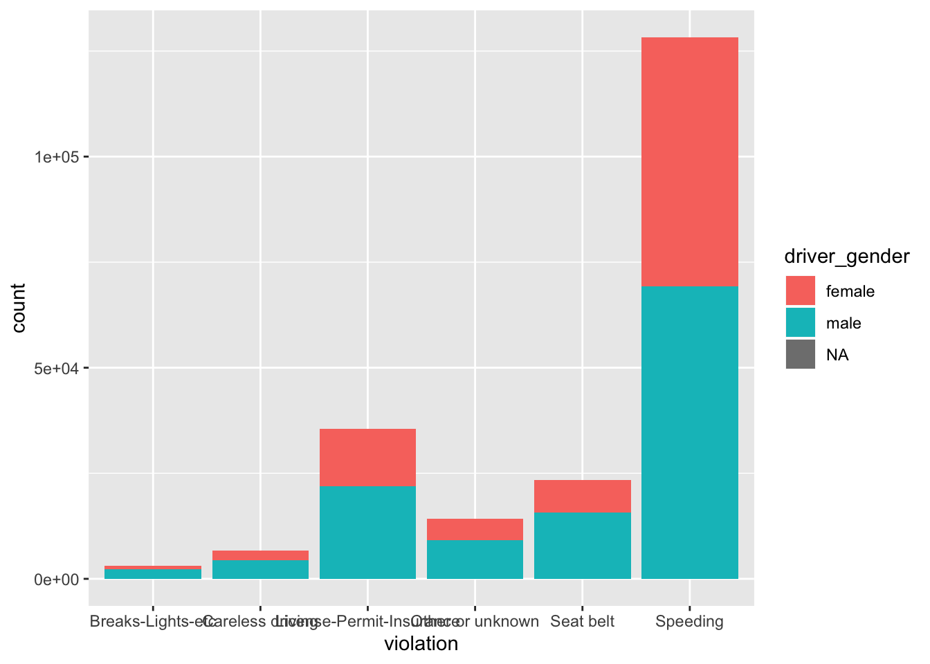
I get something like this

This is my code thus far, which works. The only thing I don't know how to do is to have all my bars of the same height (1, like a standarized value), such that I can see percentages (divided bars) for each treatment.
