I am trying to loop a ggplot2 plot with a linear regression line over it. It works when I type the y column name manually, but the loop method I am trying does not work. It is definitely not a dataset issue.
I've tried many solutions from various websites on how to loop a ggplot and the one I've attempted is the simplest I could find that almost does the job.
The code that works is the following:
plots <- ggplot(Everything.any, mapping = aes(x = stock_VWRETD, y = stock_10065)) +
    geom_point() +
    labs(x = 'Market Returns', y = 'Stock Returns', title ='Stock vs Market Returns') +
    geom_smooth(method='lm',formula=y~x)
But I do not want to do this another 40 times (and then 5 times more for other reasons). The code that I've found on-line and have tried to modify it for my means is the following:
plotRegression <- function(z,na.rm=TRUE,...){
  nm <- colnames(z)
  for (i in seq_along(nm)){
    plots <- ggplot(z, mapping = aes(x = stock_VWRETD, y = nm[i])) +
    geom_point() +
    labs(x = 'Market Returns', y = 'Stock Returns', title ='Stock vs Market Returns') +
    geom_smooth(method='lm',formula=y~x)

    ggsave(plots,filename=paste("regression1",nm[i],".png",sep=" "))
  }
}

plotRegression(Everything.any)
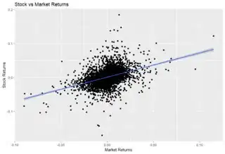
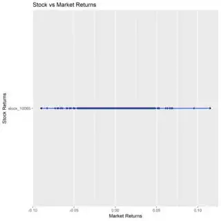
I expect it to be the nice graph that I'd expect to get, a Stock returns vs Market returns graph, but instead on the y-axis, I get one value which is the name of the respective column, and the Market value plotted as normally, but as if on a straight number-line across the one y-axis value. Please let me know what I am doing wrong.
Desired Plot:
Actual Plot:
Sample Data is available on Google Drive here: https://drive.google.com/open?id=1Xa1RQQaDm0pGSf3Y-h5ZR0uTWE-NqHtt


