0

How to move the block of divs to a) center and b) right ? That is, i wish to move the innerWrap and its contents to either center or right.
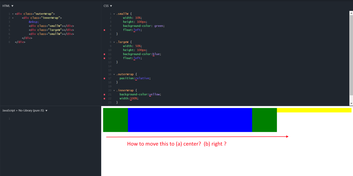
enter image description here

.smallW {
  width: 10%;
  height: 100px;
  background-color: green;
  float: left;
}

.largeW {
  width: 50%;
  height: 100px;
  background-color: blue;
  float: left;
}

.outerWrap {
  position: relative;
}

.innerWrap {
  background-color: yellow;
  width: 100%;
}
<div class="outerWrap">
  <div class="innerWrap">
    &nbsp;
    <div class="smallW"></div>
    <div class="largeW"></div>
    <div class="smallW"></div>
  </div>
</div>

Fiddle here

showdev
  • 28,454
  • 37
  • 55
  • 73
joedotnot
  • 4,810
  • 8
  • 59
  • 91
  • Thanks everyone who answered it, but i can only accept one. All the answers provided thus far use flex, i wonder how it would be done in the days prior to flex... – joedotnot Jun 07 '19 at 05:41
  • first rule to center : Never use float. Easiest way than flexbox is to consider inline-block then simply adjust text-align – Temani Afif Jun 07 '19 at 08:44

4 Answers4

0
.innerWrap{
 display: flex;
 flex-direction: row
 justify-content: center
} 

you can use below for right align

justify-content: flex-end
Shing Ho Tan
  • 931
  • 11
  • 30
  • Thanks, your answer was first and it works, so I am taking it. I got confused by center(flex-end).. So for anyone that needs this answer, you would write it separately as justify-content: center OR justify-content: flex-end. – joedotnot Jun 07 '19 at 05:39
0

Try using display: flex for this. It's much easier to get alignment done that using float.

With the use of flex you can align your inner elements to the center by using justify-content: center; or to the end of the container by using justify-content: flex-end; so you don't need to use float property. This is a sample code. Hope it helps you.

HTML

<div class="outerWrap">
  <div class="innerWrap">
    <div class="smallW"></div>
    <div class="largeW"></div>
    <div class="smallW"></div>
  </div>
</div>

CSS

.smallW {
  width: 10%;
  height: 100px;
  background-color: green;
}

.largeW {
  width: 50%;
  height: 100px;
  background-color: blue;
}

.outerWrap {
  display: flex;
}

.innerWrap {
  background-color: yellow;
  width: 100%;
  display: flex;
  flex-direction: row;
  align-items: center;
  justify-content: center;/* For center align */
  /* justify-content: flex-end;  */ /* Align to end */
}

JS Fiddle Link : https://jsfiddle.net/SJ_KIllshot/o7e4cjdL/

Stefan Joseph
  • 545
  • 2
  • 10
0

You can align the contents using flexbox in innerWrap

.innerWrap.center {
    display: flex;
    justify-content: center;
}
.innerWrap.right {
    display: flex;
    justify-content: flex-end;
}

FIDDLE

.smallW {
    width: 10%;
    height: 100px;
    background-color: green;
    float:left;
}

.largeW {
    width: 50%;
    height: 100px;
    background-color:blue;
    float:left;
}


.outerWrap {
  position:relative;
}

.innerWrap {
  background-color:yellow;
  width:100%;
}

/* additional styles */
.innerWrap.center {
    display: flex;
    justify-content: center;
}
.innerWrap.right {
    display: flex;
    justify-content: flex-end;
}
<div class="outerWrap">
    <div class="innerWrap center">
        &nbsp;
        <div class="smallW"></div>
        <div class="largeW"></div>
        <div class="smallW"></div>
    </div>
    
    <br>
    
    <div class="innerWrap right">
        &nbsp;
        <div class="smallW"></div>
        <div class="largeW"></div>
        <div class="smallW"></div>
    </div>
</div>
Jinu Kurian
  • 9,128
  • 3
  • 27
  • 35
0

.smallW {
    flex-basis: 10%;
    background-color: green;  
}

.largeW {
    flex-basis: 50%; 
    background-color:blue;  
}

.innerWrap {
  background-color:yellow;
  display:flex;
  justify-content:flex-end;
  height:100px;
}
<div class="outerWrap">
    <div class="innerWrap">
        &nbsp;
        <div class="smallW"></div>
        <div class="largeW"></div>
        <div class="smallW"></div>
    </div>
</div>

Use Flex instead of float.