NishargShah is correct about using Flexbox. Bootstrap was redesigned around Flexbox, and that is the core change from Bootstrap3 to Bootstrap4 (there are many other changes, but the switch from Floats to Flexbox is the core change).
However, there is a simpler way to do this:
Change:
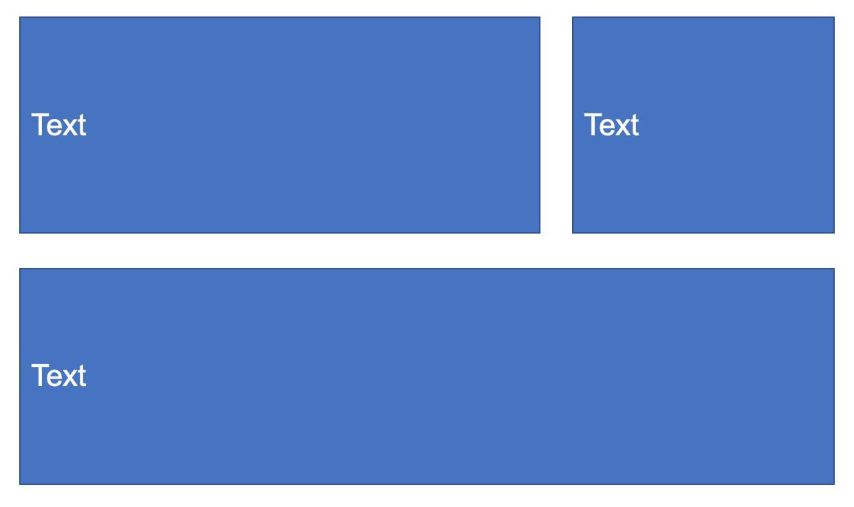
  <div class="col-8 bg-dark m-2">
    TEXT
  </div>
to:
  <div class="col-8 bg-dark m-2 d-flex align-items-center">
    TEXT
  </div>
Modified jsFiddle
html, body {
  height: 100%;
  color:white !important;
}

.flex-fill {
  flex: 1;
}

.container {
  padding: 2em 1em;
}
<link rel="stylesheet" href="https://stackpath.bootstrapcdn.com/bootstrap/4.3.1/css/bootstrap.min.css">


<div class="container d-flex h-100 flex-column">
    <div class="row flex-fill d-flex">
      <div class="col-8 bg-dark m-2 d-flex align-items-center">
        TEXT
      </div>
      <div class="col bg-dark m-2 d-flex align-items-center">
        TEXT
      </div>
    </div>
    <div class="row flex-fill d-flex">
      <div class="col bg-dark m-2 d-flex align-items-center">
        TEXT
      </div>
    </div>
</div>
Short explanation:
d-flex turns on flexbox for this container
align-items is flexbox vertical align (for immediate children inside container)
justify-content is flexbox horizontal align (for immediate children inside container)
Notes:
If you are using Bootstrap, use the included Bootstrap classes wherever possible. Bootstrap has a number of pre-fab classes specifically for Flexbox.
One of the cool things about flexbox is that any container can be a flexbox parent -- even those that are flexbox items. That is, the same container can be both a flexbox child to the container above it, and a flexbox parent to the containers inside it.
Flexbox requires two things:
- a parent container
- child items
Some flexbox settings are set on the parent, the rest are set on the child items. In this case, the only settings you need are set on the parent.
References:
Excellent 20-min video tutorial
Best-of-breed flexbox cheatsheet
Bootstrap4 Flexbox classes
