3

I have 3 blocks, that I need to:

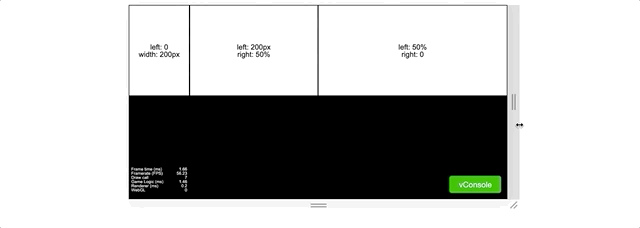
  • The first block needs to be 200px wide and touch the left side.
  • The second block is right after the first block and its right edge is at exactly 50% width of its container
  • The third block just takes over whatever the space is left.

I made something similar in some game engine: enter image description here

But how can I achieve it with css?

I don't want to nest the inner divs because they're playing the same role.


I tried this but it doesn't work :(

* {
  box-sizing: border-box;
}

.wrapper {
  width: 100%;
  display: flex;
  position: relative;
}

.wrapper > * {
  height: 300px;
  display block;
}

.wrapper > *:nth-child(1) {
  background-color: salmon;
  width: 200px;
}

.wrapper > *:nth-child(2) {
  background-color: khaki;
  right: 50%;
}

.wrapper > *:nth-child(3) {
  background-color: violet;
  width: 50%;
}
<div class="wrapper">
  <pre>
    left: 0;
    width: 200px;
  </pre>
  <pre>
    left: 200px;
    right: 50%;
  </pre>
  <pre>
    left: 50%;
    right: 0;
  </pre>
</div>
Hao Wu
  • 17,573
  • 6
  • 28
  • 60

2 Answers2

5

You can set flex: 0 0 50% to the third child which means the element would not grow, shrink and will always occupy half the width of the flexbox container.

Now to allow the second child to occupy the remaining space left by the other two elements you can set flex-grow: 1 and set min-width: 0 (allows it to shrink further than its intrinsic width - note that default min-width is auto for a flex item).

See demo below:

* {
  box-sizing: border-box;
}

.wrapper {
  width: 100%;
  display: flex;
  position: relative;
}

.wrapper > * {
  height: 300px;
  display: block;
}

.wrapper > *:nth-child(1) {
  background-color: salmon;
  width: 200px;
}

.wrapper > *:nth-child(2) {
  background-color: khaki;
  flex-grow: 1; /* grow width automatically if needed */
  min-width: 0; /* allow shrinking below default width */
}

.wrapper > *:nth-child(3) {
  background-color: violet;
  flex: 0 0 50%; /* added */
}
<div class="wrapper">
  <pre>
    left: 0;
    width: 200px;
  </pre>
  <pre>
    left: 200px;
    right: 50%;
  </pre>
  <pre>
    left: 50%;
    right: 0;
  </pre>
</div>
kukkuz
  • 41,512
  • 6
  • 59
  • 95
  • Wow, it makes so much sense to adapt the middle element instead of the third one... and one more thing I'm not very clear, is there any difference between `flex: 0 0 200px` and `width: 200px` ? – Hao Wu Jun 12 '19 at 04:33
  • 1
    Nvm I found it here: https://stackoverflow.com/questions/34352140/what-are-the-differences-between-flex-basis-and-width , thanks for the help :) – Hao Wu Jun 12 '19 at 04:40
2

Try this

    * {
      box-sizing: border-box;
    }

   body{
      display: flex;
      flex-direction: row;
   }

    .wrapper, .wrapper-1 {
      width: 50%;
      display: flex;
      position: relative;
    }

    .wrapper > *, .wrapper-1 > * {
      height: 300px;
      margin: 0;
      display: inline;
      white-space: nowrap;
    }

    .wrapper > *:nth-child(1) {
      background-color: salmon;
      flex-basis: 200px;
    }

    .wrapper-1 > *:nth-child(1) {
      background-color: violet;
      flex: 1 1 auto;
    }

    .wrapper > *:nth-child(2) {
      background-color: khaki;
      flex: 1 1 auto;
    }

    .wrapper > *:nth-child(3) {
      background-color: violet;
     flex: 1 auto;
    }
<body>
<div class="wrapper">
  <pre> flex-basis: 200px;
  </pre>
  <pre> flex: 1 1 auto;
  </pre>
  
</div>
<div class="wrapper-1">
    <pre>flex: 1 1 auto;  </pre>
</div>
</body>
Sumit Ridhal
  • 1,359
  • 3
  • 14
  • 30
  • Not really what I wanted... the first and second block add together should be 50% wide :/ – Hao Wu Jun 12 '19 at 04:35
  • @HaoWu Made some changes. Need to split the page into two wrappers. Both containing 50% of the width. Now you can handle contents the way you like :) – Sumit Ridhal Jun 12 '19 at 06:41