2

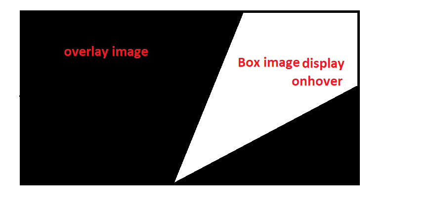
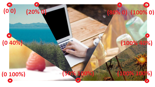
I'm working on SVG here my concept is I have two images .overlap with each other and using svg polygon I made five different triangles. my aim to achieve first overlay complete image display and when hover on triangles shapes background .box box image needs to display. This is my initial code before giving an overlay image.

.box {
  position: relative;
  background-image: url('https://picsum.photos/id/1/1000/800');
  background-repeat: no-repeat;
  width: 100%;
  height: 600px;
  background-size: cover;
}

polygon {
  stroke-width: 1;
  stroke: red;
  fill: #ffffff;
}

polygon:hover {
  fill: transparent;
}
<div class="box">
  <svg viewbox="0 0 200 100">
  <polygon points="0,100 100,100 0,50 "
       style="stroke:#000000;"/>
  <polygon points="0,50 100,100 50,00 0,0 "
       style="stroke:#000000;"/>
  <polygon points="100,100 50,00 150,0"
       style="stroke:#000000;"/>
  <polygon points="100,100 200,50 200,0 150,0"
       style="stroke:#000000;"/>
  <polygon points="100,100 200,100, 200,50"
       style="stroke:#000000;"/>
 </svg>
</div>

Now I have added overlay image need to come above the .box image and polygons shapes. Now, hover I want to display .box image in a current polygon shape like this iamge

Code here

.box {
  position: relative;
  background-image: url('https://picsum.photos/id/1/1000/800');
  background-repeat: no-repeat;
  width: 100%;
  height: 600px;
  background-size: cover;
}

polygon {
  stroke-width: 1;
  stroke: red;
  fill: #ffffff;
}

polygon:hover {
  fill: transparent;
}

.overlay:hover polygon {
  z-index: 100;
}

.overlay {
  position: absolute;
  background-image: url('https://picsum.photos/id/118/1000/800');
  background-repeat: no-repeat;
  width: 100%;
  height: 600px;
  background-size: cover;
  z-index: 10;
}
<div class="overlay"></div>
<div class="box">

  <svg viewbox="0 0 200 100">
  <polygon points="0,100 100,100 0,50 "
       style="stroke:#000000;"/>
  <polygon points="0,50 100,100 50,00 0,0 "
       style="stroke:#000000;"/>
  <polygon points="100,100 50,00 150,0"
       style="stroke:#000000;"/>
  <polygon points="100,100 200,50 200,0 150,0"
       style="stroke:#000000;"/>
  <polygon points="100,100 200,100, 200,50"
       style="stroke:#000000;"/>
 </svg>
</div>

Can anyone help me out this on hover we need to adjust the z-indexes of the divs and polygon fill.

Temani Afif
  • 245,468
  • 26
  • 309
  • 415
Husna
  • 1,286
  • 4
  • 19
  • 48

3 Answers3

2

I would adjust the code of my previous answer like below:

.box {
  width:450px;
  height:250px;
  position:relative;
  overflow:hidden;
  z-index:0;
  background:url(https://picsum.photos/id/13/1000/800) center/cover;
}
.box > div {
  position:absolute;
  top:0;
  left:0;
  right:0;
  bottom:0;
  background-size:cover;
  background-position:center;
  opacity:0;
}
.box > div:nth-child(1) {
  clip-path:polygon(20% 0,80% 0, 50% 100%);
}
.box > div:nth-child(2) {
  clip-path:polygon(0 0, 20% 0,50% 100%,0 40%);
}
.box > div:nth-child(3) {
  clip-path:polygon(100% 0,80% 0,50% 100%,100% 40%);
}

.box > div:nth-child(4) {
  clip-path:polygon(0 100%,50% 100%,0 40%);
}
.box > div:nth-child(5) {
  clip-path:polygon(100% 100%,50% 100%,100% 40%);
}

.box > div:hover {
   opacity:1;
}
<div class="box">
  <div style="background-image:url(https://picsum.photos/id/1/1000/800)"></div>
  <div style="background-image:url(https://picsum.photos/id/10/1000/800)"></div>
  <div style="background-image:url(https://picsum.photos/id/90/1000/800)"></div>
  <div style="background-image:url(https://picsum.photos/id/102/1000/800)"></div>
  <div style="background-image:url(https://picsum.photos/id/118/1000/800)"></div>
</div>

Here is an illustration to show you the different points used in clip-path

enter image description here

With the same image:

.box {
  width:450px;
  height:250px;
  position:relative;
  overflow:hidden;
  z-index:0;
  background:url(https://picsum.photos/id/13/1000/800) center/cover;
}
.box > div {
  position:absolute;
  top:0;
  left:0;
  right:0;
  bottom:0;
  background-image:url(https://picsum.photos/id/118/1000/800);
  background-size:cover;
  background-position:center;
  opacity:0;
}
.box > div:nth-child(1) {
  clip-path:polygon(20% 0,80% 0, 50% 100%);
}
.box > div:nth-child(2) {
  clip-path:polygon(0 0, 20% 0,50% 100%,0 40%);
}
.box > div:nth-child(3) {
  clip-path:polygon(100% 0,80% 0,50% 100%,100% 40%);
}

.box > div:nth-child(4) {
  clip-path:polygon(0 100%,50% 100%,0 40%);
}
.box > div:nth-child(5) {
  clip-path:polygon(100% 100%,50% 100%,100% 40%);
}

.box > div:hover {
   opacity:1;
}
<div class="box">
  <div ></div>
  <div ></div>
  <div ></div>
  <div ></div>
  <div ></div>
</div>
Temani Afif
  • 245,468
  • 26
  • 309
  • 415
  • exactly this is what I need only the point is in all polygon same image I want to add if the add individually same image I need to adjust image positions. and all can you suggest me about this only one image just view in the different shapes of a triangle. – Husna Jun 13 '19 at 08:51
  • @Husna simply use the same image for all the div, no need to adjust anyhing else ... I added a different image using inline style, simply remove this and use the image in the CSS (check the update) – Temani Afif Jun 13 '19 at 08:53
  • ok. I really appreciate you to the time you have given here. :) – Husna Jun 13 '19 at 08:54
2

Temani's CSS only solution is great, however, beware this is still not supported in Safari nor in IE/Edge.

For these browsers, you'll need to fallback on SVG, which also implements a <clipPath> element.

.overlay {
  background-image: url('https://picsum.photos/id/118/1000/800');
  background-repeat: no-repeat;
  background-size: cover;
}
.overlay use {
  opacity: 0;
}
.overlay use:hover {
  opacity: 1;
}
<svg class="overlay" viewBox="0 0 200 100">
  <defs>
    <clipPath id='clip-1'>
      <polygon points="0,100 100,100 0,50"/>
    </clipPath>
    <clipPath id='clip-2'>
      <polygon points="0,50 100,100 50,00 0,0"/>
    </clipPath>
    <clipPath id='clip-3'>
      <polygon points="100,100 50,00 150,0"/>
    </clipPath>
    <clipPath id='clip-4'>
      <polygon points="100,100 200,50 200,0 150,0"/>
    </clipPath>
    <clipPath id='clip-5'>
      <polygon points="100,100 200,100, 200,50"/>
    </clipPath>
    <image id="img" x="0" y="0" width="200" height="100" preserveAspectRatio="xMidYMid slice"
      xlink:href="https://picsum.photos/id/1/1000/800" />
  </defs>
  <use xlink:href="#img" clip-path="url(#clip-1)"/>
  <use xlink:href="#img" clip-path="url(#clip-2)"/>
  <use xlink:href="#img" clip-path="url(#clip-3)"/>
  <use xlink:href="#img" clip-path="url(#clip-4)"/>
  <use xlink:href="#img" clip-path="url(#clip-5)"/>
</svg>
<div class="box"></div>

So, yes, it's more verbose, but it should work in every browser since IE9.

Kaiido
  • 123,334
  • 13
  • 219
  • 285
  • thanks. Here I don't want polygon lines on the image as like Temani output like that can you make changes in your code and remove that lines on image. – Husna Jun 14 '19 at 05:14
  • @Husna then it's simpler – Kaiido Jun 14 '19 at 05:19
  • still very thin 1px of the line is coming can you suggest me how to remove those lines. We remove stroke but still from where these lines are coming. – Husna Jun 14 '19 at 05:22
  • That's antialising, you'd have to make your polygons a bit larger than necessary (e.g make them bleed one unit in each direction). Sorry I run out of time right now. Ah or actually we can make like Temani: inverse what is hidden – Kaiido Jun 14 '19 at 05:26
  • I edited to use the same technique as Temani: show the slice on hover. – Kaiido Jun 14 '19 at 05:31
0

If you wanted the svg to appear above it's parent div, you could change the attributes of the svg element like below:

   /*~~~~~~~~~~~~~~~~~~~~~~~~~~~~~~~~~*/
   /*necessary for expanding .box div and svg*/
   /*~~~~~~~~~~~~~~~~~~~~~~~~~~~~~~~~~*/
   html,body{
    width:100%;
    height:100%;
   }
   
   .box {
      width:100%;
      height:100%;
      
      position: relative;
      background-image: url('https://picsum.photos/id/1/1000/800');
      background-repeat: no-repeat;
      width: 100%;
      
      /*~~~~~~~~~~~~~~~~~~~~~~~~~~~~~~~~~*/
      /*I CHANGED HEIGHT TO 100% FOR BOX AS IT WASNT SPANNING THE ENTIRE PAGE - in turn, the "overlay"
      div's background image could be seen...*/
      /*~~~~~~~~~~~~~~~~~~~~~~~~~~~~~~~~~*/
      height: 100%;
      background-size: cover;
    }
    
    /*~~~~~~~~~~~~~~~~~~~~~~~~~~~~~~~~~*/
    /*position the svg element relative to its parent so it can be moved up with z-index*/
    /*~~~~~~~~~~~~~~~~~~~~~~~~~~~~~~~~~*/
    svg{
      position:relative;
      z-index:999;
    }

    polygon {
      stroke-width: 1;
      stroke: red;
      fill: #ffffff;
    }

    polygon:hover {
      fill: transparent;
    }

    .overlay:hover polygon {
      z-index: 100;
    }

    .overlay {
      position: absolute;
      background-image: url('https://picsum.photos/id/118/1000/800');
      background-repeat: no-repeat;
      width: 100%;
      height: 100%;
      background-size: cover;
      z-index: 10;
    }
<div class="overlay"></div>
<div class="box">

  <!-- ~~~~~~~~~~~~~~~~~~~~~~~~~~~~~~~~~ -->
  <!--in order to make the svg span the entirety of its parent, I set width and height attributes
  for it to 100%-->
  <!-- ~~~~~~~~~~~~~~~~~~~~~~~~~~~~~~~~~ -->
  <svg width="100%" height="100%" preserveAspectRatio="none" viewbox="0 0 200 100">
    <polygon points="0,100 100,100 0,50 "
          style="stroke:#000000;"/>
    <polygon points="0,50 100,100 50,0 0,0 "
          style="stroke:#000000;"/>
    <polygon points="100,100 50,00 150,0"
          style="stroke:#000000;"/>
    <polygon points="100,100 200,50 200,0 150,0"
          style="stroke:#000000;"/>
    <polygon points="100,100 200,100, 200,50"
          style="stroke:#000000;"/>
  </svg>
</div>
Musilix
  • 330
  • 2
  • 14