In a linear-gradient background I am creating a circle and inside that a small square. The circle is having a dodgerblue color and square should have the linear-gradient of body, but the problem is the position of linear-gradient of div element doesn't match with the body background.
I tried background:inherit With the div element, But the gradient doesn't match the body.
body {
  background: linear-gradient(45deg, yellow, green);
  background-size: 400% 400%;
}

.circle {
  height: 150px;
  width: 150px;
  border-radius: 50%;
  position: relative;
  margin: auto;
  background: dodgerblue;
}

.square {
  height: 50px;
  width: 50px;
  transform: translate(250px, -100px);
  background: inherit;
}
<body>
<div class="circle"></div>
<div class="square"></div>
</body>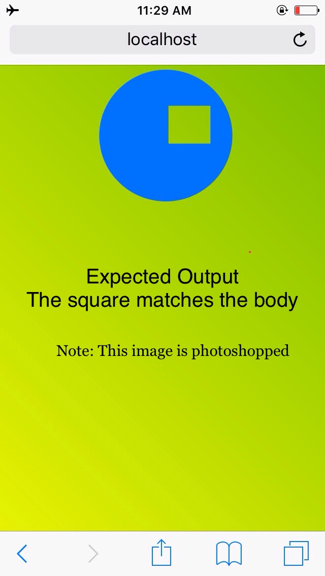

