2

I have a challenging task at work - which requires a pure CSS solution

I receive an array of widgets that are either 33% width or 66% width in size. They need to be ordered in the order they are received but the total width of widgets cannot exceed 100%.

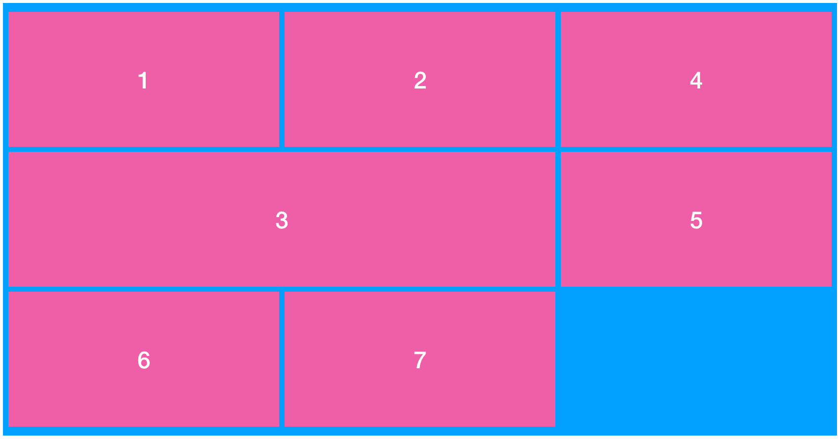
The screenshot below depicts the order in which the items should fill the screen but the numbers indicate the order in which they were received. Note that item 3 is too big to fit in after item 2 so item 4 (which is lower in priority) fills up the empty space at the top

Rendered Order

How do I do it with flex? I get the components list when the page is loading.

kukkuz
  • 41,512
  • 6
  • 59
  • 95
LilacEilim
  • 89
  • 1
  • 8
  • There's something telling 4 to look back and use the unoccupied space after 2. What is that? – Michael Benjamin Jun 19 '19 at 18:02
  • Thats the challenge. At the moment I am rendering them in the order received with flexbox. This makes 1,2 appear side by side and then leaves an ugly gap at he top because 3 cannot fit in. 4 appears after 3 BUT I am trying to get it to fill the empty gaps above where it can fit in – LilacEilim Jun 19 '19 at 18:10
  • But a natural flexbox layout would not back-fill unoccupied spaces. There's an artificial command at play. – Michael Benjamin Jun 19 '19 at 18:45
  • are you meaning something like this where you control the order of the elements itself? https://jsfiddle.net/ewxcymgu/ – John Ruddell Jun 19 '19 at 18:59
  • possible duplicate of: https://stackoverflow.com/q/55344983/8620333 – Temani Afif Jun 19 '19 at 19:35
  • not solvable with flexbox - a simple example of how css grid solves this issue: https://stackoverflow.com/questions/56269202/arrangement-of-elements-in-html – kukkuz Jun 20 '19 at 01:11

1 Answers1

3

You can't do that with flexbox.

CSS-Grid can though.

.container {
  display: grid;
  grid-template-columns: repeat(3, 1fr);
  grid-auto-flow: dense;
  grid-gap: .25em;
  padding: .25em;
}

.container div {
  height: 50px;
  display: flex;
  justify-content: center;
  align-items: center;
  color: white;
  background: rebeccapurple;
  font-size: 2em;
  width: 100%;
}

.span-2 {
  grid-column: span 2
}
<div class="container">
  <div>1</div>
  <div>2</div>
  <div class="span-2">3</div>
  <div>4</div>
  <div>5</div>
  <div>6</div>
  <div>7</div>
</div>
Paulie_D
  • 107,962
  • 13
  • 142
  • 161