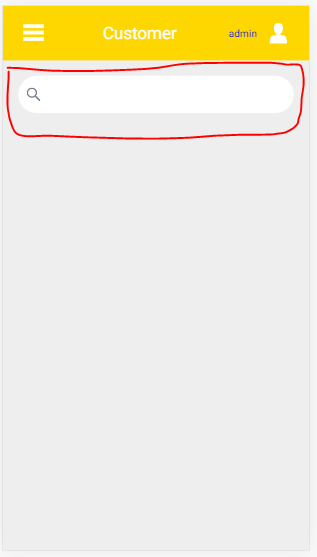
In one week, I've challenge with the background of vaadin-text-field. At end, I could git it.
In the vaadin-text-styles.js, this pages actually created for a new copy js. The styles can changed to be transparent background.
import '@vaadin/vaadin-lumo-styles/color.js';
import '@vaadin/vaadin-lumo-styles/sizing.js';
import '@vaadin/vaadin-lumo-styles/spacing.js';
import '@vaadin/vaadin-lumo-styles/style.js';
import '@vaadin/vaadin-lumo-styles/typography.js';
import '@vaadin/vaadin-lumo-styles/mixins/required-field.js';
import '@vaadin/vaadin-lumo-styles/font-icons.js';
import '@vaadin/vaadin-lumo-styles/mixins/field-button.js';
import { html } from '@polymer/polymer/lib/utils/html-tag.js';

const $_documentContainer = html`<dom-module id="lumo-text-field" theme-for="vaadin-text-field-1">
  <template>
    <style include="lumo-required-field lumo-field-button">
      :host {
        --lumo-text-field-size: var(--lumo-size-m);
        color: var(--lumo-body-text-color);
        font-size: var(--lumo-font-size-m);
        font-family: var(--lumo-font-family);
        -webkit-font-smoothing: antialiased;
        -moz-osx-font-smoothing: grayscale;
        -webkit-tap-highlight-color: transparent;
        padding: var(--lumo-space-xs) 0;
      }

      :host::before {
        height: var(--lumo-text-field-size);
        box-sizing: border-box;
        display: inline-flex;
        align-items: center;
      }

      :host([focused]:not([readonly])) [part="label"] {
        color: var(--lumo-primary-text-color);
      }

      [part="value"],
      [part="input-field"] ::slotted(input),
      [part="input-field"] ::slotted(textarea),
      /* Slotted by vaadin-select-text-field */
      [part="input-field"] ::slotted([part="value"]) {
        cursor: inherit;
        min-height: var(--lumo-text-field-size);
        padding: 0 0.25em;
        --_lumo-text-field-overflow-mask-image: linear-gradient(to left, transparent, #000 1.25em);
        -webkit-mask-image: var(--_lumo-text-field-overflow-mask-image);
      }

      [part="value"]:focus,
      [part="input-field"] ::slotted(input):focus,
      [part="input-field"] ::slotted(textarea):focus {
        -webkit-mask-image: none;
        mask-image: none;
      }

      /*
        TODO: CSS custom property in \`mask-image\` causes crash in Edge
        see https://developer.microsoft.com/en-us/microsoft-edge/platform/issues/15415089/
      */
      @-moz-document url-prefix() {
        [part="value"],
        [part="input-field"] ::slotted(input),
        [part="input-field"] ::slotted(textarea),
        [part="input-field"] ::slotted([part="value"]) {
          mask-image: var(--_lumo-text-field-overflow-mask-image);
        }
      }

      [part="value"]::-webkit-input-placeholder {
        color: inherit;
        transition: opacity 0.175s 0.05s;
        opacity: 0.5;
      }

      [part="value"]:-ms-input-placeholder {
        color: inherit;
        opacity: 0.5;
      }

      [part="value"]::-moz-placeholder {
        color: inherit;
        transition: opacity 0.175s 0.05s;
        opacity: 0.5;
      }

      [part="value"]::placeholder {
        color: inherit;
        transition: opacity 0.175s 0.1s;
        opacity: 0.5;
      }

      [part="input-field"] {
        border-radius: var(--lumo-border-radius);
        padding: 0 calc(0.375em + var(--lumo-border-radius) / 4 - 1px);
        font-weight: 500;
        line-height: 1;
        position: relative;
        cursor: text;
        box-sizing: border-box;
      }

      /* Used for hover and activation effects */
      [part="input-field"]::after {
        content: "";
        position: absolute;
        top: 0;
        right: 0;
        bottom: 0;
        left: 0;
        border-radius: inherit;
        pointer-events: none;
        background-color: var(--lumo-contrast-50pct);
        opacity: 0;
        transition: transform 0.15s, opacity 0.2s;
        transform-origin: 100% 0;
      }

      /* Hover */

      :host(:hover:not([readonly]):not([focused])) [part="label"] {
        color: var(--lumo-body-text-color);
      }

      :host(:hover:not([readonly]):not([focused])) [part="input-field"]::after {
        opacity: 0.1;
      }

      /* Touch device adjustment */
      @media (pointer: coarse) {
        :host(:hover:not([readonly]):not([focused])) [part="label"] {
          color: var(--lumo-secondary-text-color);
        }

        :host(:hover:not([readonly]):not([focused])) [part="input-field"]::after {
          opacity: 0;
        }

        :host(:active:not([readonly]):not([focused])) [part="input-field"]::after {
          opacity: 0.2;
        }
      }

      /* Trigger when not focusing using the keyboard */
      :host([focused]:not([focus-ring]):not([readonly])) [part="input-field"]::after {
        transform: scaleX(0);
        transition-duration: 0.15s, 1s;
      }

      /* Focus-ring */

      :host([focus-ring]) [part="input-field"] {
        box-shadow: 0 0 0 2px var(--lumo-primary-color-50pct);
      }

      /* Read-only and disabled */
      :host([readonly]) [part="value"]::-webkit-input-placeholder,
      :host([disabled]) [part="value"]::-webkit-input-placeholder {
        opacity: 0;
      }

      :host([readonly]) [part="value"]:-ms-input-placeholder,
      :host([disabled]) [part="value"]:-ms-input-placeholder {
        opacity: 0;
      }

      :host([readonly]) [part="value"]::-moz-placeholder,
      :host([disabled]) [part="value"]::-moz-placeholder {
        opacity: 0;
      }

      :host([readonly]) [part="value"]::placeholder,
      :host([disabled]) [part="value"]::placeholder {
        opacity: 0;
      }

      /* Read-only */

      :host([readonly]) [part="input-field"] {
        color: var(--lumo-secondary-text-color);
        background-color: transparent;
        cursor: default;
      }

      :host([readonly]) [part="input-field"]::after {
        background-color: transparent;
        opacity: 1;
        border: 1px dashed var(--lumo-contrast-30pct);
      }

      /* Disabled style */

      :host([disabled]) {
        pointer-events: none;
      }

      :host([disabled]) [part="input-field"] {
        background-color: var(--lumo-contrast-5pct);
      }

      :host([disabled]) [part="label"],
      :host([disabled]) [part="value"],
      :host([disabled]) [part="input-field"] ::slotted(*) {
        color: var(--lumo-disabled-text-color);
        -webkit-text-fill-color: var(--lumo-disabled-text-color);
      }

      /* Invalid style */

      :host([invalid]) [part="input-field"] {
        background-color: var(--lumo-error-color-10pct);
      }

      :host([invalid]) [part="input-field"]::after {
        background-color: var(--lumo-error-color-50pct);
      }

      :host([invalid][focus-ring]) [part="input-field"] {
        box-shadow: 0 0 0 2px var(--lumo-error-color-50pct);
      }

      :host([input-prevented]) [part="input-field"] {
        color: var(--lumo-error-text-color);
      }

      /* Small theme */

      :host([theme~="small"]) {
        font-size: var(--lumo-font-size-s);
        --lumo-text-field-size: var(--lumo-size-s);
      }

      :host([theme~="small"][has-label]) [part="label"] {
        font-size: var(--lumo-font-size-xs);
      }

      :host([theme~="small"][has-label]) [part="error-message"] {
        font-size: var(--lumo-font-size-xxs);
      }

      /* Text align */

      :host([theme~="align-center"]) [part="value"] {
        text-align: center;
        --_lumo-text-field-overflow-mask-image: none;
      }

      :host([theme~="align-right"]) [part="value"] {
        text-align: right;
        --_lumo-text-field-overflow-mask-image: none;
      }

      @-moz-document url-prefix() {
        /* Firefox is smart enough to align overflowing text to right */
        :host([theme~="align-right"]) [part="value"] {
          --_lumo-text-field-overflow-mask-image: linear-gradient(to right, transparent 0.25em, #000 1.5em);
        }
      }

      /* Slotted content */

      [part="input-field"] ::slotted(:not([part]):not(iron-icon):not(input):not(textarea)) {
        color: var(--lumo-secondary-text-color);
        font-weight: 400;
      }

      /* Slotted icons */

      [part="input-field"] ::slotted(iron-icon) {
        color: var(--lumo-contrast-60pct);
        width: var(--lumo-icon-size-m);
        height: var(--lumo-icon-size-m);
      }

      /* Vaadin icons are based on a 16x16 grid (unlike Lumo and Material icons with 24x24), so they look too big by default */
      [part="input-field"] ::slotted(iron-icon[icon^="vaadin:"]) {
        padding: 0.25em;
        box-sizing: border-box !important;
      }

      [part="clear-button"]::before {
        content: var(--lumo-icons-cross);
      }
    </style>
  </template>
</dom-module>`;

document.head.appendChild($_documentContainer.content);
And the vaadin-text-field-theme.js is also created for the copy vaadin-text-field. It is not modified but it should change 'vaadin-text-field-1' in static get is().
/**
@license
Copyright (c) 2017 Vaadin Ltd.
This program is available under Apache License Version 2.0, available at https://vaadin.com/license/
*/
import { PolymerElement } from '@polymer/polymer/polymer-element.js';

import { TextFieldMixin } from '@vaadin/vaadin-text-field/src/vaadin-text-field-mixin.js';
import { ElementMixin } from '@vaadin/vaadin-element-mixin/vaadin-element-mixin.js';
import { html } from '@polymer/polymer/lib/utils/html-tag.js';
import { ThemableMixin } from '@vaadin/vaadin-themable-mixin/vaadin-themable-mixin.js';
/**
 * `<vaadin-text-field>` is a Web Component for text field control in forms.
 *
 * ```html
 * <vaadin-text-field label="First Name">
 * </vaadin-text-field>
 * ```
 *
 * ### Prefixes and suffixes
 *
 * These are child elements of a `<vaadin-text-field>` that are displayed
 * inline with the input, before or after.
 * In order for an element to be considered as a prefix, it must have the slot
 * attribute set to `prefix` (and similarly for `suffix`).
 *
 * ```html
 * <vaadin-text-field label="Email address">
 *   <div slot="prefix">Sent to:</div>
 *   <div slot="suffix">@vaadin.com</div>
 * </vaadin-text-area>
 * ```
 *
 * ### Styling
 *
 * The following custom properties are available for styling:
 *
 * Custom property | Description | Default
 * ----------------|-------------|-------------
 * `--vaadin-text-field-default-width` | Set the default width of the input field | `12em`
 *
 * The following shadow DOM parts are available for styling:
 *
 * Part name | Description
 * ----------------|----------------
 * `label` | The label element
 * `input-field` | The element that wraps prefix, value and suffix
 * `value` | The text value element inside the `input-field` element
 * `error-message` | The error message element
 *
 * The following state attributes are available for styling:
 *
 * Attribute    | Description | Part name
 * -------------|-------------|------------
 * `disabled` | Set to a disabled text field | :host
 * `has-value` | Set when the element has a value | :host
 * `has-label` | Set when the element has a label | :host
 * `invalid` | Set when the element is invalid | :host
 * `input-prevented` | Temporarily set when invalid input is prevented | :host
 * `focused` | Set when the element is focused | :host
 * `focus-ring` | Set when the element is keyboard focused | :host
 * `readonly` | Set to a readonly text field | :host
 *
 * See [ThemableMixin – how to apply styles for shadow parts](https://github.com/vaadin/vaadin-themable-mixin/wiki)
 *
 * @memberof Vaadin
 * @mixes Vaadin.TextFieldMixin
 * @mixes Vaadin.ThemableMixin
 * @demo demo/index.html
 */
class TextFieldElement extends ElementMixin(TextFieldMixin(ThemableMixin(PolymerElement))) {
  static get template() {
    return html`
    <style include="vaadin-text-field-shared-styles">
      /* polymer-cli linter breaks with empty line */
    </style>

    <div class="vaadin-text-field-container">

      <label part="label" on-click="focus" id="[[_labelId]]">[[label]]</label>

      <div part="input-field">

        <slot name="prefix"></slot>

        <slot name="input">
          <input part="value">
        </slot>

        <div part="clear-button" id="clearButton" role="button" aria-label\$="[[i18n.clear]]"></div>
        <slot name="suffix"></slot>

      </div>

      <div part="error-message" id="[[_errorId]]" aria-live="assertive" aria-hidden\$="[[_getErrorMessageAriaHidden(invalid, errorMessage, _errorId)]]">[[errorMessage]]</div>

    </div>
`;
  }

  static get is() {
    return 'vaadin-text-field-1';
  }

  static get version() {
    return '2.4.5';
  }

  static get properties() {
    return {
      /**
       * Identifies a list of pre-defined options to suggest to the user.
       * The value must be the id of a <datalist> element in the same document.
       */
      list: {
        type: String
      },

      /**
       * A regular expression that the value is checked against.
       * The pattern must match the entire value, not just some subset.
       */
      pattern: {
        type: String
      },

      /**
       * Message to show to the user when validation fails.
       */
      title: {
        type: String
      }
    };
  }
}

customElements.define(TextFieldElement.is, TextFieldElement);

export { TextFieldElement };
At the end, it can work with created the vaadin-text-field-1.
import './vaadin-text-field-theme.js';
import './vaadin-text-styles';
After that, you can import './vaadin-text-field-1.js' in any pages.
Thank you for sharing our experience with kind.