0

I'm trying to get a card to be vertically centered between the search bar and the bottom of the viewport.

I've tried to make the body height 100%, but then it extends past the viewport and the user is able to scroll down into whitespace. I've tried to use align-content: center; on the parent container, but it doesn't change anything.

html.html


<body>
    <div class="navbar navbar-expand-lg sticky-top">
        <!-- nav info -->
    </div>

    <div class="container-fluid">

        <!-- Title above search bar -->
        <div class="row">
            <div id="search-title" class="col-xl-6 col-md-7 col-sm-8 col-8 mx-auto">
                <h3>Title</h3>
            </div>
        </div>

        <!-- Search bar -->
        <div class="row">
            <div class="col-xl-6 col-md-7 col-sm-8 col-8 mx-auto">
                <!-- search form -->
                </form>
            </div>
        </div>

        <!-- No results -->
        <div class="row">
            <div id="no-results" class="col-xl-6 col-md-7 col-sm-8 col-8 mx-auto">

                {% if term != '' and not cameras %}
                <!-- if no results then tell user -->
                {% endif %}

            </div>
        </div>

        <!-- Resulting card from search -->
        {% if camera %}
        <div class="container align-center">
            <!-- I would like this card to be vertically centered between the search bar and the bottom of viewport -->
            <div class="col-xl-6 col-md-7 col-sm-8 col-8 mx-auto card myclass">
                <div class="card-body">
                    <!-- info -->
                </div>
            </div>
        </div>
        {% endif %}
    </div>
</body>

css

html, body {
    height: 100%;
    width: 100%;
}

.align-center {
    align-content: center;
}

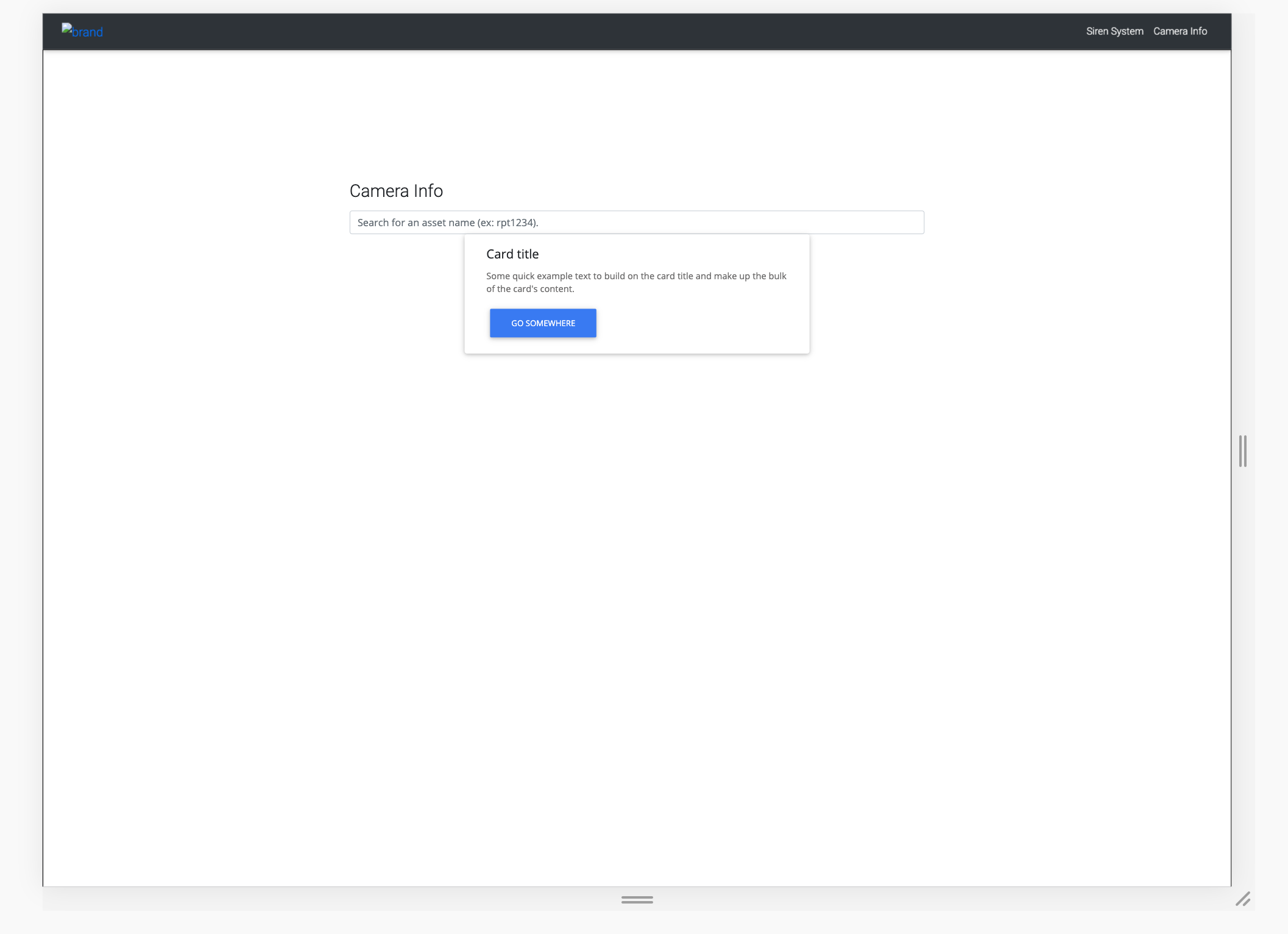
This is what it looks like right now. Notice how the border on the body is below the viewport.

Current image

Hunter
  • 646
  • 1
  • 6
  • 23
  • 1
    Can't get you but keep in mind to center a `static` positioned element both horizontally and vertically in its parent using `flexbox` use `justify-content: center` for horizontal alignment and `align-items: center` for vertical alignment. Keep in mind the main axis while doing so. – Saqlain Jun 20 '19 at 20:09
  • @Saqlain I just changed the css class `.align-center` to `align-items: center;` and the card is still in the same position. I'm trying to get the card to be vertically centered in all that whitespace right below it (ie. in between the search bar and the bottom of the viewport.) – Hunter Jun 20 '19 at 20:25
  • What @Saqlain means is, add `display:flex;`, `justify-content:center;` and `align-items:center;` to the card. – Aakash Choubey Jun 20 '19 at 21:23
  • @Hunter I assumed that you are aware of `flexbox` model. But it seems you are not. Please read this article https://www.w3.org/TR/css-flexbox-1/ – Saqlain Jun 21 '19 at 17:30

3 Answers3

1

You can wrap your card element inside a container(card-container) with position property set to relative. Give your card absolute positioning with top property set to 50%. Make sure your container has a height property specified.

Edit 2:

You can also use the flex-box feature of css to make your layout more reponsive. It will also resolve the issue that you are having on big screen. I have update the code inside the container and css classes applied to container section. Update your code accordingly and let me know.

.card-container {
  display: flex;
  flex-direction: row;
  justify-content: center;
  align-items: center;
  border: 2px solid red;
}


.card-body {
  flex: 2 0;
  align-self: center;
  border: 2px solid green;
}
.card {
  flex: 1 1;
  align-self: center;
  
}


.good-status {
  color: #45A163;
}

.bad-status {
  color: red;
}
  <div class="card-container">
    <div class="card mx-auto"></div>
    <div class="card-body">
      <h5 class="card-title text-center">Title</h5>
      <ul>
        <li>Item 1</li>
        <li>Item 1</li>
        <li>Item 1</li>
        <li>Item 1</li>
      </ul>
      <a href="#" class="btn btn-primary">Ping device</a>
      <a href="#" class="btn btn-primary">Go to webbooter page</a>
    </div>
       <div class="card mx-auto"></div>
  </div>
</div>
Ajay Sharma
  • 166
  • 1
  • 6
  • Thanks for the help!! Here is another set of pictures with the updated results https://imgur.com/a/G4dVVSw. Also, here is a JSFiddle of exactly what i'm working with https://jsfiddle.net/hqovfu2b/5/. I've written my current issues in the comments of the imgur pictures. – Hunter Jun 20 '19 at 22:27
  • @Hunter I have updated the answer according to images. Flexbox approach will give you more sustainable UI across the different devices. – Ajay Sharma Jun 21 '19 at 00:16
  • For some reason this didn't work for me. I'm going to try playing around with it but this is the new results: https://imgur.com/a/6Fc27FB. I'm going to try – Hunter Jun 21 '19 at 01:17
  • @Hunter Did you add another card div in your html? N also remove the border property for .card from css? Check my mentioned html there is two card divs in the container. – Ajay Sharma Jun 21 '19 at 01:20
  • Yes I made all the changes you made. Here's a jsfiddle of what it looks like for me: https://jsfiddle.net/ftysx6oq/1/. It's hugging the search bar again – Hunter Jun 21 '19 at 12:11
  • @Hunter I can clearly see in this fiddle that you didn't change the css for .card-container, .card and .card-body as mentioned. – Ajay Sharma Jun 21 '19 at 12:33
  • I'm sorry I forgot to save the fiddle. I saved it now, but if it's still not showing up use this one: https://jsfiddle.net/9xr5k80t/4/ – Hunter Jun 21 '19 at 12:36
  • Add height property to .card-container. It should work fine. https://jsfiddle.net/b0q28yj1/2/ – Ajay Sharma Jun 21 '19 at 12:56
1
  1. You can do this by setting up your page height. Actually height:100vh fills the page completely. As you have the navbar, calc the height of it and subtract it from 100vh in this way height:calc(100vh - (56px)).
  2. To set your card to the center of the page, you can use position:absolute and transform:translate(-50%,-50%) property. It will align your card to the vertical and horizontal center. I will be aligned to center in all the devices too.

<!DOCTYPE html>
<html>

<head>
  <meta charset="utf-8">
  <meta name="viewport" content="width=device-width, initial-scale=1">
  <link rel="stylesheet" href="https://maxcdn.bootstrapcdn.com/bootstrap/4.3.1/css/bootstrap.min.css">
  <link rel="stylesheet" href="https://use.fontawesome.com/releases/v5.1.0/css/all.css"
    integrity="sha384-lKuwvrZot6UHsBSfcMvOkWwlCMgc0TaWr+30HWe3a4ltaBwTZhyTEggF5tJv8tbt" crossorigin="anonymous">
  <script src="https://ajax.googleapis.com/ajax/libs/jquery/3.4.0/jquery.min.js"></script>
  <script src="https://cdnjs.cloudflare.com/ajax/libs/popper.js/1.14.7/umd/popper.min.js"></script>
  <script src="https://maxcdn.bootstrapcdn.com/bootstrap/4.3.1/js/bootstrap.min.js"></script>
  <style>
    .form-control-borderless {
      border: none;
    }

    .form-control-borderless:hover,
    .form-control-borderless:active,
    .form-control-borderless:focus {
      border: none;
      outline: none;
      box-shadow: none;
    }
    .centre{
      position: absolute;
      top: 50%;
      left: 50%;
      transform: translate(-50%,-50%)
    }
  </style>
</head>

<body>
  <nav class="navbar navbar-expand-lg bg-dark navbar-dark sticky-top">
    <a class="navbar-brand" href="#"><img class="img-responsive" src="/testing/users/images/logo.png"></a>
    <button class="navbar-toggler" type="button" data-toggle="collapse" data-target="#collapsibleNavbar">
      <span class="navbar-toggler-icon"></span>
    </button>
    <div class="collapse navbar-collapse" id="collapsibleNavbar">
      <ul class="navbar-nav  ml-auto">
        <li class="nav-item"><a href="/testing/" class="nav-link"><span class="fa fa-fw fa-home"></span> Home</a></li>
        <li class="nav-item"><a href="/testing/users/account.php" class="nav-link"><span
              class="fa fa-fw fa-user"></span> admin</a></li>
        <li class="nav-item">
          <a href="/testing/users/messages.php" class="nav-link">
            <span class="fa fa-envelope"></span><i class="badge"></i> Message</a>
        </li>
        <li class="nav-item dropdown">
          <a class="nav-link dropdown-toggle" href="#" id="dropdown_main" data-toggle="dropdown" aria-haspopup="true"
            aria-expanded="false"><span class="fa fa-fw fa-cogs"></span> <span class="caret"></span>Settings</a>
          <div class="dropdown-menu dropdown-info" aria-labelledby="dropdown_main">
            <a class="dropdown-item" href="/testing/"><span class="fa fa-fw fa-home"></span> Home</a>
            <div class="dropdown-divider"></div>
            <a class="dropdown-item" href="/testing/users/account.php"><span class="fa fa-fw fa-user"></span>
              Account</a>
            <a class="dropdown-item" href="/testing/users/admin.php"><span class="fa fa-fw fa-cogs"></span> Admin
              Dashboard</a>
            <a class="dropdown-item" href="/testing/users/admin.php?view=users"><span class="fa fa-fw fa-user"></span>
              User Management</a>
            <a class="dropdown-item" href="/testing/users/admin.php?view=permissions"><span
                class="fa fa-fw fa-lock"></span> Permissions Management</a>
            <a class="dropdown-item" href="/testing/users/admin.php?view=pages"><span class="fa fa-fw fa-wrench"></span>
              Page Management</a>
            <a class="dropdown-item" href="/testing/users/admin.php?view=messages"><span
                class="fa fa-fw fa-envelope"></span> Messages Manager</a>
            <a class="dropdown-item" href="/testing/users/admin.php?view=logs"><span class="fa fa-fw fa-search"></span>
              System Logs</a>
            <a class="dropdown-item" href="/testing/users/logout.php"><span class="fa fa-fw fa-sign-out"></span>
              Logout</a>
          </div>
        </li>
        <li class="nav-item dropdown menu">
          <a class="nav-link dropdown-toggle" href="#" id="navbarDropdown" role="button" data-toggle="dropdown"
            aria-haspopup="true" aria-expanded="false">
            <span class="fa fa-fw fa-lock"></span> menu
          </a>
          <div class="dropdown-menu w-100" aria-labelledby="navbarDropdown">
            <a class="dropdown-item mx-auto" href="#">Action</a>
            <a class="dropdown-item" href="#">Another action</a>
            <a class="dropdown-item" href="#">Another action</a>
            <a class="dropdown-item" href="#">Another action</a>
          </div>
        </li>
      </ul>
    </div>
  </nav>
  <div class="container" style="height:calc(100vh - (56px))">
    <br>
    <div class="row justify-content-center">
      <div class="col-12 col-md-10 col-lg-8">
        <form class="card card-sm">
          <div class="card-body row no-gutters align-items-center">
            <div class="col-auto">
              <i class="fas fa-search h4 text-body"></i>
            </div>

            <div class="col">
              <input class="form-control form-control-lg form-control-borderless" type="search"
                placeholder="Search topics or keywords">
            </div>

            <div class="col-auto">
              <button class="btn btn-lg btn-success" type="submit">Search</button>
            </div>
            <!--end of col-->
          </div>
        </form>
      </div>
      <!--end of col-->
    </div>
    <div class="col-sm-6 centre">
      <div class="card bg-light ">
        <div class="card-body text-center">
          <p class="card-text">Some text inside the card</p>
        </div>
      </div>
    </div>
  </div>
</body>

</html>
Sai Manoj
  • 3,809
  • 1
  • 14
  • 35
0

There's no reason to use height:100%, calc() or extra CSS. Use the flexbox classes available in Bootstrap 4. Set a min height on the body (min-vh-100), flex direction column, and then flex-fill to allow the container to fill the remaining height. The vertical centering will then work as expected.

<body class="d-flex flex-column min-vh-100">
   <nav>
   </nav>
   <div class="container-fluid d-flex flex-column flex-fill align-items-center justify-content-center">
      <div class="row">...</div>
   </div>
</body>

https://www.codeply.com/go/3k7MBc10tb

Related: Bootstrap 4: How to make the row stretch remaining height?

Carol Skelly
  • 351,302
  • 90
  • 710
  • 624
  • This helped a lot. I think flex-properties are probably the way to go. One last question: if I wanted to vertically align the card (see picture link) at any percentage away from the top of its container, how would I do that? https://imgur.com/a/27hwFPE. In your example, it would be the div class underneath the nav that I would like to vertically place at any percentage inside its parent element – Hunter Jun 21 '19 at 13:22
  • I'm not sure exactly what you mean. The form is no longer vertically centered and the height of the card container seems random – Carol Skelly Jun 21 '19 at 13:25
  • The picture is what I was going for the entire time. I wanted to center the card in between the search bar and the bottom of the viewport, and you've helped me accomplish that. I thought you were just centering the form to showcase how to use the flex properties. – Hunter Jun 21 '19 at 13:26
  • I think I may have gotten it. I took away the justify-content-center on my parent class, and then on the child element I just used margin-top. – Hunter Jun 21 '19 at 13:32