0

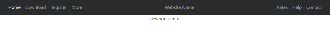
I am new to coding websites and very new to Bootstrap. I am trying to center the brand in the navbar and align text to the left of the brand. But every time I try, it centers both the brand and the text. I want the brand to be in the middle always.

<nav class="navbar navbar-expand-md flex-column">
    <div class="container justify-content-center flex-row navbar-expand-md">
        <a href="/index.html" class="navbar-brand">VIRAL BEAUTY</a>
        <h4>Beauty Products As Seen On YouTube</h4>
    </div>
</nav>

--

nav{
  height: 6vh
}

.navbar-brand{
  border: 2px #FA5DB1 solid;
  padding: 5px 10px;
}

.navbar-brand:hover{
  text-decoration: none;
  color: #FA5DB1;
  cursor: pointer;
}

.navbar a{
  text-decoration: none;
  color: #FA5DB1;
  font-weight: 500;
}

.navbar h4{
  font-size: 12px;
  margin: 0;
}

PS: I am not sure how to paste my code so I apologize.

1 Answers1

0

In Bootstrap 4 navbar is using flexbox. It helps in centering the barnd name or any name that you need to get centered. so the it can be centered using mx-auto. Then left right menus will not need floats.

 <nav class="navbar navbar-expand-md navbar-fixed-top navbar-dark bg-dark main-nav">
    <div class="container">
        <ul class="nav navbar-nav">
            <li class="nav-item active">
                <a class="nav-link" href="#">Home</a>
            </li>
            <li class="nav-item">
                <a class="nav-link" href="#">products</a>
            </li>
            <li class="nav-item">
                <a class="nav-link" href="#">Hair products</a>
            </li>
        </ul>
        <ul class="nav navbar-nav mx-auto">
            <li class="nav-item"><a class="nav-link" href="#">VIRTUAL BEAUTY</a></li>
        </ul>
        <ul class="nav navbar-nav">
            <li class="nav-item">
                <a class="nav-link" href="#">Services</a>
            </li>
            <li class="nav-item">
                <a class="nav-link" href="#">Blog</a>
            </li>
            <li class="nav-item">
                <a class="nav-link" href="#">Contact Us</a>
            </li>
        </ul>
    </div> </nav>

This will give you a nav bar like the image below. enter image description here

Reference image from: Center an element in Bootstrap 4 Navbar

Here you can see the actual viewport center is different from the center that brand name is located at. Thats because it takes center in respective to the left and right ends of navigation bar.

The following code can be used to overcome this issue. BY using position absolute.

.abs-center-x {
    position: absolute;
    left: 50%;
    transform: translateX(-50%); }

Hope this helps.

Follow this link It much clearly illustrates the way to do your work. mx-auto to center navbar- https://www.codeply.com/go/J9rL11Tf7h Navbar center and absolute position- https://www.codeply.com/go/BC2gFdZ9fb

Carol Skelly
  • 351,302
  • 90
  • 710
  • 624
Sadie Kelsey
  • 42
  • 10
  • To paste your code properly follow the below steps. 1.Paste your code in the editor. 2.select whole code text 3.click on {} icon on the tool bar. It will display properly then when it posted. – Sadie Kelsey Jun 21 '19 at 04:02
  • That is exactly what I needed! Thank you so much Sadie! – theryanshafer Jun 21 '19 at 04:17