-3

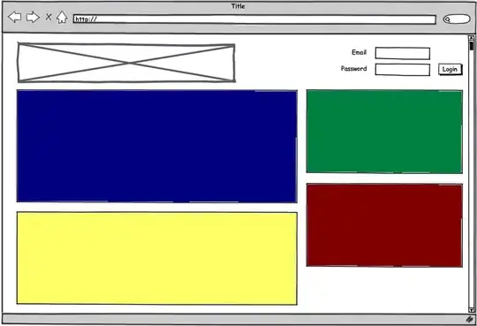
I need to arrange following set of cards into two columns and appear vertically after one by one. SO that I can arrange then in a order in mobile devices.

enter image description here

I have used flex layout to create this but it doesn't help when the cards had different heights.

<div class="ui container">
  <div class="ui segment">About</div>
  <div class="ui segment">Video</div>
  <div class="ui segment">Experiences</div>
  <div class="ui segment">Preferences</div>
  <div class="ui segment">Skills</div>
  <div class="ui segment">Education</div>
  <div class="ui segment">Projects</div>
</div>

Here is the Codepen example for this.

Mobile design would be like this.

enter image description here

Andrew Thompson
  • 168,117
  • 40
  • 217
  • 433
WenukaGTX
  • 155
  • 1
  • 1
  • 9
  • @Paulie_D It's for the layouts which has one card in the left column. In my case I cannot make left side card height 100%. I need every card to arrange one after one into two columns. – WenukaGTX Jul 02 '19 at 09:08
  • Issue is the same - it's not possible at present without additional wrappers and `display:contents` which has little support. CSS-Grid can't help as it's clearly *not a grid*. – Paulie_D Jul 02 '19 at 09:21
  • @Paulie_D I suggest that this not a duplicated question. This is a unique requirement. – WenukaGTX Jul 02 '19 at 10:12
  • The *basic* issue is a duplicate as I have already stated. This is not possible with your given structure. - check the other link. – Paulie_D Jul 02 '19 at 10:16

1 Answers1

-1

Please use the one of the following:-

  1. Bootstrap - https://getbootstrap.com/ This will give you a row-column layout of 12 grids. It is just a css file. You can manipulate your look for different screens simply using css classes.

  2. Media Queries -Media Queries

Shruti Agrawal
  • 366
  • 1
  • 9