9

The goal is to render HTML elements with perspective, as in the examples below.

We tried using CSS skew transformations, but those didn't look right as they warped the element's aspect ratio or otherwise created distortions.

Here are CSS skew transformations we tried. None of these look as good as the examples below.

Codepen: https://codepen.io/anon/pen/MMzdPx

transform: skew(20deg, -15deg);

transform: skew(45deg, -25deg);

transform: skew(45deg, -30deg);

How can you achieve this kind of perspective rendering of HTML elements?
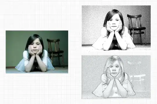
enter image description here enter image description here enter image description here enter image description here

Crashalot
  • 33,605
  • 61
  • 269
  • 439

3 Answers3

12

As you said, use perspective combined with some rotation

img {
  width:150px;
  margin:20px;
}
img.first {
  transform:perspective(500px) rotateY(20deg);
}
img.last {
  transform:perspective(500px) rotateY(-20deg);
}
<img src="https://i.imgur.com/DGAOsPz.png" class="first">
<img src="https://i.imgur.com/DGAOsPz.png" class="last">

img {
  width:150px;
  margin:30px;
  transform:perspective(500px)  rotateY(15deg) rotateX(50deg) rotateZ(-20deg);
}
<img src="https://i.imgur.com/DGAOsPz.png" >

Related question for more details:

CSS 3d transform doesn't work if perspective is set in the end of property

Temani Afif
  • 245,468
  • 26
  • 309
  • 415
  • I’m not sure whether the asker wants [perspective projection](https://en.wikipedia.org/wiki/Perspective_(graphical)) or [parallel projection](https://en.wikipedia.org/wiki/Parallel_projection). The above code examples use perspective projection, but if you want parallel projection instead, you can just change `perspective(500px)` to `perspective(0)`. – Rory O'Kane Jul 22 '19 at 14:44
3

Something like this. I used CSS custom properties, to make the calculation a little bit more obvious.

Please note: The order of the transform properties is very important. It is evaluated from right to left:

From MDN transform CSS

The transform functions are multiplied in order from left to right, meaning that composite transforms are effectively applied in order from right to left.

That means, transform: rotateX(90deg) translateX(100px) is not the same as transform: translateX(100px) rotateX(90deg). The former first translates and then rotates while the latter does the rotation before the translations.

.box {
  width: 130px;
  height: 268px;
  background-size: cover;
}
.box:nth-child(4n+1) {
  background: url(https://picsum.photos/id/100/136/276);
}
.box:nth-child(4n+2) {
  background: url(https://picsum.photos/id/200/136/276);
}
.box:nth-child(4n+3) {
  background: url(https://picsum.photos/id/300/136/276);
}
.box:nth-child(4n+4) {
  background: url(https://picsum.photos/id/400/136/276);
}

.container {
  transform: perspective(1200px) rotateX(60deg) rotateZ(-35deg) translate3d(-100px, -200px, -500px);
}

.skew {
  position: absolute;
  top: 200px;
  left: 50%;
  --width: 140px;
  --height: 278px;
  --x: 0;
  --y: 0;
  --offsetX: calc(var(--x) * var(--width));
  --offsetY: calc(var(--y) * var(--height));
  transform: translate(var(--offsetX), var(--offsetY));
}
.skew:nth-child(5n + 1) {
  --x: -2;
}
.skew:nth-child(5n + 2) {
  --x: -1;
}
.skew:nth-child(5n + 3) {
  --x: 0;
}
.skew:nth-child(5n + 4) {
  --x: 1;
}
.skew:nth-child(5n + 5) {
  --x: 2;
}
.skew:nth-child(n + 1):nth-child(-n + 5) {
  --y: -2;
}
.skew:nth-child(n + 6):nth-child(-n + 10) {
  --y: -1;
}
.skew:nth-child(n + 11):nth-child(-n + 15) {
  --y: 0;
}
.skew:nth-child(n + 16):nth-child(-n + 20) {
  --y: 1;
}
.skew:nth-child(n + 21):nth-child(-n + 25) {
  --y: 2;
}
<div class="container">
  <div class="skew box"></div>
  <div class="skew box"></div>
  <div class="skew box"></div>
  <div class="skew box"></div>
  <div class="skew box"></div>
  <div class="skew box"></div>
  <div class="skew box"></div>
  <div class="skew box"></div>
  <div class="skew box"></div>
  <div class="skew box"></div>
  <div class="skew box"></div>
  <div class="skew box"></div>
  <div class="skew box"></div>
  <div class="skew box"></div>
  <div class="skew box"></div>
  <div class="skew box"></div>
  <div class="skew box"></div>
  <div class="skew box"></div>
  <div class="skew box"></div>
  <div class="skew box"></div>
  <div class="skew box"></div>
  <div class="skew box"></div>
  <div class="skew box"></div>
  <div class="skew box"></div>
  <div class="skew box"></div>
</div>
yunzen
  • 32,854
  • 11
  • 73
  • 106
0

You have to build the element so to speak. The following from your codepen: Changed html:

<div class="perspective">
<div class="skew">
<div class="front"></div>
<div class="back"></div>
<div class="left"></div>
<div class="right"></div>
</div>
</div>

changed css:

.perspective {
position: relative;
-webkit-perspective: 1242px; /* Safari 4-8 */
perspective: 1242px;
height: 2688px;
}

.front {
width: 1242px;
height: 2688px;
max-width: 100%;
max-height: 100%;
position: absolute;
transform: rotateX(45deg) rotateY(-60deg) translateZ(-80em);
background: url(https://i.imgur.com/DGAOsPz.png);
}

.skew {
transform-style: preserve-3d;
transform: rotateX(10deg) rotateY(80deg);
height: 2560px;
width: 100%;
}

Still need sides and back added in the css, but you can paste this into your codepen and see how it is working.

Mr.Lister
  • 422
  • 3
  • 11