It's already 2019, iPhone retina invented near 10 years, as you may know, you can now use 0.5px as border width in CSS3, and most of iPhone and Android devices can correctly solve it as 1px in retina screen.
My question is, if I specify font-size: 12px, actually it will show a font size with 24px in retina screen. If I want to show 25px font in retina screen, can I use font-size: 12.5px? Thanks!
I asked our UI designer, she said she will use 750px as width when designing for mobile. So that means if she set a text font size as 28px, I will divide it by 2, so I should use 14px in my css, right?
But that bring another question: the UI designer can only design by 22px, 24px, 26px, 28px and so on, so I can divide by 2, to get 11px, 12px, ... in css.
If UI designer set font size as 25px, we cannot use 12.5px in css. I've tried to set font-size: 12.5px, but it won't work, browsers simply convert it as 13px.
How to exactly set it as UI picture?
@Josh Lee, Thank you very much! I tried your code in desktop Chrome browser, it shows like below:

This is great! However, if I run the code in Safari of the newest iPhone iOS 12.3.1, it shows as below:
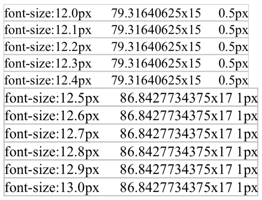
You can see that iPhone still cannot correctly show .5 font size, it will either change it to 12px or 13px, just cannot be 12.5px.
I also tried the code on Android Chrome, it shows correctly.
iPhone really sucks.