0

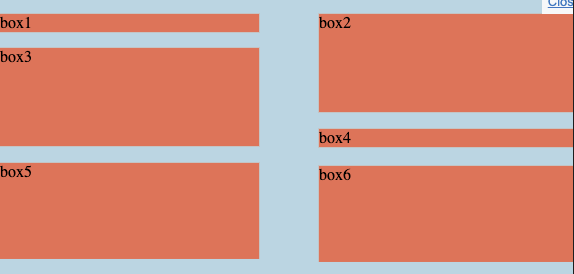
There are big gaps between box3, box1 and box4, box6 How to get rid of the gap? so each box could have the dynamic height?

.wrap {
  display: flex;
  align-items: baseline;
  align-content:flex-start;
  justify-content: space-between;
  flex-wrap: wrap; 
  background-color: lightblue;
}

.box {
  display: flex;
  background-color: tomato;
  box-sizing: border-box;
  border: 1px solid #C4C4C4;
  height: 100px;
  width: 45%;
  margin-top: 15px;
}

.box1, .box4 {
  height: 20px;
}
  <div class="wrap">
    <div class="box box1">box1</div>
    <div class="box box2">box2</div>
    <div class="box box3">box3</div>
    <div class="box box4">box4</div>
    <div class="box box5">box5</div>
    <div class="box box6">box6</div>
  </div>

Here is the desired layout. Thanks

enter image description here

olo
  • 5,225
  • 15
  • 52
  • 92
  • Your question is confusing. Could you please state the exact problem in a better way? What is the current problem and what you expect would be helpful. – maazadeeb Jul 12 '19 at 03:55

4 Answers4

5

The default direction of flex is row, and when you use flex-wrap: wrap push overflowed element downed to another row, and the row height will default always equal to the highest element of that row, that why you seeing the element having that gap.

This can be done if you change the flex direction to column and give the wrap element a fixed height so it push overflowed element to it right, from top to bottom.

.wrap {
  /*Added these*/
  height: 300px;
  flex-direction: column;
  /*-----------*/
  display: flex;
  align-items: baseline;
  align-content: space-around;
  flex-wrap: wrap; 
  background-color: lightblue;

}

.box {
  display: flex;
  background-color: tomato;
  box-sizing: border-box;
  border: 1px solid #C4C4C4;
  height: 100px;
  width: 45%;
  margin-top: 15px;
}

.box1, .box5 {
  height: 20px;
}
  <div class="wrap">
    <div class="box box1">box1</div>
    <div class="box box2">box2</div>
    <div class="box box3">box3</div>
    <div class="box box4">box4</div>
    <div class="box box5">box5</div>
    <div class="box box6">box6</div>
  </div>
Ethan Vu
  • 2,911
  • 9
  • 25
1

Since FlexBox is going to attempt to line the boxes up in rows, you have to create two separate FlexBoxes with flex-flow: column set. You can achieve this affect with about the same amount of CSS though:

.outer{
    display: flex;
    padding: 15px 0;
    background-color: lightblue;
}

.wrap {
  display: flex;
  flex-flow: column;
  flex-grow: 1;
}

.wrap:nth-child(2){
   align-items: flex-end;
}

.box {
  background-color: tomato;
  box-sizing: border-box;
  border: 1px solid #C4C4C4;
  height: 100px;
  width: 90%;
  margin-top: 15px;
}

.box1, .box4{
  margin-top: 0;
}

.box1, .box5 {
  height: 20px;
}
<div class="outer">
    <div class="wrap">
        <div class="box box1">box1</div>
        <div class="box box2">box2</div>
        <div class="box box3">box3</div>
    </div>
    <div class="wrap">
        <div class="box box4">box4</div>
        <div class="box box5">box5</div>
        <div class="box box6">box6</div>
    </div>
</div>
symlink
  • 11,984
  • 7
  • 29
  • 50
1

You could instead use a CSS grid layout depending on your browser support requirements.

Great resource on CSS Grid: https://css-tricks.com/snippets/css/complete-guide-grid/

Browser support: https://caniuse.com/#feat=css-grid

.wrap {
  display: grid;
  background-color: lightblue;
  grid-template-columns: 50% 50%;
  grid-template-rows: repeat(14, 20px);
  background-color: lightblue;
}

.box {
  background-color: tomato;
  box-sizing: border-box;
  border: 1px solid #C4C4C4;
  height: 100px;
  width: 90%;
  margin-top: 15px;
}
.box1 {
  grid-row: 1/2;
}
.box2 {
  grid-row: 1/5;
}
.box3 {
  grid-row: 3/8;
}
.box4 {
  grid-row: 7/8;
}
.box5, .box6 {
  grid-row: 9/14;
}
.box1, .box4 {
  height: 20px;
}
  <div class="wrap">
    <div class="box box1">box1</div>
    <div class="box box2">box2</div>
    <div class="box box3">box3</div>
    <div class="box box4">box4</div>
    <div class="box box5">box5</div>
    <div class="box box6">box6</div>
  </div>
0

Flex is always going to create a grid which is why you're seeing big spaces. Neither flex:row or flex:column will achieve the order that you have specified. Flex column will be able to achieve the layout that you're after like Ethan Vu suggested but that main caveat in that solution is a mandatory fixed height container which you may not want.

If you want a layout like that and don't want a fixed height then you can try using css columns or go for a javascript solution and use a 2 column masonry layout.

lucidlips
  • 46
  • 2