I'm trying to achieve a flexbox, where the row will have the titles all lined up. Requirements:
- The images won't always be the same height
- The description won't always be the same height
- The title could be 1 row, or 3 (depending on the length)
Here is a simple fiddle:
https://jsfiddle.net/youradds/r56j4uLe/6/
As you can see this is what you get:
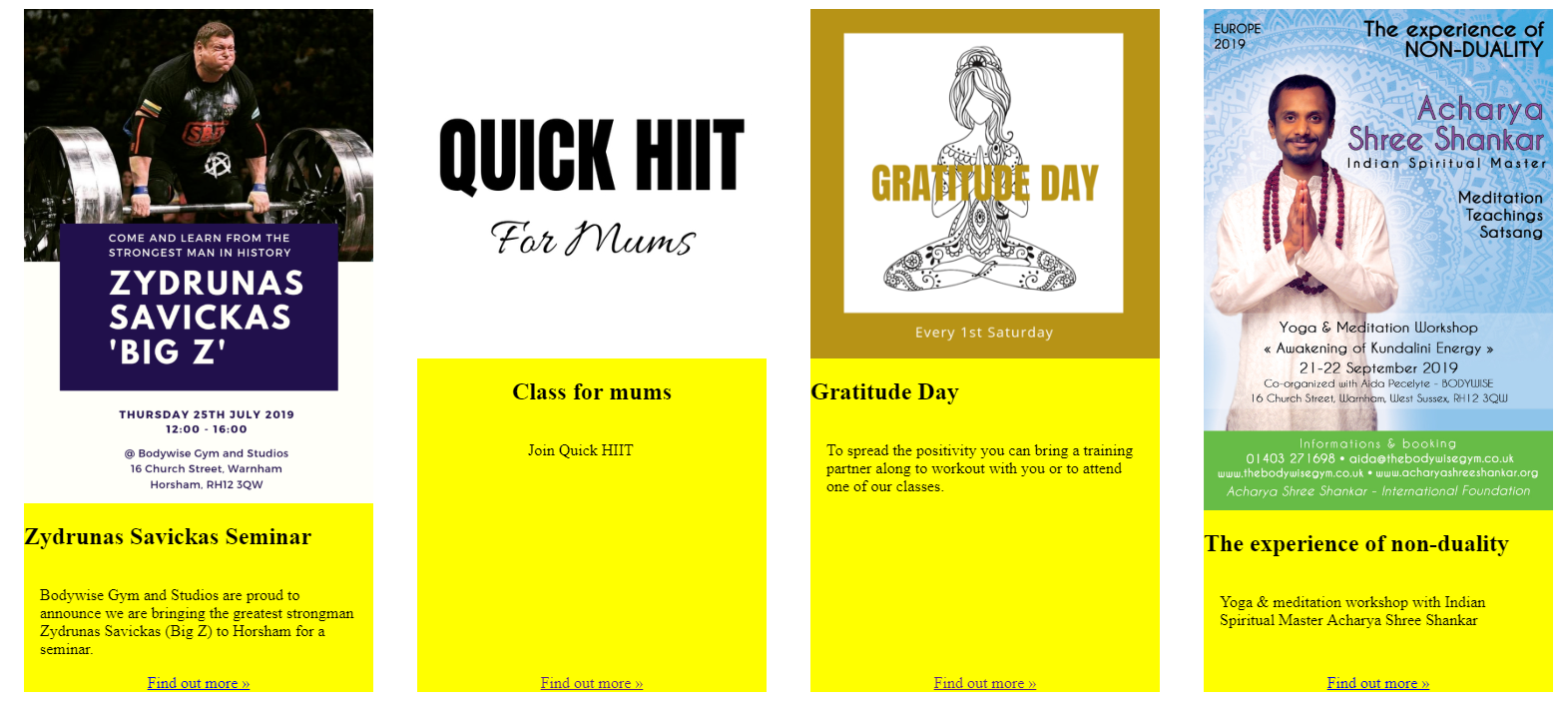
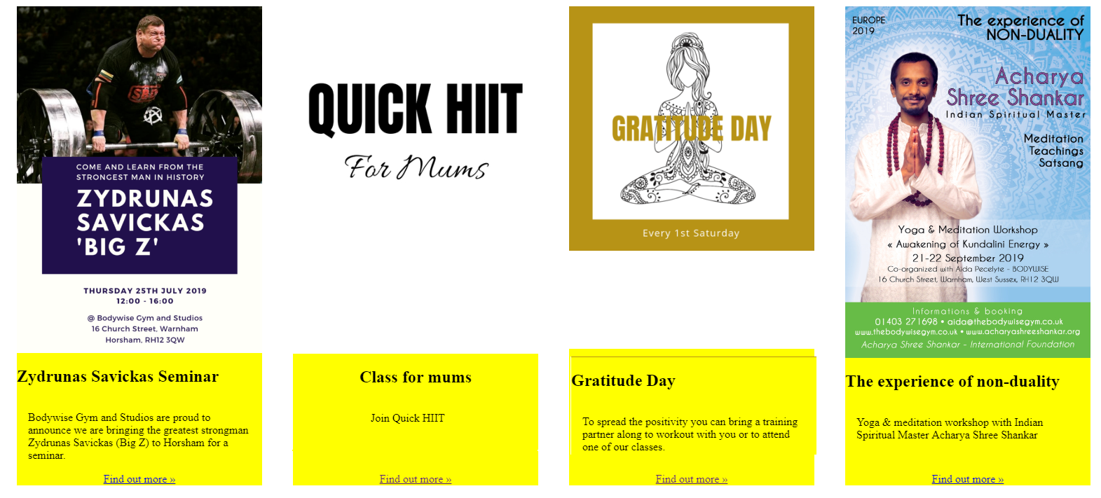
This is more what I'm after:
My SCSS is:
#item-wrapper {

    display: flex;
    justify-content: space-around;
    flex-wrap: wrap;

    .item-block {

    background: yellow;

        flex-grow: 0;
        width: 350px;
        margin: 2rem 1rem;

        display: flex;
        flex-direction: column;
        justify-content: space-between;
        align-content: center;
        align-items: center;

        .what-logo {

            img {
                max-height: 100%;
            }
        }

        .text-info {
            flex-grow: 1;

            .desc {
                padding: 1rem;
            }

            h2 {
                flex-grow: 0;
            }

        }


        .action-button {
            margin: 0 auto;
        }


    }
}

.pure-img {
  max-width: 100%;
  height: auto;
  display: block;
}
..and test HTML:
<div id="item-wrapper">
<div class="item-block">
<div class="what-logo">
<img src="https://bodywisegym.co.uk/2018/images/events/3/3-1562951826-3.png" class="pure-img">
</div>
<div class="text-info">
<h2>Zydrunas Savickas Seminar</h2>
<div class="desc">Bodywise Gym and Studios are proud to announce we are bringing the greatest strongman Zydrunas Savickas (Big Z) to Horsham for a seminar.</div>
</div>
<a href="https://yogida.co.uk/collections/events/products/zydrunas-savickas-big-z-seminar" class="action-button">Find out more »</a>
</div>
<div class="item-block">
<div class="what-logo">
<img src="https://bodywisegym.co.uk/2018/images/events/7/7-1562936970-7.jpg" class="pure-img">
</div>
<div class="text-info">
<h2>Class for mums</h2>
<div class="desc">Join Quick HIIT</div>
</div>
<a href="" class="action-button">Find out more »</a>
</div>
<div class="item-block">
<div class="what-logo">
<img src="https://bodywisegym.co.uk/2018/images/events/6/6-1562936464-6.png" class="pure-img">
</div>
<div class="text-info">
<h2>Gratitude Day</h2>
<div class="desc">To spread the positivity you can bring a training partner along to workout with you or to attend one of our classes.</div>
</div>
<a href="" class="action-button">Find out more »</a>
</div>
<div class="item-block">
<div class="what-logo">
<img src="https://bodywisegym.co.uk/2018/images/events/4/4-1562951950-4.jpg" class="pure-img">
</div>
<div class="text-info">
<h2>The experience of non-duality</h2>
<div class="desc">Yoga & meditation workshop with Indian Spiritual Master Acharya Shree Shankar </div>
</div>
<a href="https://yogida.co.uk/collections/workshops" class="action-button">Find out more »</a>
</div>
</div>
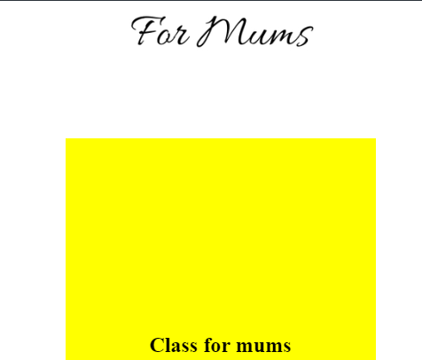
Important note: This is a responsive design, so I can't set a height on the image div (i.e min-height 600px) because while this kind of sorts it on wider screens:
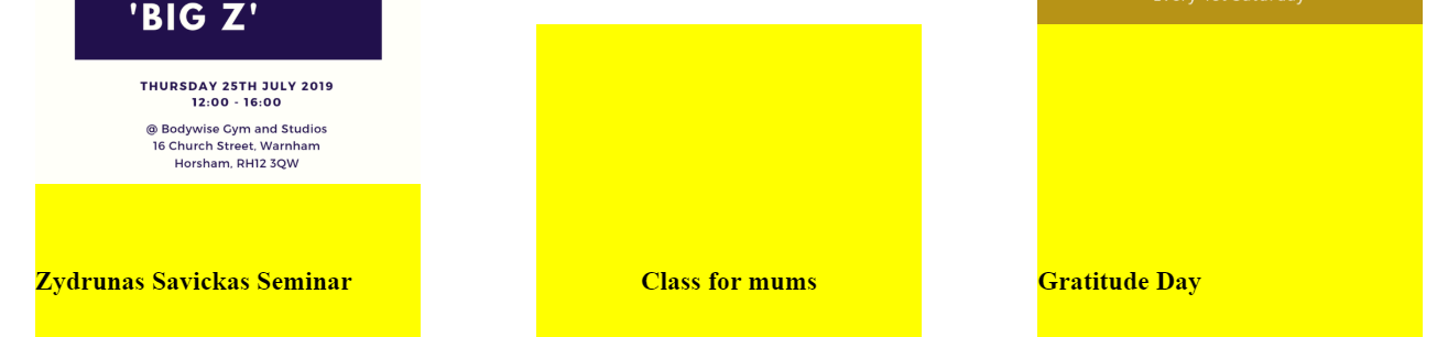
...but then on smaller screens, it scales down to 1 element per row - and this then means we have a silly amount of padding between the image and the title on the entries with smaller images: