You can do it using gradient but in case you want to create your own Container to get more customization, here you have:
class MyCustomContainer extends StatelessWidget {
  final Color backgroundColor;
  final Color progressColor;
  final double progress;
  final double size;

  const MyCustomContainer({
    Key key,
    this.backgroundColor = Colors.grey,
    this.progressColor = Colors.red,
    @required this.progress,
    @required this.size,
  }) : super(key: key);

  @override
  Widget build(BuildContext context) {
    return ClipRRect(
      borderRadius: BorderRadius.circular(size / 2),
      child: SizedBox(
        height: size,
        width: size,
        child: Stack(
          children: [
            Container(
              color: backgroundColor,
            ),
            Align(
              alignment: Alignment.bottomCenter,
              child: Container(
                height: size * progress,
                color: progressColor,
              ),
            ),
          ],
        ),
      ),
    );
  }
}
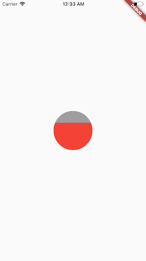
Usage
Center(
        child: MyCustomContainer(
          progress: 0.7,
          size: 100,
          backgroundColor: Colors.grey,
          progressColor: Colors.red,
        ),
      ),
Result
And of course you can customize that widget to receive a child and put it at the center.
