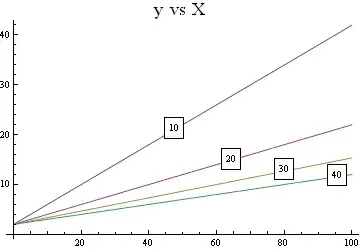
I have the following dataset which produces a grouped bar plot:
library(ggplot2)
library(dplyr)
expand.grid(gender=c("M","F"),
            education=c("HS","College","Advanced"),
            value = sample(1:20,8, replace = T)) %>%
  ggplot(aes(x =  education, y = value, fill = gender))+
  geom_col(position = position_dodge())
But instead of having a legend I want the labels to be on the x axis like this:
Is this possible?
Thanks


