56

I am trying to add a border radius to a LinearProgressIndicator in Flutter.

When I replace the LinearProgressIndicator with another widget (e.g. Text) in the code below, it works, as expected.

Container(
  decoration: new BoxDecoration(
      borderRadius:
          new BorderRadius.all(const Radius.circular(20.0))),
  child: LinearProgressIndicator(
    value: _time,
  ),
) 

a busy cat

oemera
  • 3,223
  • 1
  • 19
  • 33
  • Seems like `ClipRRect` does the trick. But the inner bar still has only the left side rounded. https://i.imgur.com/Jdrm8up.png – oemera Aug 17 '19 at 07:31

11 Answers11

104

1) Using Widget

 Container(
          margin: EdgeInsets.symmetric(vertical: 20),
          width: 300,
          height: 20,
          child: ClipRRect(
            borderRadius: BorderRadius.all(Radius.circular(10)),
            child: LinearProgressIndicator(
              value: 0.7,
              valueColor: AlwaysStoppedAnimation<Color>(Color(0xff00ff00)),
              backgroundColor: Color(0xffD6D6D6),
            ),
          ),
        )

enter image description here

2) Using dependency

List of different types indicator https://pub.dev/packages/percent_indicator

Try this template code

        child:  Padding(
          padding: EdgeInsets.all(15.0),
          child:  LinearPercentIndicator(
            width: MediaQuery.of(context).size.width - 50,
            animation: true,
            lineHeight: 20.0,
            animationDuration: 2000,
            percent: 0.9,
            linearStrokeCap: LinearStrokeCap.roundAll,
            progressColor: Colors.greenAccent,
          ),
        )

enter image description here

Mark O'Sullivan
  • 10,138
  • 6
  • 39
  • 60
Amit Prajapati
  • 13,525
  • 8
  • 62
  • 84
  • 1
    In your example code you don't use the percent indicator. Its called `LinearPercentIndicator` and if you use it, you don't need `ClipRRect` anymore. Also `ClipRRect` would only round the outer bar, not the inner bar (see my comment on my post) – oemera Aug 18 '19 at 11:31
  • yahh, i understand then you should follow dependency https://pub.dev/packages/percent_indicator – Amit Prajapati Aug 19 '19 at 04:51
  • 1
    Edit your original post, to use the `LinearPercentIndicator` so I can mark it as the correct answer. – oemera Aug 20 '19 at 07:05
  • @AmitPrajapati Must this be `main dependancy` or can It be `dev dependancy`? – Pretty_Girl Aug 02 '21 at 20:09
  • @Pretty_Girl use into dependancy. For more you can read out https://stackoverflow.com/questions/57751291/flutter-dependencies-vs-dev-dependencies – Amit Prajapati Aug 03 '21 at 12:41
  • FYI clipping is a somewhat expensive operation – Amy Aug 09 '21 at 16:34
38

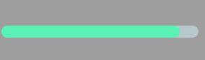
Edit: I just wanted to point out my answer doesn't account for rounding the end of the 'value' fill inside the bar, which the OP wanted. However it seems many people came to this question looking for the answer I provided, (as did I before I found the answer and came back to respond).

So if you need the inside of this indicator also to have a rounded edge, as of now I think the accepted answer from Amit is the best route. If the inside of the indicator can have a flat edge and you don't want to use a third party package, I think my answer below is still the best option.

Original:

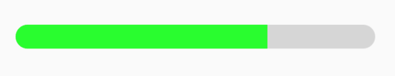
You actually don't need to use a third party package, and can wrap your LinearProgressIndicator with the ClipRRect widget and give it a circular border radius. If you want to give it a specific thickness/height then you could use a container as an intermediary:

ClipRRect(
  borderRadius: BorderRadius.circular(8),
  child: Container(
    height: 10,
      child: LinearProgressIndicator(
        value: 0.35, // percent filled
        valueColor: AlwaysStoppedAnimation<Color>(Colors.orange),
        backgroundColor: Color(0xFFFFDAB8),
      ),
    ),
  )

would produce this, if placed in another widget with a defined width:

enter image description here

Community
  • 1
  • 1
Tristan Bennett
  • 746
  • 1
  • 8
  • 18
  • In my original post, I wanted the right corners of the inner bar to be rounded too. In your example it's straight. – oemera Dec 19 '19 at 17:15
  • Ohh I see that now! Sorry I missed it in my response. In that case have you been unable to find a way to do it without using the percent_indicator packge? – Tristan Bennett Dec 19 '19 at 17:20
  • I haven't worked with flutter for a long time, so no, I didn't find anything unfortunately. – oemera Dec 19 '19 at 18:32
  • 1
    It hasn't round corners on the inner bar but is pretty cool to use native stuff without adding more deps, It would be great to request an update on the flutter team to the inner bar options as well. – Eduardo Pereira Mar 05 '20 at 17:20
  • 1
    @EduardoPereira thanks! Yeah I realized later that issue still exists, and have been meaning to put in a request/dig around the source code enough to try submitting a PR...I'm still new to this stuff though – Tristan Bennett Mar 05 '20 at 19:09
  • In the percent_indicator, the 'percent' must be in [0,1] range, but sometimes we have to exceed the range [0, 1]. So this method may be more useful. – Alexweng Mar 06 '20 at 02:51
28

Let's try my custom progress bar, simple and don't use any library :)

enter image description here

class ProgressBar extends StatelessWidget {
 final double max;
 final double current;
 final Color color;

 const ProgressBar(
  {Key? key,
  required this.max,
  required this.current,
  this.color = AppColors.secondaryColor})
  : super(key: key);
  @override
  Widget build(BuildContext context) {
  return LayoutBuilder(
  builder: (_, boxConstraints) {
    var x = boxConstraints.maxWidth;
    var percent = (current / max) * x;
    return Stack(
      children: [
        Container(
          width: x,
          height: 7,
          decoration: BoxDecoration(
            color: Color(0xffd3d3d3),
            borderRadius: BorderRadius.circular(35),
          ),
        ),
        AnimatedContainer(
          duration: Duration(milliseconds: 500),
          width: percent,
          height: 7,
          decoration: BoxDecoration(
            color: color,
            borderRadius: BorderRadius.circular(35),
          ),
        ),
      ],
    );
  },
);
}
}
Nhật Trần
  • 2,522
  • 1
  • 20
  • 20
  • Its not working in listview item. Gives error when included in column. – Hitesh Sarsava Apr 15 '22 at 05:40
  • This works great! You just need to wrap it in an Expanded widget if you're in a row. I love the animation too. This is way better than including a dependency. Looks great! Thanks @Nhật Trần – chandler Aug 25 '23 at 16:38
6

You can try this code:

Container(
   decoration: const BoxDecoration(
   borderRadius: BorderRadius.all(Radius.circular(40.0))),
   child: const ClipRRect(
                  borderRadius: BorderRadius.all(Radius.circular(20)),
                  child: LinearProgressIndicator(
                    minHeight: 5.0,
                    value: 0.2,
                    color: Colors.white,
                    backgroundColor: Color(0xFF3B2D73),
                  ),
                ),
ANORAK_MATFLY
  • 345
  • 3
  • 7
4

I am going to leave my answer in case someone is looking for something custom, basic with custom BorderRadius

      Container(
        height: 24.0,
        margin: EdgeInsets.only(top: 12.0, bottom: 2.0),
        decoration: BoxDecoration(
          color: Colors.grey,
          borderRadius: BorderRadius.all(Radius.circular(4.0)),
        ),
        clipBehavior: Clip.antiAlias,
        child: FractionallySizedBox(
          alignment: Alignment.centerLeft,
          widthFactor: 0.57,
          heightFactor: 1.0,
          child: Container(
            decoration: BoxDecoration(
              color: Colors.blueAccent,
              borderRadius: BorderRadius.all(Radius.circular(4.0)),
            ),
            clipBehavior: Clip.antiAlias,
          ),
        ),
      ),

Feel free to try it out :)

3

Do not need to wrap LinearPercentIndicator inside a Container widget. You could get the desired output only using LinearPercentIndicator.

See the template code

    LinearPercentIndicator(
        lineHeight: 40.0,
        barRadius: const Radius.circular(20.0),
        percent: 0.7,
        animation: true,
        animationDuration: 1000,
        backgroundColor: Color(0xFFD6D6D6),
        progressColor: Color(0xFF5BFB82),          
    ),
1

To make the inner bar rounded, we need to use the following logic :

  1. Make the Outer progress bar rounded, use ClipRRect and set borderRadius

  2. To make the inner bar rounded, we can use Container, where we will make one side (right side) rounded using borderRadius. Then, we will place it on top of our progress bar, using Stack. The width of the container will be actually the progress shown in the progress bar.

          Container(
              width: (MediaQuery.of(context).size.width - 30) *
                  calculateProgressBarValue(Data1, Data2),
              height: 6,
              decoration: BoxDecoration(
                  borderRadius: const BorderRadius.only(
                    topLeft: Radius.circular(CommonDimens.MARGIN_10),
                    bottomLeft: Radius.circular(CommonDimens.MARGIN_10),
                  ),
                  color: progressBarColor,
    
            ),
    

Full code :

ClipRRect(
      borderRadius: const BorderRadius.all(Radius.circular(10)),
      child: Stack(
        children: [
          ClipRRect(
            borderRadius: const BorderRadius.all(Radius.circular(10)),
            child: LinearProgressIndicator(
              minHeight: 6.0,
              valueColor:
                  AlwaysStoppedAnimation<Color>(Colors.grey),
              value: 1,
            ),
          ),
          Positioned(
            right: 0,
            child: Container(
              width: ((MediaQuery.of(context).size.width) - 30) *
                  calculateProgressBarValue(Data1,Data2),
              height: 6,
              decoration: BoxDecoration(
                  borderRadius: const BorderRadius.only(
                    topLeft: Radius.circular(CommonDimens.MARGIN_10),
                    bottomLeft: Radius.circular(CommonDimens.MARGIN_10),
                  ),
                  color: progressBarColor,
            ),
          ),
        ],
      ),
    );
Akshay Chopra
  • 1,035
  • 14
  • 10
0

You can make use of curved_progress_bar , It has both CurvedCircularProgressIndicator as well as CurvedLinearProgressIndicator, and it works just like normal CircularProgressIndicator and LinearProgressIndicator.

L Uttama
  • 379
  • 1
  • 4
  • 14
0

You could try my library (capped_progress_indicator) that does what you want and works exactly like Flutter's original LinearProgressIndicator and CircularProgressIndicator. It not only rounds the ends of the track/background but also the ends of the progress/indicator.

So its just a matter of installing the package and changing your code from

LinearProgressIndicator(
  // ...
)

to

import 'package:capped_progress_indicator/capped_progress_indicator.dart';

LinearCappedProgressIndicator(
  // ...
)

You can also change the corner radius to your liking

LinearCappedProgressIndicator(), // Circle end (default).
LinearCappedProgressIndicator(cornerRadius: 5), // Rounded end.
LinearCappedProgressIndicator(cornerRadius: 0), // Square end.
JakesMD
  • 1,646
  • 2
  • 15
  • 35
0

Now it is easy to make Progress Indicators with curved corners.

First import the package: percent_indicator

Then, use below code and design your curved corner progress indicator.

LinearPercentIndicator(
 barRadius: Radius.circular(16), // just using this, you can curve your corner as much you want
 width: double.infinity,
 lineHeight: 6,
 percent: percentage.trouble() / 100.0,
 progressColor: Color(0xFFF69904),
 backgroundColor: Color(0xFFE9ECEF),
 )

Hope using this you can solve your problem.

Md. Al-Amin
  • 690
  • 3
  • 13
0

Update 2023

Container(
      padding: EdgeInsets.symmetric(
        vertical: MediaQuery.of(context).size.height * 0.015,
      ),
      child: ClipRRect(
        borderRadius: BorderRadius.circular(4.0),
        child: const LinearProgressIndicator(
          semanticsLabel: 'Carregando categorias',
          semanticsValue: 'Carregando categorias',
          backgroundColor: Colors.red,
          color: Colors.yellow,
        ),
      ),
    );
    ```