0

I am working on a website and I have run into a CSS issue. It is using Grid display and currently the contents are overflown and have to scroll to the bottom. I want to to be in the same height as the viewport without any need to scroll. How do I do that? The CSS and component files are as below. I tried using the grid-template-area to see if the components accommodate to the area names but to no avail. Thank you for your time.

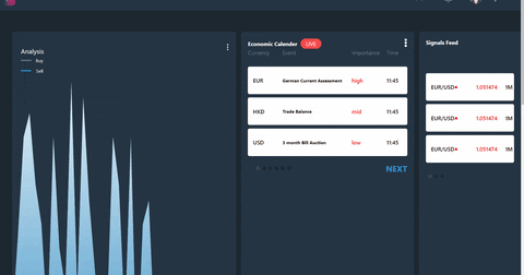
Here's how it looks currently and I want all that to accommodate in the viewport and don't have to scroll. https://media.giphy.com/media/U8GRKLQgnUo1J5L9ox/giphy.gif

//App.js

     render(){

    return (
      <div className="App">
        <Navbar className="nav"></Navbar>
        <MainContent className="content" analysisOnEnd={streamDataStep} analysisData={this.state.data}></MainContent>
      </div>
    );
  }

//App.css

        *{
      margin: 0;
      padding: 0;
      box-sizing: border-box;
    }
    html, body, #root, .App{
      height: 100%
    }

    .nav{
      grid-area: 'nav';
    }

    .content{
      grid-area: 'content';
    }

    .App {
      background: #1D2730;
      /* overflow: hidden; */
      display: grid;
      height: 100vh;
      grid-template-rows: 74px 1fr;
      grid-gap: 62px;
      grid-template-areas: 'nav'
                            'content';
    }
senyor
  • 119
  • 1
  • 5
Bikal Nepal
  • 477
  • 1
  • 10
  • 26

1 Answers1

1

First: It's Hard to solve this issue by gif preview (And not HTML).

overflow

The default value of overflow is visible https://developer.mozilla.org/en-US/docs/Web/CSS/overflow

If you set col height to 1fr (related to 100vh) and put inside long article you get overflow.

grid and 100vh

Start here:

Grid areas

In general - this basic example works fine:

.container {
  display: grid;
  height: 100vh;
  grid-template-columns: 2fr 2fr 1fr;
  grid-template-rows: auto 1fr auto;
  grid-template-areas:
    "nav nav nav"
    "main main sidebar"
    "footer footer footer";
}

nav {
  grid-area: nav;
}

main {
  grid-area: main;
}

sidebar {
  grid-area: sidebar;
}

footer {
  grid-area: footer;
}

.item {
  border-radius: 10px;
  border: 2px solid #949494;
  text-align: center;
  padding: 20px;
}
<div class="container">
  <nav class="item"><span>Logo</span></nav>
  <main class="item"><h1>Main</h1><p>Main article</p></main>
  <aside class="item"><h2>aside</h2><ul style="display:inline-block;"><li>link 1</li><li>link 2</li></ul></aside>
  <footer class="item"><h2>Footer</h2></footer>
</div>
Ezra Siton
  • 6,887
  • 2
  • 25
  • 37