How to make bevel and Embosed effect to Submit button in CSS 3 ?
Like this.
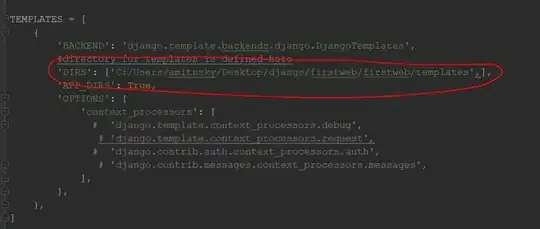
Enlarged Image
I'm only considering Web-kit based browsers. and I'm not asking about How to give round corner and how to give gradient to button, I'm only asking about bevel effect
Html
<input type="submit" value="Submit your entry" class="input" />