1

Using igraph in R-studio I made a network analysis based on an adjacency matrix(45*45) that has 45 culture nodes from interviews with multiple people in the same organisations. A connection between 2 nodes was coded "1" whenever 2 cultural themes were spoken about in the same passage, so connections always go both ways and are not directed. The problem with my network analysis is that there are a lot of connections, and the graph is not easy to read, that is why I tried to add in a layout to form some kind of hierarchy so I can see if certain cultural aspects are grouped (and thus if certain culture nodes form a theme together). However, when I add a layout such as my lables in "words" dissapear and I get a smaller amount of nodes with numbers, however I don't know what this numbers mean.

I have tried to use the fruchterman.reingold. layout. However, I get some error saying "l" cannot be found (see code below). Then I get a nice tree like output, however with numbers, which I don't know what they mean. I would like to be able to read what cultural themes are grouped together and thus need to know which ones are closest together/ connect most/ form a group. See the code I used below:

my_data <- read.csv(file.choose(),sep=";",header=TRUE)
nodelist <- names(my_data)[-1]
my_matrix <- as.matrix(my_data) [,-1]
rownames(my_matrix) <- colnames(my_matrix) <- nodelist
my_matrix
library(igraph)
g <- graph_from_adjacency_matrix(my_matrix, mode="undirected", 
weighted=NULL)
my_matrix.bg <- barabasi.game(80) 
V(my_matrix.bg)$frame.color <- "white" 
V(my_matrix.bg)$color <- "orange" 
V(my_matrix.bg)$label <- "orange" 
V(my_matrix.bg)$size <- 10 
E(my_matrix.bg)$arrow.mode <- 0 
l <- layout.fruchterman.reingold. 
   (my_matrix.bg,repulserad=vcount(my_matrix.bg)^3,area=vcount
   (my_matrix.bg)^2.4) 
par(mfrow=c(1,2), mar=c(0,0,0,0))
plot(my_matrix.bg,layout=layout.fruchterman.reingold) 
plot(my_matrix.bg,layout=l)

I hope to get a network analysis output, which is readable in which I can see what nodes have most/ the strongest connections, and can clearly see if nodes exist. It would also be nice If this output can be made larger and readable.

  • We don't have access to a sample of your data, so we can't run your code, and we can't see any output, so all anyone can do is guess what you're working with and how to help debug. [See here](https://stackoverflow.com/questions/5963269/how-to-make-a-great-r-reproducible-example) on making a reproducible post that folks can more easily help with. – camille Aug 25 '19 at 19:21

1 Answers1

2

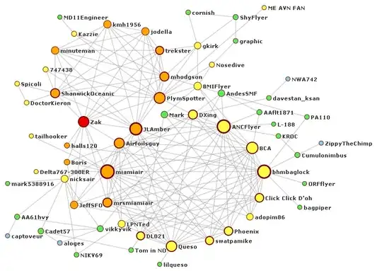
Although you don't provide your data, since you continue your example with barabasi.game(80) I assume that is close enough for your purposes. Since you say that your real data has 45 vertices, I will just use 50 vertices for barabasi.game. Just taking the whatever layout you get from fruchterman.reingold does give a graph that is hard to read.

library(igraph)
set.seed(4321)
my_matrix.bg <- barabasi.game(50, directed=FALSE) 
V(my_matrix.bg)$frame.color <- "white" 
V(my_matrix.bg)$color <- "orange" 
V(my_matrix.bg)$label <- "orange" 
V(my_matrix.bg)$size <- 10 
LO1 = layout_with_fr(my_matrix.bg)
plot(my_matrix.bg,layout=LO1)

Graph 1

igraph does leave unnecessarily large margins, so you can make this a little better by making bigger margins and using smaller text.

Graph 2

But the difference is small. In order to get better control of the layout, I will illustrate grouping the nodes and using a layout to emphasize the groups.

First let's just look at the groups.

CW = cluster_walktrap(my_matrix.bg)
plot(my_matrix.bg,layout=LO1, margin=-0.2,
    vertex.color=rainbow(8, alpha=0.4)[CW$membership], vertex.label=NA) 

Graph 3 - groups

The idea is to collapse the groups and layout the groups. Then expand the groups back again so that we see all of the vertices. The collapsed groups are easy to get.

CWGroups = simplify(contract(my_matrix.bg, CW$membership))
GLO = layout_with_fr(CWGroups)
plot(CWGroups , layout=GLO)

Collapsed groups

Now I want to layout each group separately and plot it where the group is plotted in the collapsed plot.

Rad = min(dist(GLO))
LO2 = matrix(0, nrow=vcount(my_matrix.bg), ncol=2)
for(i in unique(CW$membership)) {
    Clust = induced_subgraph(my_matrix.bg, which(CW$membership == i))
    CLO = layout_with_fr(Clust)
    LO2[which(CW$membership == i), ] = t(t(scale(CLO)*Rad/5) + GLO[i,])
}
plot(my_matrix.bg, layout=LO2, 
    vertex.color=rainbow(8, alpha=0.4)[CW$membership], , margin=-0.2) 

Graph 4

This may be a little better, but I think it is still not enough. Looking back, we can see why. The plot of the collapsed groups used the space somewhat inefficiently. If we create a tight layout for the collapsed graph, we will get a better version of the full graph. So, a tight version of the collapsed graph.

GLO2 = matrix(c(1,-1, -1,1, 1,1, 1,0, 0,0, -1,0, 0,-1, 0,1), 
    ncol=2, byrow=T)
plot(CWGroups , layout=GLO2)

Graph 6 - Tighter version of collapsed graph

This keeps the vertices well separated, but uses up less space overall. Now let's expand the collapsed groups.

LO3 = matrix(0, nrow=vcount(my_matrix.bg), ncol=2)
for(i in unique(CW$membership)) {
    Clust = induced_subgraph(my_matrix.bg, which(CW$membership == i))
    CLO = layout_with_fr(Clust)
    LO3[which(CW$membership == i), ] = t(t(scale(CLO)/5) + GLO2[i,])
}
plot(my_matrix.bg, layout=LO3, margin=-0.15,
    vertex.color=rainbow(8, alpha=0.4)[CW$membership]) 

Final graph

The nodes are pretty well separated and you can see the connections.

G5W
  • 36,531
  • 10
  • 47
  • 80