1

I'm trying to attach an "information div" to the left bottom edge of a fullscreen/centered/fitted image.

The image has to fit into the screen size (just like css property object-fit: contain does) and the information div should be attached to the bottom left side of the image.

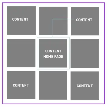
Here is my css try (not even close) and here are three images to describe the wanted behavior!

Note: I'm looking for a CSS-only solution, so, please, no JS!

One Two Three

Edit: Attach div to a fullscreen image to the corner of another div with no predefined size / fullscreen.

* {
  margin: 0;
  padding: 0;
}

#out {
  
}

#in {

}

#info {
  background-color: red;
  color: white;
  display: inline-block;
  position: absolute;
  bottom: 10px;
  left: 10px;
}

img {
  width: 100vw;
  height: 100vh;
  object-fit: contain;
}
<div id="out">
  <div id="in">
    <img src="https://images.unsplash.com/photo-1501630834273-4b5604d2ee31?ixlib=rb-1.2.1&ixid=eyJhcHBfaWQiOjEyMDd9&w=1000&q=80" alt="">
    <div id="info">This is the image info!</div>
  </div>
</div>
Mia
  • 6,220
  • 12
  • 47
  • 81
  • Possible duplicate of [How to overlay images](https://stackoverflow.com/questions/403478/how-to-overlay-images) – Chris W. Aug 27 '19 at 14:49
  • @ChrisW. how is this the duplicate of that topic? No relation at all. – Mia Aug 27 '19 at 14:50
  • You're right, that's image over image so not exactly, sorry I just grabbed one from the top of dozens of would-be duplicates. Literally just make the parent `position: relative` and the info div `position: absolute; left: 1rem; bottom: 1rem;` and voila. – Chris W. Aug 27 '19 at 14:52
  • It has to work like in the images, though. Try it, you'll see that it won't work. – Mia Aug 27 '19 at 14:53
  • The image has to be fitted&centered to the screen size, and the "info text" should be at the bottom left corner – Mia Aug 27 '19 at 14:54
  • The `object-fit: contain` setting is essential for your problem, so I would put that into the header of your question. – Johannes Aug 27 '19 at 15:23
  • @Johannes if there is a solution without object-fit: contain that would still work for me. – Mia Aug 27 '19 at 16:47

3 Answers3

0

If I understand you correctly, you're looking for something like this? Open it fullscreen, resize the page, throw different images in there, cheers.

div {
  border: red 1px dashed;
  position: absolute;
  top: 0;
  left: 50%;
  transform: translateX(-50%);
}

div:after {
  content: attr(data-overlay);
  position: absolute;
  bottom: 1rem;
  left: 1rem;
  color: white;
  font-size: 2rem;
}

img {
  object-fit: contain;
  height: 100vh;
  width: 100wh;
}
<div data-overlay="TEXT TEXT TEXT">
  <img src="https://images.pexels.com/photos/1498923/pexels-photo-1498923.jpeg"/>
</div>
Chris W.
  • 22,835
  • 3
  • 60
  • 94
  • It works if width of the page is bigger than the width of the image, but does not work if image is wider. – Mia Aug 28 '19 at 02:15
  • Just adjust the height property of the container, if you want a true full responsive way that works cross browser without tweaking per instance needs than you'll need actual code. – Chris W. Aug 28 '19 at 12:39
  • I can Mae this behavior with max height and max width properties together vu then a reaching a div to the edge of the image becomes impossible. Also background image property can be used In contain mode but then again it's impossible to attach the div to the edge of the image as the image is just a part of the background property. – Mia Aug 28 '19 at 17:18
  • Like I said, if you want a truly full solution you'll need actual code. – Chris W. Aug 28 '19 at 18:13
0

Wrap the image in a div that will be the relative parent of your info div.

section {
  display: flex; /* centers everything in the section */
  flex-direction: column;
  align-items: center;
}

.image-wrap {
  display: inline-block; /* keeps the wrapper div the same size as the child image */
  position: relative; /* for positioning the info div */
}

.image-info {
  position: absolute;
  left: 10px;
  bottom: 10px;
  font-size: 18px;
  text-transform: uppercase;
  color: white;
}
<section>
  <div class="image-wrap">
    <img src="https://picsum.photos/200/300" />
    <div class="image-info">Nice image</div>
  </div>

  <div class="image-wrap">
    <img src="https://picsum.photos/300/200" />
    <div class="image-info">This one is cool</div>
  </div>

  <div class="image-wrap">
    <img src="https://picsum.photos/450/180" />
    <div class="image-info">Pretty!</div>
  </div>
</section>
BugsArePeopleToo
  • 2,976
  • 1
  • 15
  • 16
  • Nothing is full screen here? I've specifically mentioned full screen centered images. – Mia Aug 28 '19 at 02:14
  • The question is unclear then. You mention full-screen but you also are asking for `object-fit: contain` behavior. These two requests are kind of contradictory. A full screen image will need to be cut off somewhere depending on the size of the screen . Do you really want the image to fill the entire width of the screen? Portrait oriented images will be extremely tall on a wide screen... If you can clarify I am happy to update the answer I gave. – BugsArePeopleToo Aug 28 '19 at 14:43
  • Full-screen image can be object fit contain there are no problems with that. "contain" means no cut off. Attaching a div to the edge of the image is the real problem. – Mia Aug 28 '19 at 17:16
  • If an image is full width and not cutoff at all then any portrait image will be far taller than the screen usually. Either way, the answer I gave will work. Wrap the image and info in a wrapper div and use position relative/absolute . – BugsArePeopleToo Aug 28 '19 at 17:19
  • I don't want an image full width, as I've mentioned, I want it to behave like "contain" – Mia Aug 30 '19 at 11:13
-2

you need to use Viewport unit for that you need to set the size of your div.#out which is width: 100vw; height: 100vh

  • the problem is not "out", the problem is attaching the "in" to the corner of the image. – Mia Aug 27 '19 at 14:52
  • Edited my css to explain you the problem, have a look. – Mia Aug 27 '19 at 15:07
  • When you make your image 100% width into a parent div and that div has a width and height of 100vw and 100vh the image will automatically stay in the div which has a position of relative and right next to the image a sibling div with an absolute position will stay inside the image. And that is what I think you are trying to achieve which ia fairly simple. – Mahad Zaman Aug 27 '19 at 21:08
  • While img is an element which can not contain any other element hence also cant be used as a relative parent to any other html element. What you are trying to achieve can be done via a sibling div element of the image which would be absolute positioned. And the parent of both image and info div would be relative in position. – Mahad Zaman Aug 27 '19 at 21:17
  • Try image: position absolute and overflow hidden to the parent, you cant do what you are wanting to achieve – Mahad Zaman Aug 27 '19 at 22:18
  • I'd like to see what you mean – Mia Aug 30 '19 at 11:14