I am trying to plot a simple line graph using matplotlib and for some reason, matlpotlib is plotting the data incorrectly.
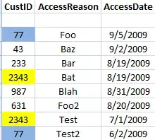
Here are examples of the data I am trying to plot:
The code that I have constructed is rather basic as the following:
fh = df['Datetime']
temp = df['tmp']
dew = df['dpt']
winds = df['wsp']

fig,ax = plt.subplots(figsize=(20,10))
ax.plot(fh,df['tmp'],marker='o')
ax.set_ylabel('MOS Forecasted Temperature (degF)')

plt.xticks(rotation='90')

plt.legend()
Any suggestions on how to fix the matplotlib graph would be greatly appreciated!


