57

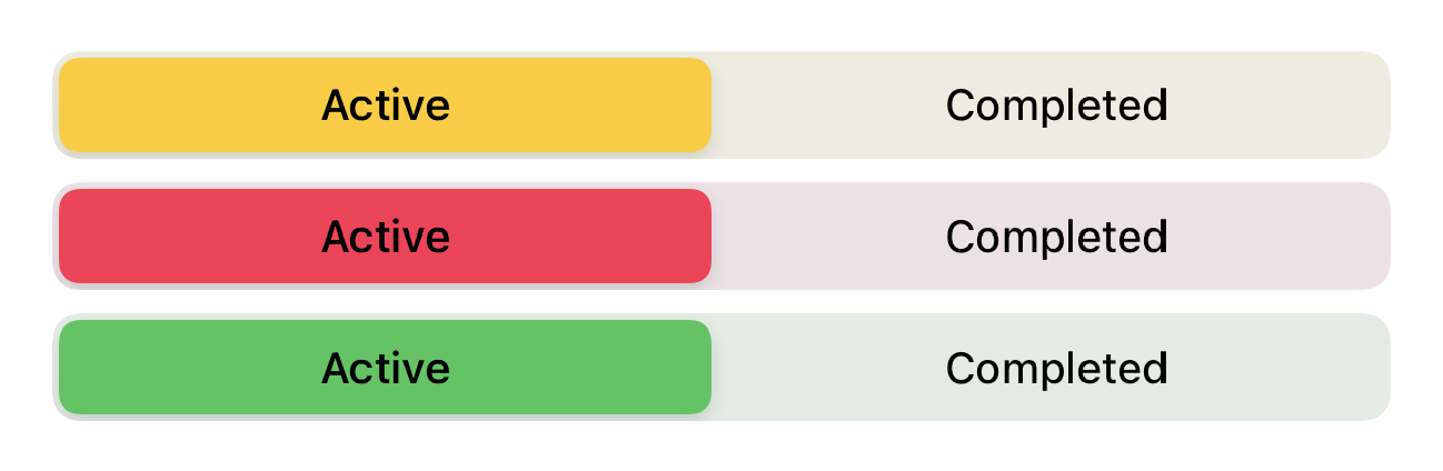
I want to set the selected segment color in a SwiftUI segmented picker and change the text color to white.

I have tried both using the modifiers for the picker view and modifying the tint color from the appearance proxy. None of them seem to work, unfortunately.


import SwiftUI

struct PickerView: View {

    @State var pickerSelection = 0

    init() {
        UISegmentedControl.appearance().tintColor = UIColor.blue
    }

    var body: some View {
        Picker(selection: $pickerSelection, label: Text("")) {
            Text("Active").tag(0).foregroundColor(Color.white)
            Text("Completed").tag(1)
        }.pickerStyle(SegmentedPickerStyle()).foregroundColor(Color.orange)
    }
}

Is there any way to do this in SwiftUI, or should I just use the UISegmentedControl by using UIViewControllerRepresentable?

Mojtaba Hosseini
  • 95,414
  • 31
  • 268
  • 278
swifty
  • 971
  • 1
  • 8
  • 15
  • 2
    What should we do if we want to have different tint color for another segmented picker in the same view? – jamryu Jun 10 '20 at 21:37

5 Answers5

115

Native ( but limited )

SwiftUI is not currently supporting native SegmentedPicker styling (see the bottom of the answer for the working workaround). But there is a limited way to apply a color to the segmented picker using .colorMultiply() modifier:

enter image description here


Full control using UIAppearance

selectedSegmentTintColor is available since beta 3 for changing the color of the selected segment.

For changing the textColor, you should use setTitleTextAttributes for .selected state and .normal state (unselected).

So it will be like:

init() {
    UISegmentedControl.appearance().selectedSegmentTintColor = .blue
    UISegmentedControl.appearance().setTitleTextAttributes([.foregroundColor: UIColor.white], for: .selected)
    UISegmentedControl.appearance().setTitleTextAttributes([.foregroundColor: UIColor.blue], for: .normal)
}

Segmented Controll

Also as mike mentioned, you can set the background color too like:

UISegmentedControl.appearance().backgroundColor = .yellow

Background demo

Also, don't forget you can set SwiftUI colors too! For example:

UISegmentedControl.appearance().selectedSegmentTintColor = UIColor(Color.accentColor)
Mojtaba Hosseini
  • 95,414
  • 31
  • 268
  • 278
  • 2
    Note that there is no code completion for these properties, but if you type them they will compile – iSpain17 Jan 18 '20 at 09:11
  • You can change the color of the unselected segments with UISegmentedControl.appearance().backgroundColor = .blue – Mike Feb 23 '21 at 23:10
  • Hey @mojtaba-hosseini @mike any idea how to have it be the `AccentColor`? – StuFF mc Mar 06 '21 at 18:09
  • 2
    just set it like `UIColor(Color.accentColor)` @StuFFmc – Mojtaba Hosseini Mar 07 '21 at 07:25
  • Oh thanks @MojtabaHosseini I was actually doing `UIColor(named: "AccentColor")!`. I didn't know there's that convenient converter :) – StuFF mc Mar 08 '21 at 08:35
  • Where do you put init in Picker declaration ? – Hope Apr 08 '22 at 09:54
  • @Hope inside any class that is being created in the flow – Mojtaba Hosseini Apr 08 '22 at 10:52
  • 1
    It is better to limit the use of the appearance. If the parent-view is specific enough, then it is not necessary to reset the appearance with nil. That can affect the other components in the app. let appearance = UISegmentedControl.appearance(whenContainedInInstancesOf: [MyController.self]) – Vladimír Slavík Nov 04 '22 at 17:09
7

Recently I had a similar issue that I needed a custom background and foreground colors for SwiftUI SegmentedControl I've found this post that also was helpful, but I also wanted to share other solution that I've found and I'm using now. There is a very nice package called SwiftUI Introspect that allows to, well...

Introspect underlying UIKit components from SwiftUI

With this package I created the following SegmentedControl enter image description here With this code:

VStack {
    Picker("Activity view", selection: $selectedActivity) {
        ForEach(ActivityView.allCases) { activity in
            Text(activity.description)
        }
    }
    .introspectSegmentedControl { segmentedControl in
        segmentedControl.backgroundColor = .clear
        segmentedControl.tintColor = TCHColors.SegmentedControl.backgroundSelected
        segmentedControl.selectedSegmentTintColor = TCHColors.SegmentedControl.backgroundSelected
        segmentedControl.setTitleTextAttributes([
            NSAttributedString.Key.foregroundColor: TCHColors.SegmentedControl.selectedText
        ], for: .selected)
        segmentedControl.setTitleTextAttributes([
            NSAttributedString.Key.foregroundColor: TCHColors.SegmentedControl.normalText
        ], for: .normal)
    }
    .pickerStyle(.segmented)
}
.padding(.horizontal, 16)

And you can use this package to access many other underlying components from SwiftUI.

Sangsom
  • 373
  • 5
  • 9
  • I get an error "Cannot find 'TCHColors' in scope" can you update the code if you can tnx or just add comment to solve it please @Sangsom – Vegas97 Jan 06 '23 at 00:28
  • 1
    Hey there, these are colors used from global app specific enum file, you just change to colors you want using UIColor instance, eg. UIColor.green. – Sangsom Jan 06 '23 at 07:14
2

Here is a manual implementation of segmented picker functionality:

@ViewBuilder func viewSegmentedButtons(arr: [String], selIndex: Int, baseColor: Color, closure:@escaping (_ selectedIndex: Int) -> Void) -> some View {
    
    let columns = Array(repeating: GridItem(spacing: 1), count:arr.count)
    LazyVGrid(columns: columns, spacing: 1.0) {
        ForEach(Array(arr.enumerated()), id: \.element) { index, translation in
            Button {
                closure(index)
            } label: {
                ZStack {
                    Rectangle()
                        .foregroundColor(index == selIndex ? baseColor : Color(.systemBackground))
                        .cornerRadius(radius: index==0 ? cRadius : 0, corners: [.topLeft, .bottomLeft])
                        .cornerRadius(radius: index==arr.count-1 ? cRadius : 0, corners: [.topRight, .bottomRight])
                    Text(translation)
                        .padding(.vertical, 10)
                        .font(.footnote)
                        .foregroundColor(index != selIndex ? baseColor : Color(.systemBackground) )
                }
            }
        }
    }
    .foregroundColor(baseColor)
    .overlay(
        RoundedRectangle(cornerRadius: cRadius)
            .stroke(baseColor, lineWidth: 2)
    )
    .font(.callout)
    .background(baseColor)
    .cornerRadius(cRadius)
    .padding(.bottom, 10)
}

Usage example:

@State private var levelIndex: Int = 0
var body: some View {
    VStack {
        Text("Level:")
        
        viewSegmentedButtons(arr: ["Easy", "Meduim", "Hard"], selIndex: levelIndex, baseColor: .orange) { selectedIndex in
            withAnimation {
                levelIndex = selectedIndex
            }
        }
    }
}

Result: enter image description here

Maria N.
  • 601
  • 4
  • 5
0

This answered helped me, but there is something I would like to add. The color I used was an argument to the view, so placing these methods in an init did not allow me to access the color.

Alternatively, you can use an onAppear method directly on the Segmented Picker, like so.

import SwiftUI

struct PickerView: View {
    var color: UIColor   
    @State var pickerSelection = 0

    var body: some View {
        Picker(selection: $pickerSelection, label: Text("")) {
            Text("Active").tag(0).foregroundColor(Color.white)
            Text("Completed").tag(1)
        }.pickerStyle(SegmentedPickerStyle()).foregroundColor(Color.orange)
        .onAppear {
            UISegmentedControl.appearance().tintColor = color
        }
    }
}
nikost
  • 788
  • 6
  • 14
-2

Here is my solution that works in SwiftUI:

init(){

    UISegmentedControl.appearance().selectedSegmentTintColor = .green
    UISegmentedControl.appearance().setTitleTextAttributes([.foregroundColor: UIColor.black], for: .selected)

    }
indrit saveta
  • 127
  • 1
  • 6