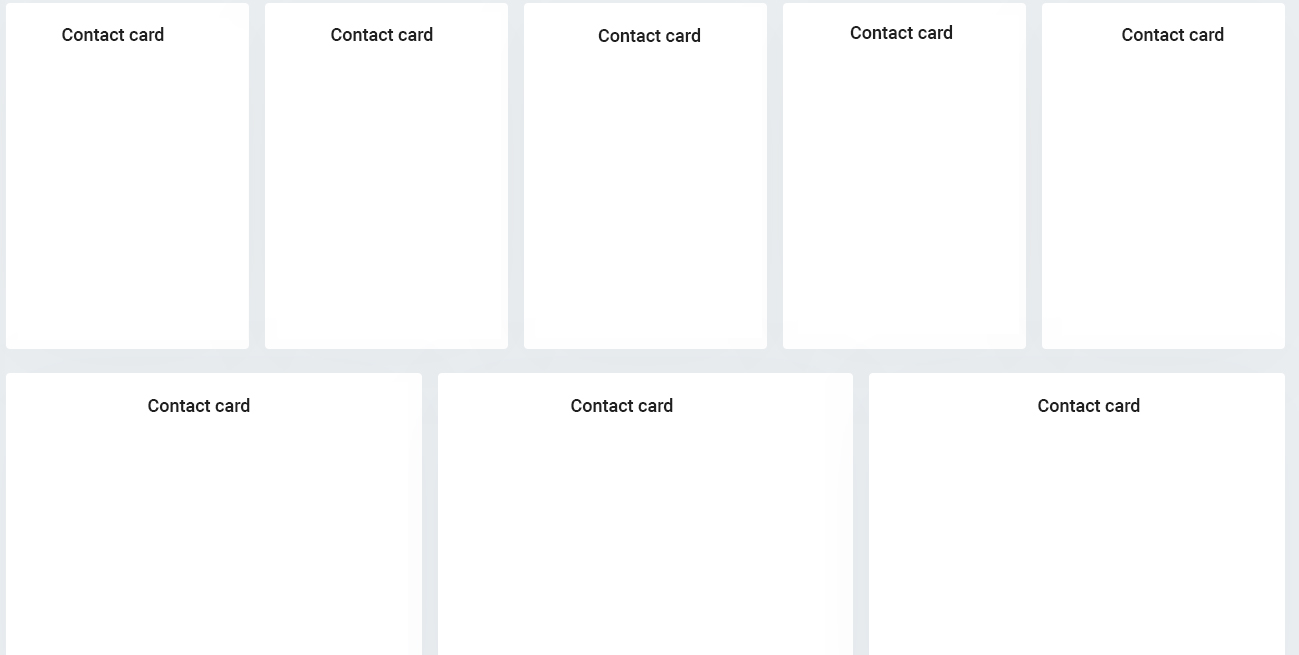
So basically, what I have here is a contact page, that shows each contact's info inside a card. It's basically flex container with flex items. I want cards to expand to full width of a first row (5 cards in a row on desktop). I have managed to achieve that but what I want to have is to have all the cards be the same width. For example if user has 7 contacts, first 5 cards will be displayed in a first row nicely, but second two will expand to take the full width of the second row. Is it possible to make those cards the same width as others?
<div class="d-flex flex wrap">
  <div class="contact-card">
  <div>
  <div class="contact-card">
  <div>
  <div class="contact-card">
  <div>
  <div class="contact-card">
  <div>
  <div class="contact-card">
  <div>
</div>
.contact-card {
   flex: 1 1 0;
}