2

i want to ask how to create the 80 backgrounds only with html and CSS?

background

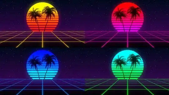
I have tried to do it but getting this result:

background

 .bottom-background {
        background-size: 100px 100px;
        background-image: linear-gradient(to right, green 2px, transparent 2px), linear-gradient(to bottom, green 2px, transparent 2px);
        width: 100%;
        height: 50vh;
        bottom: 0;
        position: absolute;
        perspective: 20px;
        transform: rotateX(45deg);
    }
<div class="bottom-background"></div>

I would like to have all centered like the first image.

G-Cyrillus
  • 101,410
  • 14
  • 105
  • 129
Leon Schwanitz
  • 223
  • 1
  • 8
  • 3
    perspective need to go to the parent element https://jsfiddle.net/opxyreu7/ ... don't know why this question is too broad? – Temani Afif Sep 06 '19 at 19:08
  • @Reactgular https://developer.mozilla.org/en-US/docs/Web/CSS/perspective it is **only** about perspective not used as it should ...once used correctly, the op should find out himself how to position this extra container or eventually make a new question if he get lost ;) – G-Cyrillus Sep 06 '19 at 20:15
  • @G-Cyr if you think the question is just about CSS perspective, then clearly it can be closed as a duplicate as that's obviously been asked here before. – Reactgular Sep 06 '19 at 20:17
  • I think this question can be improved. Can you explain in more detail what exactly you're trying to reproduce. Is it only the grid? because you could update this to ask how to create a perspective grid that goes to the horizon. – Reactgular Sep 06 '19 at 20:23
  • 1
    @Reactgular having multiple correct answers is completely different from *too broad*. There is never one unique way to achieve something. The question is clear: he want to achieve a design, tried to do it with a code he provided and failed There is a *specific* problem and the OP is not asking multiple questions. – Temani Afif Sep 06 '19 at 20:32
  • @Reactgular example of question where I provided 6 different ways to achieve the same result which technically make the question able to receive at least 6 correct answers: https://stackoverflow.com/q/50439518/8620333 .. It's far from being too broad – Temani Afif Sep 06 '19 at 20:36
  • @TemaniAfif https://meta.stackoverflow.com/questions/258589/breaking-down-too-broad-and-trying-to-understand-it – Reactgular Sep 06 '19 at 20:39
  • @Reactgular really? a five year old meta post ... read this: https://meta.stackexchange.com/q/291819/386331 things have changed since then – Temani Afif Sep 06 '19 at 21:03

1 Answers1

6

You need a combination of transforms to get this effect, I used:

transform: perspective(400px) rotateX(70deg) scale(2);

The perspective() transform only has an effect when combined with another transform, in this case rotateX(). The scale() transform is to make sure the entire transformed graphic fills the screen. I adjusted the border gradient to compensate for doubling the scale.

body { margin: 0; }

.perspective-container {
  overflow: hidden; /* so we dont get any undesired scrolling in the browser window */
}

.bottom-background {
  background-size: 20px 20px;
  background-image: linear-gradient(to right, green 1px, transparent 1px), linear-gradient(to bottom, green 1px, transparent 1px);
  width: 100%;
  height: 50vh;
  bottom: 0;
  position: absolute;
  
  transform: perspective(400px) rotateX(70deg) scale(2);
}
<div class="perspective-container">
  <div class="bottom-background"></div>
</div>
BugsArePeopleToo
  • 2,976
  • 1
  • 15
  • 16