0

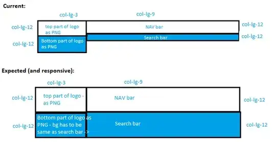
I'm trying to create a responsive nav and search bar container row composed of a 3 column-long logo (made of two horizontal columns) on the left, and a 9 column-long nav and search bar on the right (also made of two horizontal columns - nav on top and search on bottom). I need all of these columns to have the same height in different devices. See image for current and expected result: screenshot

I've tried using w-100 and height at 100%, plus various bootstrap tricks to have all columns have the same height, but can't seem to get it right and hardcoding the column height will not work across devices. I'm not a bootstrap expert so may have a fundamental flaw in this design.

<div class="row">

//container for two columns on the left, containing both parts of the logo

  <div class="first-container col-lg-3">
    <div class="row d-flex flex-column">
      <div class="col-lg-12 w-100">
        <img src="public/img/....png" alt="logo-desktop" class="w-100" />
     </div>
      <div class="col-lg-12 w-100">
        <img src="public/img/....png" alt="logo-desktop" class="w-100" />
     </div>
    </div>
  </div>

//container for two columns on the right, containing nav and search bar

  <div class="second-container col-lg-9">
    <div class="row d-flex flex-column ">
      <div class="col-lg-12">
        <nav class="navbar navbar-inverse navbar-toggleable-md">...
          //nav bar
        </nav>
     </div>
      <div class="col-lg-12">
        //search bar
     </div>
   </div>
  </div>
</div>

The expected result is as in the screenshot. Thanks for any help!

Jonathan Bareket
  • 318
  • 2
  • 12
  • Hey Jonathan, this question is already asked, you can find it [here](https://stackoverflow.com/questions/19695784/how-can-i-make-bootstrap-columns-all-the-same-height). – sbrrk Sep 10 '19 at 11:37
  • have you tried CSS Grid? https://developer.mozilla.org/pt-BR/docs/Web/CSS/grid – Felipe Endlich Sep 10 '19 at 11:38
  • Possible duplicate of [How can I make Bootstrap columns all the same height?](https://stackoverflow.com/questions/19695784/how-can-i-make-bootstrap-columns-all-the-same-height) – Calvin Nunes Sep 10 '19 at 11:39
  • Thanks for the CSS grid suggestion, I'll check it out. The other question was relevant but the answers given weren't exactly matching my goal. – Jonathan Bareket Sep 10 '19 at 12:00

1 Answers1

2

Simplify the structure. There's no reason to use the nesting.

   <div class="row">
        <div class="col-3">
            <img src="//placehold.it/160x40" alt="logo-desktop">
        </div>
        <div class="col-9">
            <nav class="navbar navbar-dark py-0 bg-dark navbar-toggleable-md">
                <a href="/" class="navbar-brand">Navbar</a>
                <div class="navbar-collapse collapse" id="navbar5">
                    <ul class="navbar-nav">
                        <li class="nav-item active">
                            <a class="nav-link" href="#">Link <span class="sr-only">Home</span></a>
                        </li>
                        <li class="nav-item">
                            <a class="nav-link" href="#">Link</a>
                        </li>
                        <li class="nav-item">
                            <a class="nav-link" href="#">Link</a>
                        </li>
                        <li class="nav-item">
                            <a class="nav-link" href="#">Link</a>
                        </li>
                    </ul>
                </div>
            </nav>
        </div>
        <div class="col-3">
            <img src="//placehold.it/160x40/222" alt="logo-desktop">
        </div>
        <div class="col-9">
            <input class="form-control" placeholder="search bar">
        </div>
    </div>

https://www.codeply.com/go/C89nFud7db

Carol Skelly
  • 351,302
  • 90
  • 710
  • 624