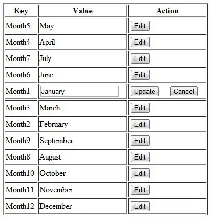
I have some text inside a <p> that is inside a <div>. I have a css image shape that floats to one side. I want the text in the two upper boxes to wrap to the shape but also align to the bottom of the div. The two lower boxes work fine because I do not need to vertically align the text within them. The problem is, the text can vary in length and so can the amount of lines, so I can not use a fixed height. Therefore absolute positioning will not work, plus the text will ignore my floating css image shape.
I have read dozens of questions and answers and all of them seem to use hacks. There is also one question that seems to ask the same as mine, but I can't find it anymore, besides there was only one answer which was javascript based. I tried using flexboxes with align-items:flex-end; but that doesn't work well with my floating shapes. I also tried using a table and vertical-align:bottom; but my text just breaks to another line and doesn't wrap to the shape.
A workaround I came up with is to use padding-top on the text, but not knowing the height of the text means the text does not always position it to the bottom of the div, especially if the length of text changes.
EDIT: I am totally open to any new ideas. This was just the best approach I could come up with. I even started toying around with the idea of using only one shape for all four boxes. But that seems a bigger challenge.
EDIT: I also updated the URL's so you can now run the code snippet.
EDIT: I have decided to go the Javascript route and am working on a solution. I am open to any ideas.
EDIT: What bothers me the most, is that every single idea I come up with requires an army of Javascript. The solution, in my opinion, should NOT require a nightmare. CSS should be able to solve this, but I can't seem to find a way without Javascript.
div, img, p  {
   margin:0px;
   border:0px;
   padding:0px;
}

#wrapper {
   display:block;
   position:absolute;
   left:0px;
   top:0px;
   width:100%;
   height:100%;
}

.box {
   display:block;
   position:absolute;
   width:50%;
   height:50%;
}

.box p { line-height:1.5em; padding:10px; }

/* The image shape is 300px x 300px. * /
/* I use 50vh because I want the shape size to always be half of the window height. */
/* This gives the illusion of one larger shape. */
.shape {
   position:relative;
   shape-margin:2em;
   width:50vh;
   height:50vh;
}

/* My workaround solution - #top_left p, #top_right p { padding-top:29vh; } */
#top_left { right:50%; top:0%; }
#bottom_left { right:50%; top:50%; }
#top_right { left:50%; top:0%; }
#bottom_right { left:50%; top:50%; }

#top_left p, #bottom_left p { text-align:right; }
#top_right p, #bottom_right p { text-align:left; }

#top_left .shape { float:right; shape-outside:url('https://i.stack.imgur.com/B1Dzu.png'); }
#bottom_left .shape { float:right; shape-outside:url('https://i.stack.imgur.com/Vxmz0.png'); }
#top_right .shape { float:left; shape-outside:url('https://i.stack.imgur.com/UL8uT.png'); }
#bottom_right .shape { float:left; shape-outside:url('https://i.stack.imgur.com/EGBRz.png'); }
<div id="wrapper">
<div id="top_left" class="box">
<img src="https://i.stack.imgur.com/B1Dzu.png" class="shape" />
<p>Here is some text. Here is some text. Here is some text.</p>
</div>
<div id="top_right" class="box">
<img src="https://i.stack.imgur.com/UL8uT.png" class="shape" />
<p>Here is some text. Here is some text. Here is some text.</p>
</div>
<div id="bottom_left" class="box">
<img src="https://i.stack.imgur.com/Vxmz0.png" class="shape" />
<p>Here is some text. Here is some text. Here is some text.</p>
</div>
<div id="bottom_right" class="box">
<img src="https://i.stack.imgur.com/EGBRz.png" class="shape" />
<p>Here is some text. Here is some text. Here is some text.</p>
</div>
</div>I have created an image to illustrate. The pink borders are just to show the box boundaries.
 shape_top_left.png
shape_top_right.png
shape_bottom_left.png
shape_bottom_right.png


