Inspired by the latest blog post by Cleve Moler, you could also use the gplot function to draw a graph given an adjacency matrix and node coordinates.
Here is an example using bucky; a demo function part of MATLAB that generates the graph of a truncated icosahedron (looks like a soccer ball). We will only use its adjacency matrix for this example since we are laying out the vertices in a circular shape:
%# 60-by-60 sparse adjacency matrix
A = bucky();
N = length(A);

%# x/y coordinates of nodes in a circular layout
r =  1;
theta = linspace(0,2*pi,N+1)'; theta(end) = [];
xy = r .* [cos(theta) sin(theta)];

%# labels of nodes
txt = cellstr(num2str((1:N)','%02d'));

%# show nodes and edges
line(xy(:,1), xy(:,2), 'LineStyle','none', ...
    'Marker','.', 'MarkerSize',15, 'Color','g')
hold on
gplot(A, xy, 'b-')
axis([-1 1 -1 1]); axis equal off
hold off

%# show node labels
h = text(xy(:,1).*1.05, xy(:,2).*1.05, txt, 'FontSize',8);
set(h, {'Rotation'},num2cell(theta*180/pi))
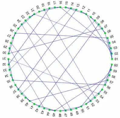
We can take this a step further and try to minimize edge crossings. That is we want to rearrange the nodes so that the edges are as close as possible to the circumference of the circle.
This can be done by finding a symmetric permutation of the matrix that minimizes its bandwidth (non-zeros are closer to the diagonal)

p = symrcm(A);
A = A(p,p);
txt = txt(p);
The result in this case:

Other improvements include replacing straight lines with curved splines to draw the edges, (that way you get a nicer graph similar to the second one you've shown), or using different colors to show clusters of vertices and their edges (obviously you'll need to do graph clustering). I will leave those steps to you :)


