1

I want to add blur behind text up to some amount of padding. I don't want some div behind and blur the div, I want it to be bound to the text.

Here is my attempt:

.container {
  width: 400px;
  height: 200px;
  position: relative;
  overflow: hidden;
}

.image {
   z-index: -1;
  object-fit: cover;
   
}

.text {
  z-index: 2;
  position: absolute;
  width: auto;
  bottom: 24px;
  left: 24px;
  font-size: 36px;
  
}

.text::before {
  content: "";
  position: absolute;
  z-index: 1;
  top: -5px;
  bottom: -5px;
  left: -15px;
  right: -15px;

  background-color: red;
  opacity: 0.4;
  filter: blur(10px);
}
<div class="container">
  <img class="image" src="https://source.unsplash.com/random" />
  <h1 class="text">Example Text</h1>
</div>

I am getting like this:

Example Image

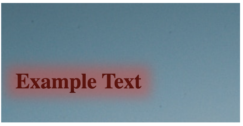
I want the edges to be not blurred.

I want something like below:

edited img

Temani Afif
  • 245,468
  • 26
  • 309
  • 415
Nihhaar
  • 141
  • 11
  • This question is very unclear. The text isn't blurred in your example. _the edges must not be blurred_, what does that mean? – disinfor Sep 28 '19 at 18:54
  • I mean there should be a sharp separation (edge) between blurred part and the background image. I don't know how to express this, please suggest to improve. – Nihhaar Sep 28 '19 at 19:12
  • @ekad what was not clear in the question? considering the fact that there is already an accepted answer and edits was made to clarify it. – Temani Afif Sep 29 '19 at 00:55
  • @AlFoиceѫ what was not clear in the question? considering the fact that there is already an accepted answer and edits was made to clarify it. – Temani Afif Sep 29 '19 at 00:55

1 Answers1

1

You can consider overflow:hidden to stop the blur effect and have a sharpe edge. I also considered padding instead of adjusting top/left/right/bottom:

.container {
  width: 400px;
  height: 200px;
  position: relative;
  overflow: hidden;
}

.text {
  z-index: 1;
  position: absolute;
  width: auto;
  bottom: 24px;
  left: 24px;
  font-size: 36px;
  padding: 12px 22px; /*added this*/
  overflow: hidden; /*added this*/
}

.text::before {
  content: "";
  position: absolute;
  z-index: -1;
  top: 0;
  bottom: 0;
  left: 0;
  right: 0;
  background-color: red;
  opacity: 0.4;
  filter: blur(10px);
}
<div class="container">
  <h1 class="text">Example Text</h1>
</div>
Temani Afif
  • 245,468
  • 26
  • 309
  • 415
  • Just to add here: transform: scale(1.1) to the blurred part made a huge improvement. Not sure why though. – Nihhaar Sep 28 '19 at 19:45
  • @Nihhaar you simply made the blurred part bigger but kept the overflow box the same – Temani Afif Sep 28 '19 at 19:46
  • Now I got it. Since gaussian blur is very weak at the edges (~zero slope), I zoomed it to make more uniform across. – Nihhaar Sep 28 '19 at 19:50
  • Why does a z-index: 0 in ::before element fades away the text also? Since z-index is 1 in the parent element, it shouldn't be a problem? – Nihhaar Oct 03 '19 at 11:03
  • 1
    z-index of the parent play no role and can be any value. Both pseudo element and text are stacked inside the parent element. If you keep z-index:0 or positive value to the pseudo element it will painted above the text, it need to have negative value to be painted below. Full details here: https://stackoverflow.com/a/54903621/8620333 – Temani Afif Oct 03 '19 at 11:09
  • I noticed that it is not blurring the background to give a frosty look like in this question: https://stackoverflow.com/questions/27583937/how-can-i-make-a-css-glass-blur-effect-work-for-an-overlay Can you suggest me how to do this in my context? – Nihhaar Oct 03 '19 at 11:18
  • @Nihhaar here is some examples that may help you: https://stackoverflow.com/a/54019014/8620333 / https://stackoverflow.com/a/48887665/8620333 – Temani Afif Oct 03 '19 at 11:22