0

I'm trying to achieve the following layout (note there is text/content above and below the image):

enter image description here

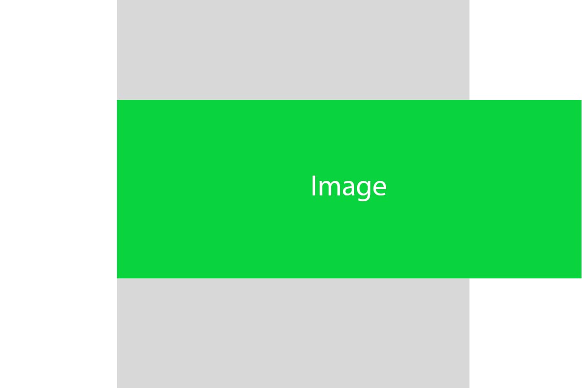
The main content/row is in gray. It is 800px max width and centered. How can I make the image align with the main div to the left but have it overflow/stretch to the right 100% to the end of the browser window? I am looking for a CSS only solution if possible without JS.

body {
  text-align: center;
}

.main {
  width: 100%;
  max-width: 800px;
  margin: 0 auto;
  padding: 0 15px;
  position: relative;
  overflow: visible;
}

img {
  width: 100%;
  position: absolute;
  left: 0;
}
<div class="main">
  <img src="https://via.placeholder.com/300x100" />
</div>

but cannot get it to work. Please note, the layout is responsive.

CyberJ
  • 1,018
  • 1
  • 11
  • 24
  • Is this an actual image or a background image? – Paulie_D Oct 04 '19 at 12:29
  • Related - https://stackoverflow.com/questions/28565976/css-how-to-overflow-from-div-to-full-width-of-screen and https://stackoverflow.com/questions/33564131/bootstrap-full-width-with-2-different-backgrounds-and-2-columns – Paulie_D Oct 04 '19 at 12:31
  • Is there content in the gray area above and below the image? Or is it always blank space? – disinfor Oct 04 '19 at 12:40
  • Yes there is content. I am just showing a simplified illustration as an example – CyberJ Oct 04 '19 at 12:41
  • Thanks for updating. That is important information to know, especially if we need to rely on `position: absolute`. – disinfor Oct 04 '19 at 12:50

2 Answers2

0

You can use CSS grid to achieve this effect with only CSS.

.grid-container {
  display: grid;
  grid-template-columns: 1fr 1fr 1fr;
  grid-template-rows: 1fr;
  grid-template-areas: ". . .";
}

.grid-container1 {
  display: grid;
  grid-template-columns: 1fr 2fr;
  grid-template-rows: 1fr;
  grid-template-areas: ". .";
}

.grid-container1 div:nth-child(2) img {
  width: 100%;
}

[class^="grid-container"] div:first-child {
  background-color: red;
}

[class^="grid-container"] div:nth-child(2) {
  background-color: blue;
}

[class^="grid-container"] div:nth-child(3) {
  background-color: green;
}
<div class="grid-container">
  <div>here1</div>
  <div>here2</div>
  <div>here3</div>
</div>
<div class="grid-container1">
  <div>here4</div>
  <div><img src="https://via.placeholder.com/300x100" /></div>
</div>
<div class="grid-container">
  <div>here5</div>
  <div>here6</div>
  <div>here7</div>
</div>
muka.gergely
  • 8,063
  • 2
  • 17
  • 34
  • Thanks but i think there's an easier way to do it in css using `vw` and `calc()` as long as the main container width is known.... also your code does not have the same layout i posted with a main container of 800px. I'm not really sure what your html is. – CyberJ Oct 05 '19 at 12:01
-2

Please Try this

.main{
  max-width:800px;
  background:grey;
  margin:0 auto;
}
img{
  width:100%;
  height:100%;
}
<div class="main">
  <img src="https://via.placeholder.com/300x100"></img>
</div>