I would like to compile some data into a ggplot() line plot of different colors.
It's rainfall in various places over 100 days, and the data is quite different between locations which is giving me fits.
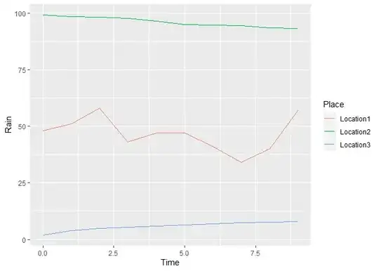
I've tried using different suggestions from this forum and they don't seem to be working well for this data. Sample data:
Time        Location1   Location2           Location3
0           48          99.2966479761526    2
1           51          98.7287820735946    4
2           58          98.4803262236528    4.82842712474619
3           43          97.8941490454599    5.46410161513775
4           47          96.6091435402632    6
5           47          95.207282404881     6.47213595499958
6           41          94.8696538619697    6.89897948556636
7           34          94.6514389757067    7.29150262212918
8           40          93.7297335476615    7.65685424949238
9           57          93.2440731907263    8
My code thus far is
ggplot(Rain) +
 geom_line(aes(x=Time,y=Location1,col="red")) +
 geom_line(aes(x=Time,y=Location2,col="blue")) +
 geom_line(aes(x=Time,y=Location3,col="green")) +
 scale_color_manual(labels = c("Location 1","Location 2","Location 3"),
                    values = c("red","blue","green")) +
 xlab("Time (Days)") + ylab("Rainfall (Inches)") + labs(color="Locations") +
 ggtitle("Rainfall Over 100 Days In Three Locations")
So far it gives me everything that I want but for some reason the colors are wrong when I plot it, i.e. it plots location 1 in green while I told it red in my first geom_line.