I am using the Bootstrap grid system for styling. What I want to achieve is the following (the illustration on the top is meant to be for Desktop size, the one on the bottom for mobile view):
The items are located in a div with the classes row and container.
<div class="container row">
 <div class="col-md-2 col-6">
    div1
 </div>
 <div class="col-md-9 col-12">
    div 2
 </div>
 <div class="col-md-1 col-6">
    div 3
 </div>
</div>
The css .container class:
.container {
     display: flex;
     align-items: center;
     justify-content: space-between;
     height: 100%;
}
Currently, I am getting something like this when resizing to mobile:
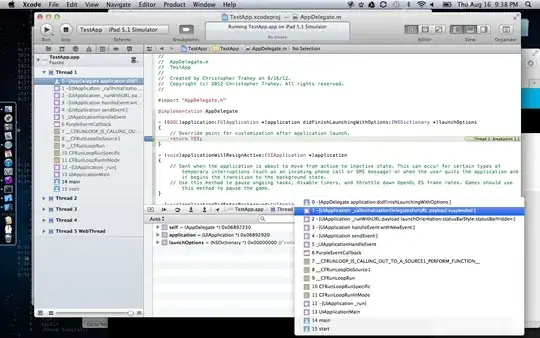
How can I achieve the layout shown in the first image?