I have a bunch of timedelta objects.
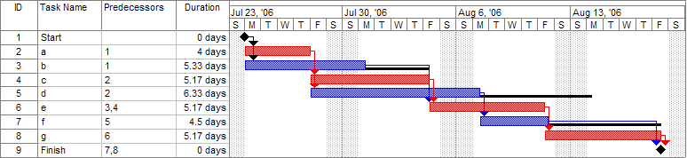
I want to visualize them by showing them as bars on a common linear time axis (think something like Gantt charts).
The end product should be an SVG with a defined total width W (so a time axis with width W, and boxes above it, visualizing the timedeltas).
The solution should be as precise as possible.
What's the best way to do this?
So far, the best way I've come up with is to
somehow extract an absolute numerical value from all
timedeltaobjects (something like Unix Epoch time maybe)use the first and last timestamp to define the time range
create a mapping function from the absolute, interpolating the values (something like this)
map the absolute values onto the defined SVG width
create the SVG objects using
svgwrite
After googling for a bit, steps 1 and 2 seem problematic - I'm not even sure timedeltas have an absolute numeric value.