0

My data is

          PC_Name Electors_2009 Electors_2014 Electors_2019 Voters_2009 Voters_2014
1         Amritsar       1241099       1477262       1507875      814503     1007196
2   Anandpur Sahib       1338596       1564721       1698876      904606     1086563
3         Bhatinda       1336790       1525289       1621671     1048144     1176767
4         Faridkot       1288090       1455075       1541971      930521     1032107
5  Fatehgarh Sahib       1207556       1396957       1502861      838150     1030954
6         Ferozpur       1342488       1522111       1618419      956952     1105412
7        Gurdaspur       1318967       1500337       1595284      933323     1042699
8       Hoshiarpur       1299234       1485286       1597500      843123      961297
9        Jalandhar       1339842       1551497       1617018      899607     1040762
10   Khadoor Sahib       1340145       1563256       1638842      946690     1040518
11        Ludhiana       1309308       1561201       1683325      846277     1100457
12         Patiala       1344864       1580273       1739600      935959     1120933
13         Sangrur       1251401       1424743       1529432      931247     1099467
   Voters_2019
1       859513
2      1081727
3      1200810
4       974947
5       985948
6      1172033
7      1103887
8       990791
9      1018998
10     1046032
11     1046955
12     1177903
13     1105888


I have written the code

data <- read.csv(file = "Punjab data 3.csv")
data
library(ggplot2)
library(reshape2)
long <- reshape2::melt(data, id.vars = "PC_Name")
ggplot(long, aes(PC_Name, value, fill = variable)) + geom_freqpoly(stat="identity",binwidth = 500)

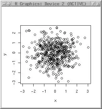
I am trying to plot something like this I tried line chart and geom line but I am not sure where problem resides. I am trying geom polygon now but its not plotting.I want to compare voters or electors not both of them according to year 2009 2014 2019.Sorry for bad english.

I want to plot PC_Name on x-axis and compare Electors_2009 with Voters_2009 and Electors_2014 with Voters_2014 and all these on same graph. So on y axis I will have 'values' after melting.
DD11
  • 75
  • 8
  • Hi Damandeep, can you please make it easier to load your data, see some tips here https://stackoverflow.com/questions/5963269/how-to-make-a-great-r-reproducible-example. I would also put results post reshape to focus on plotting issue to make the question `minimal` – Bulat Oct 13 '19 at 09:33
  • In addition, please clarify how you would like your plot to look. What would be plotted on each axis? And lines for which variables? – Ben Oct 13 '19 at 13:06
  • Don't worry about your English, it's fine. After melting the data into a long shape, you might want to split the type of values into voters and electors, then cast back into a wide shape so you have one column for voters and one for electors. Or you could leave it in its melted state and filter for one or the other before plotting. Either way, there should be other SO posts that already cover each of those steps – camille Oct 13 '19 at 14:11
  • @Bulat I don't know how those command dput etc works can you demonstrate me I tried but coudlnt . – DD11 Oct 14 '19 at 01:49
  • @Ben I just edited – DD11 Oct 14 '19 at 01:49

1 Answers1

1

It sounds like you were interested in PC_Name on horizontal axis, and value (after melting) on vertical axis. Perhaps you might be interested in a barplot with and compare electors and voters side-by-side?

As suggested by @camille, you could split your data frame's variable column after melting into two columns (one with either Electors or Voters, and the other column with the year). This would provide flexibility in plot options.

Here are a couple of possibilities to start with:

  1. You could order your variable factor how you would like (e.g., Electors_2009, Voters_2009, Electors_2014, etc. for comparison) and use geom_bar.

plot of value vs. PC_Name all years

  1. You could use facet_wrap to make comparisons between Electors and Voters by year.

plot of value vs. PC_Name faceted by year

library(ggplot2)
library(reshape2)

long <- reshape2::melt(data, id.vars = "PC_Name")

# Split electors/voters from year into 2 columns
long <- cbind(long, colsplit(long$variable, "_", c("type", "year")))

# Change order of variable factor for comparisons
long$variable <- factor(long$variable, levels = 
                          c("Electors_2009", "Voters_2009",
                            "Electors_2014", "Voters_2014",
                            "Electors_2019", "Voters_2019"))

# Plot value vs. PC_Name using barplot (all years together)
ggplot(long, aes(PC_Name, value, fill = variable)) +
  geom_bar(position = "dodge", stat = "identity")

# Show example plot faceted by year
ggplot(long, aes(PC_Name, value, fill = type)) +
  geom_bar(position = "dodge", stat = "identity") +
  facet_wrap(~year, ncol = 1)

Please let me know if this is what you had in mind. There would be alternative options available.

Ben
  • 28,684
  • 5
  • 23
  • 45